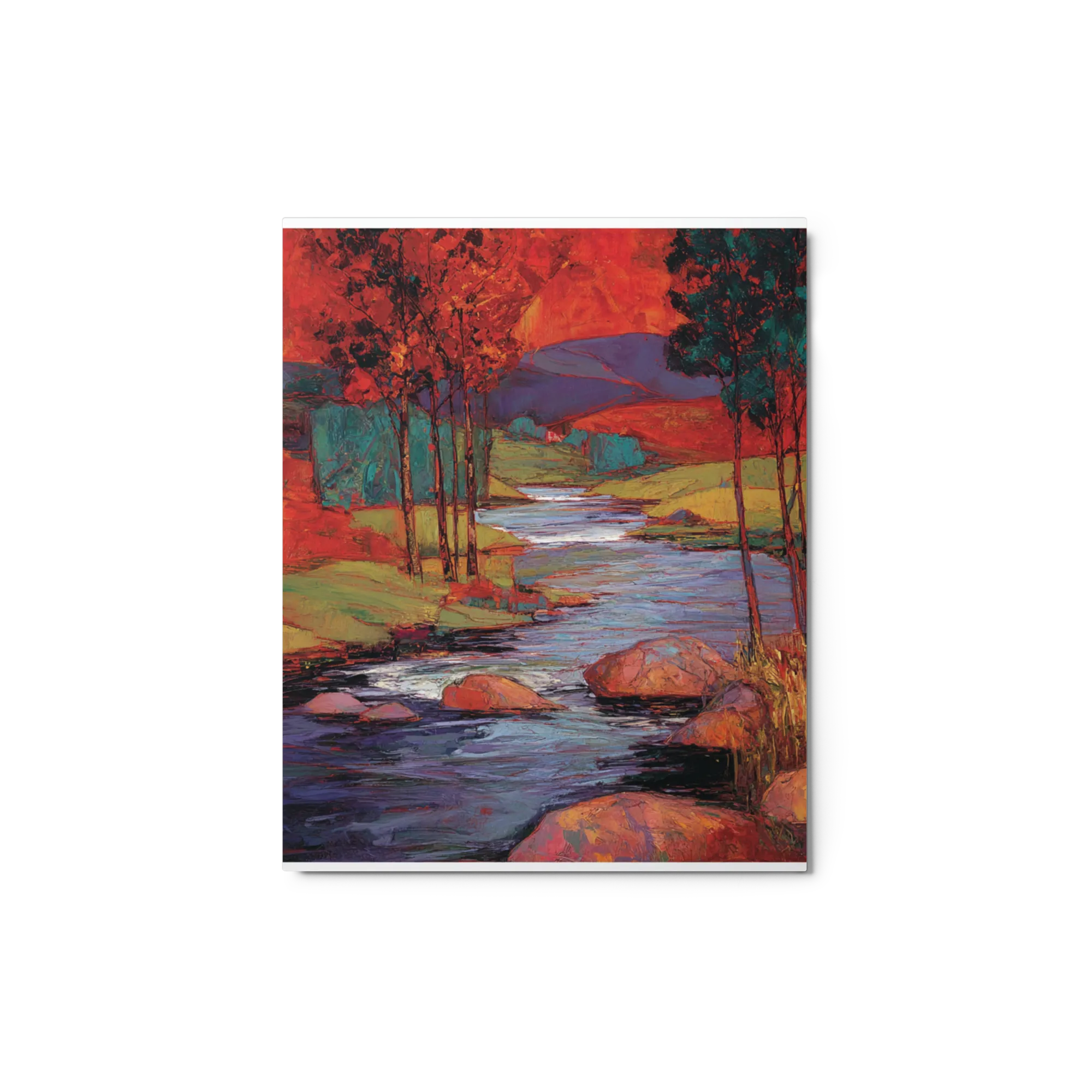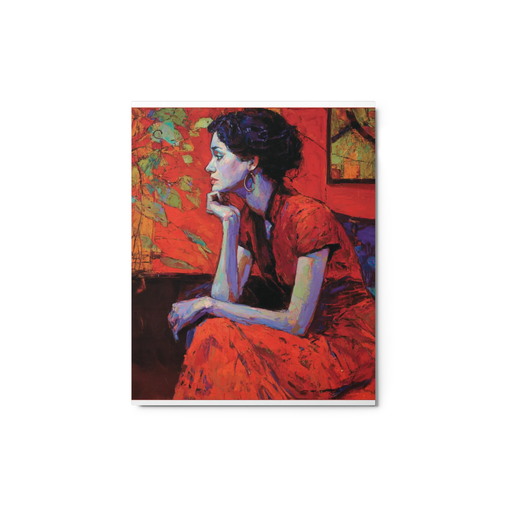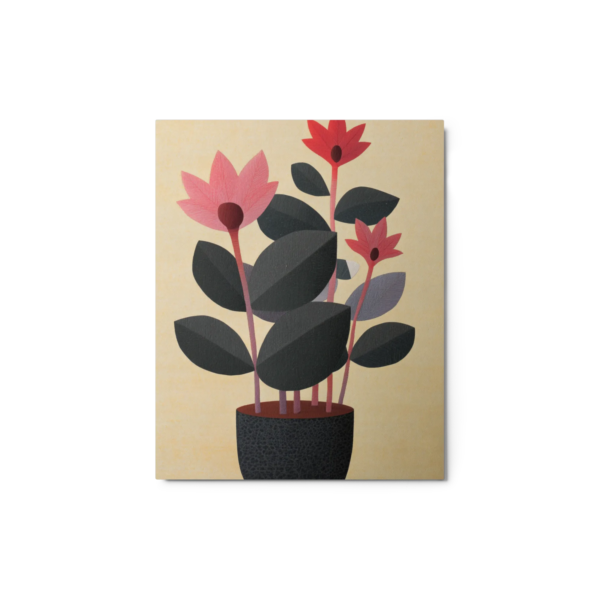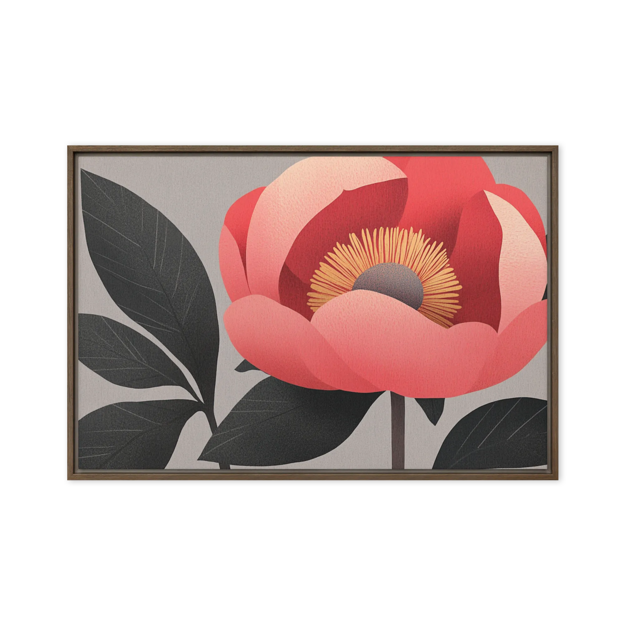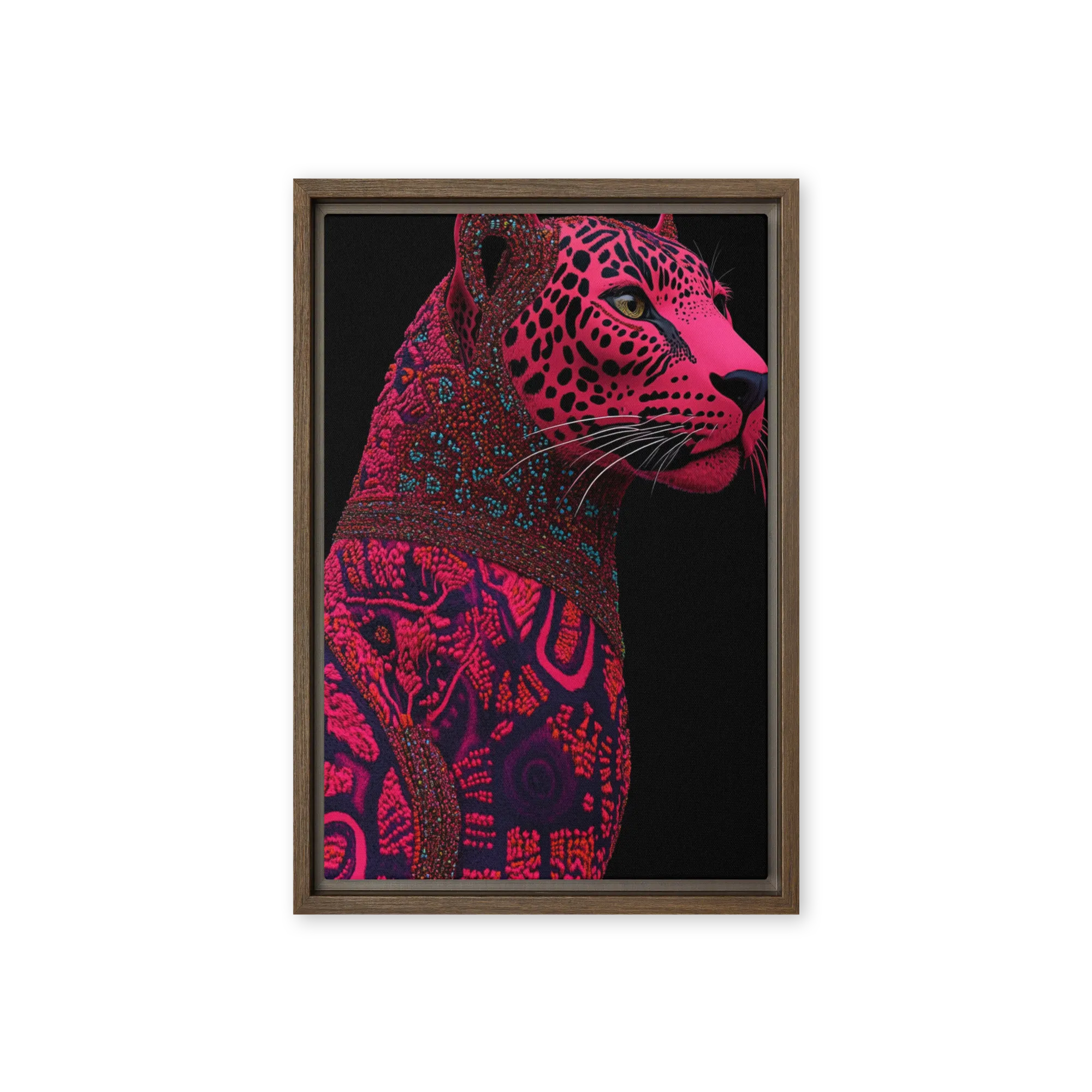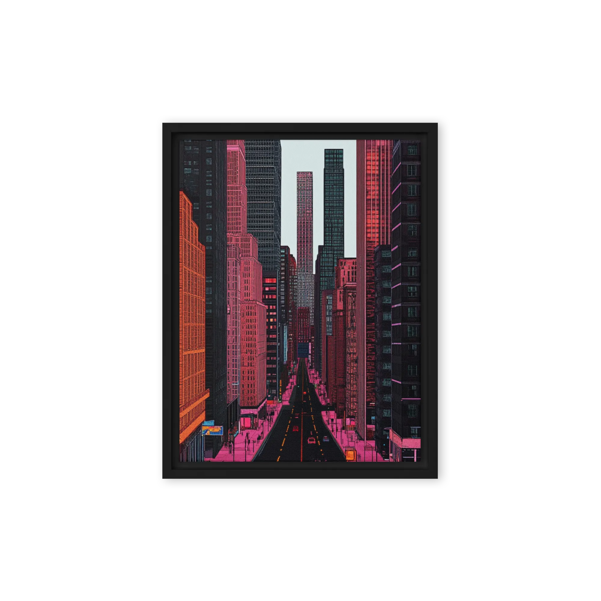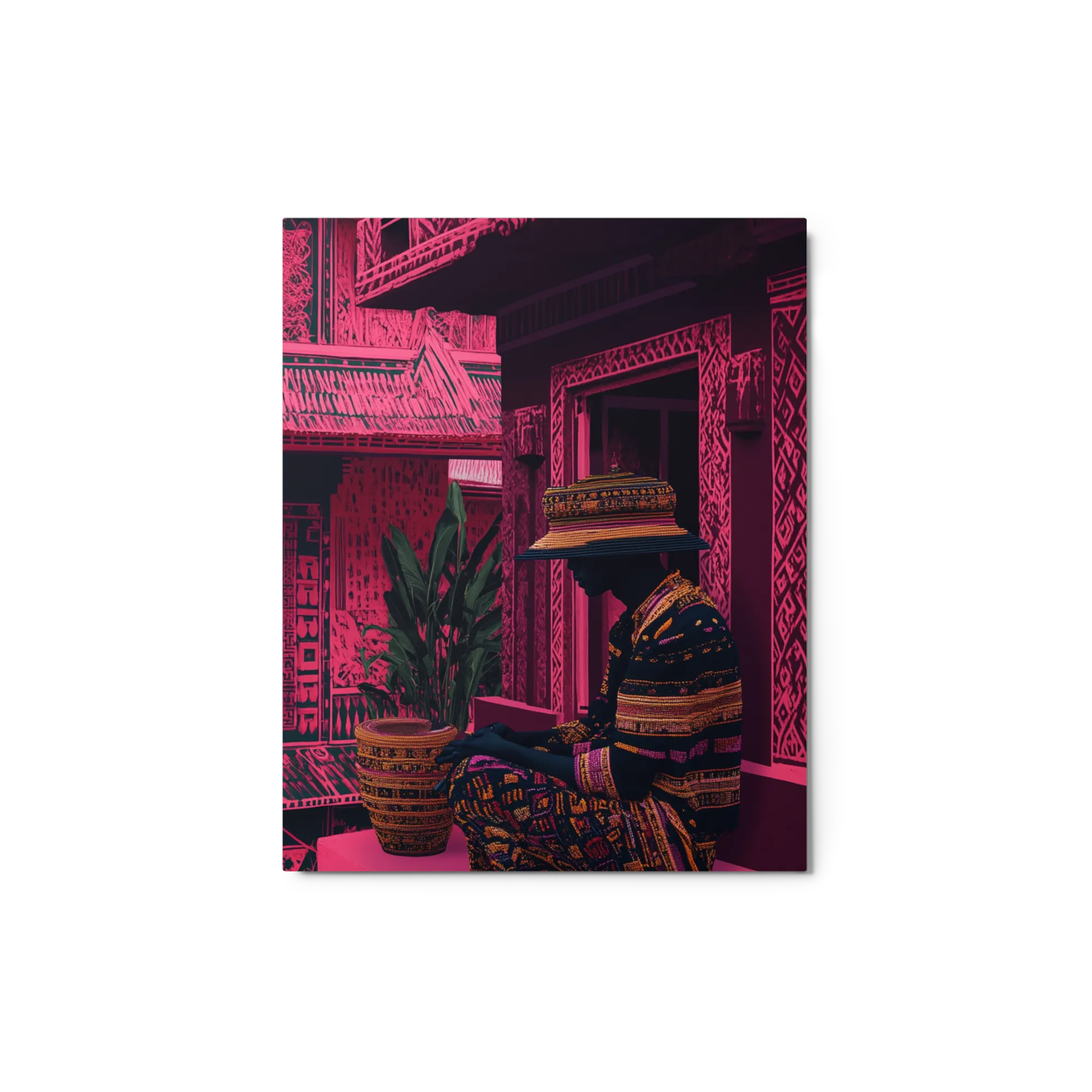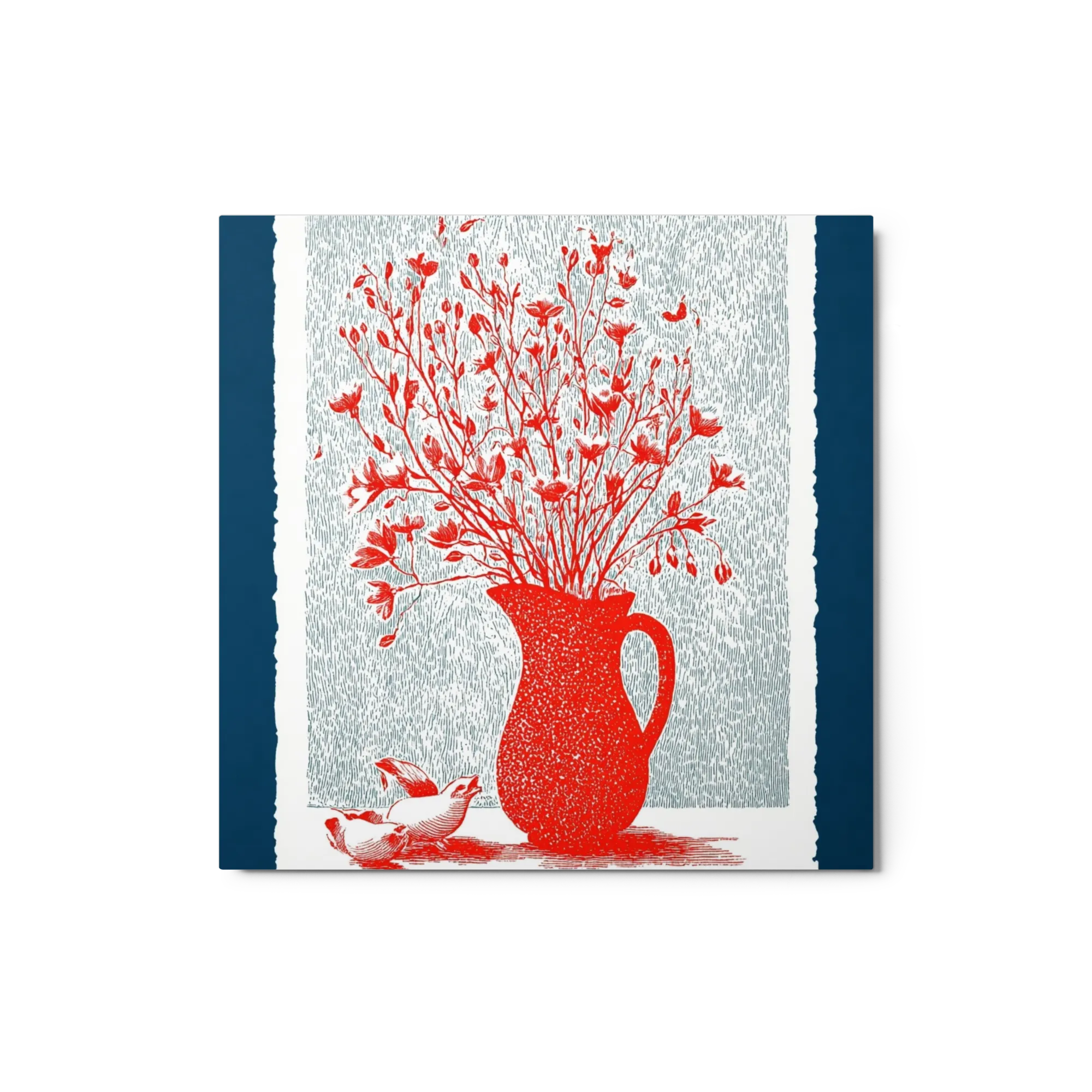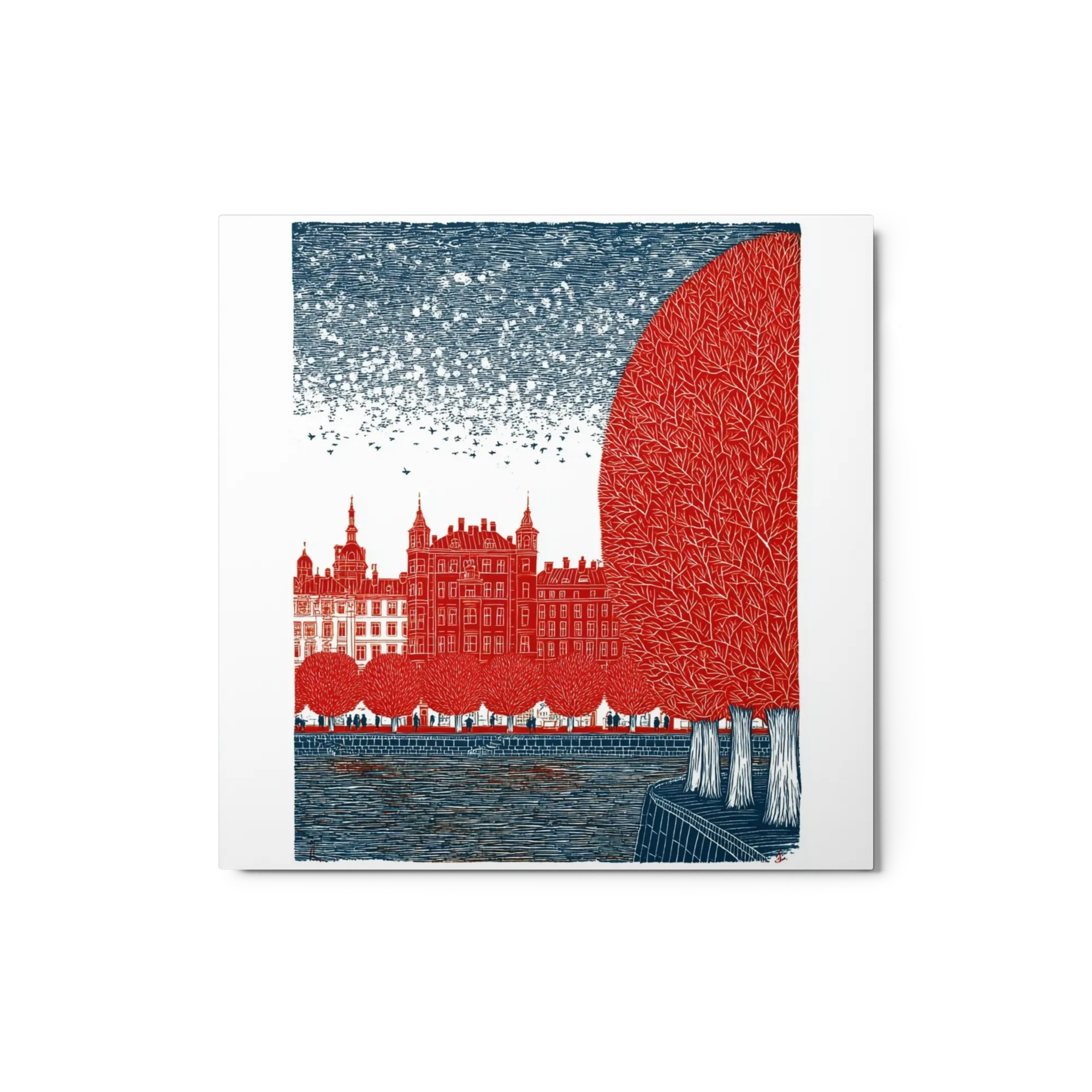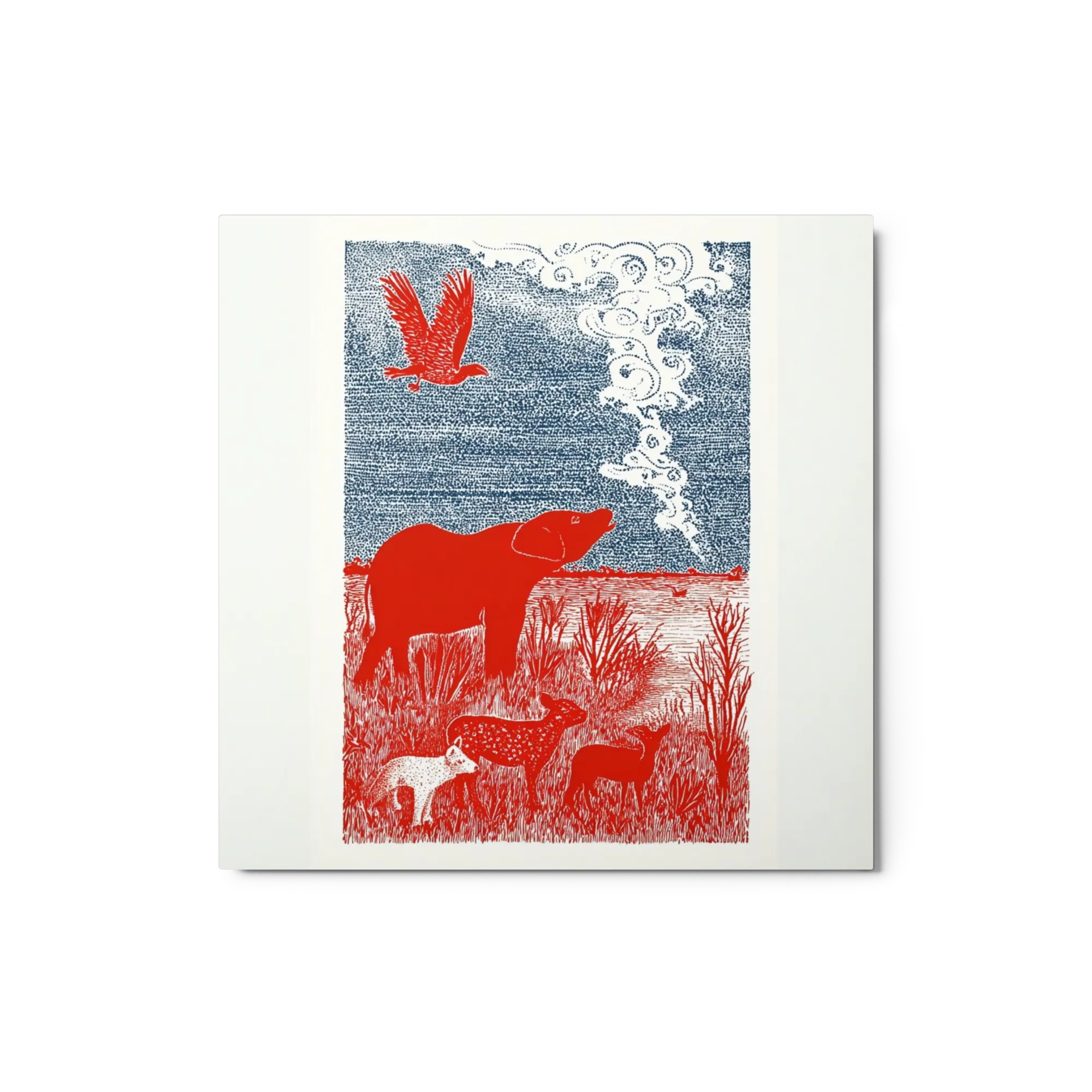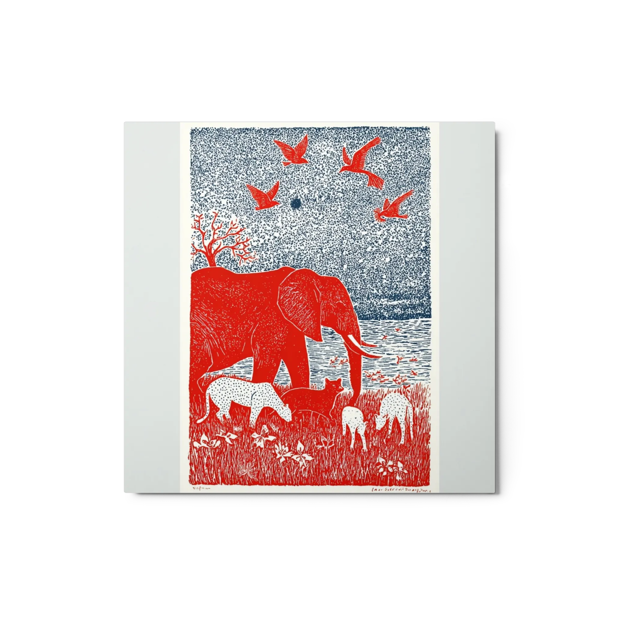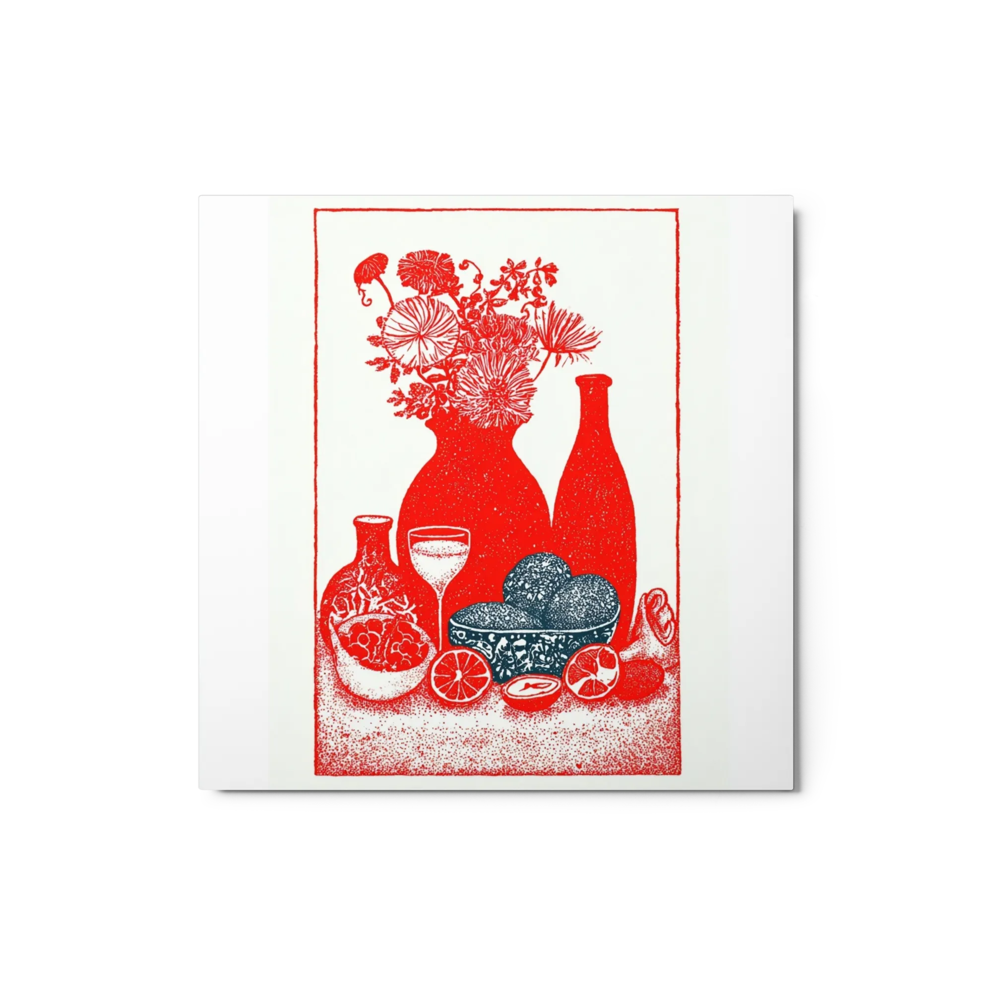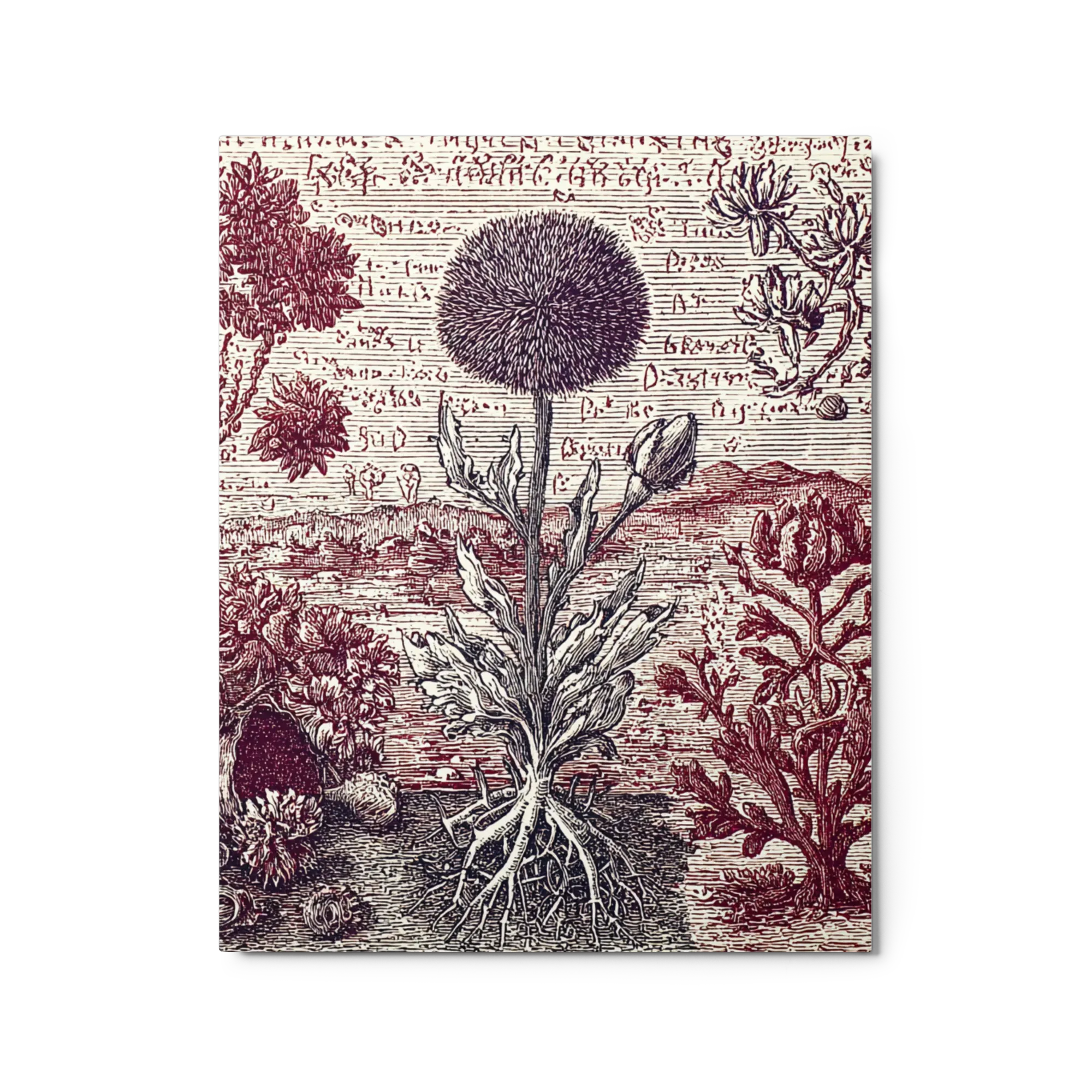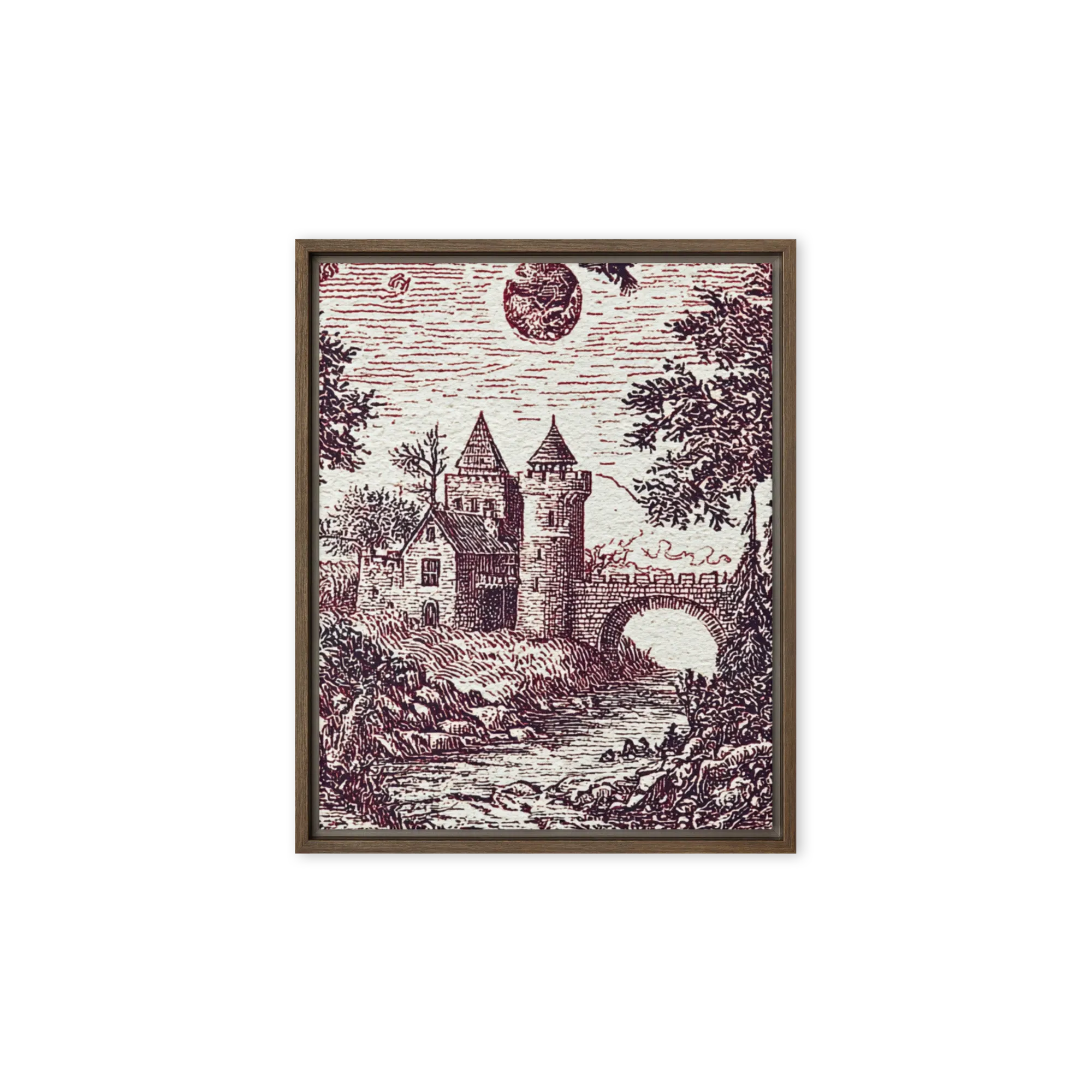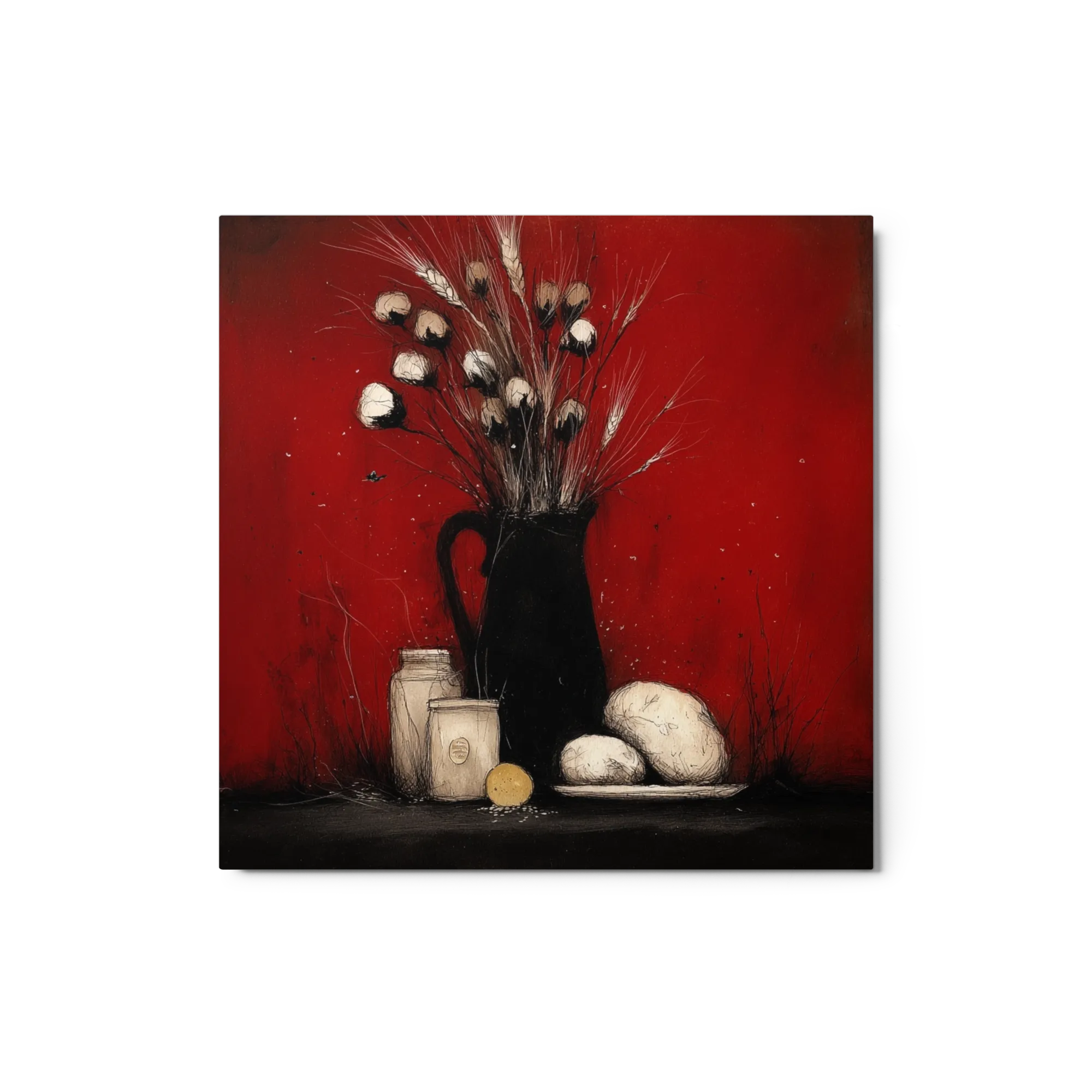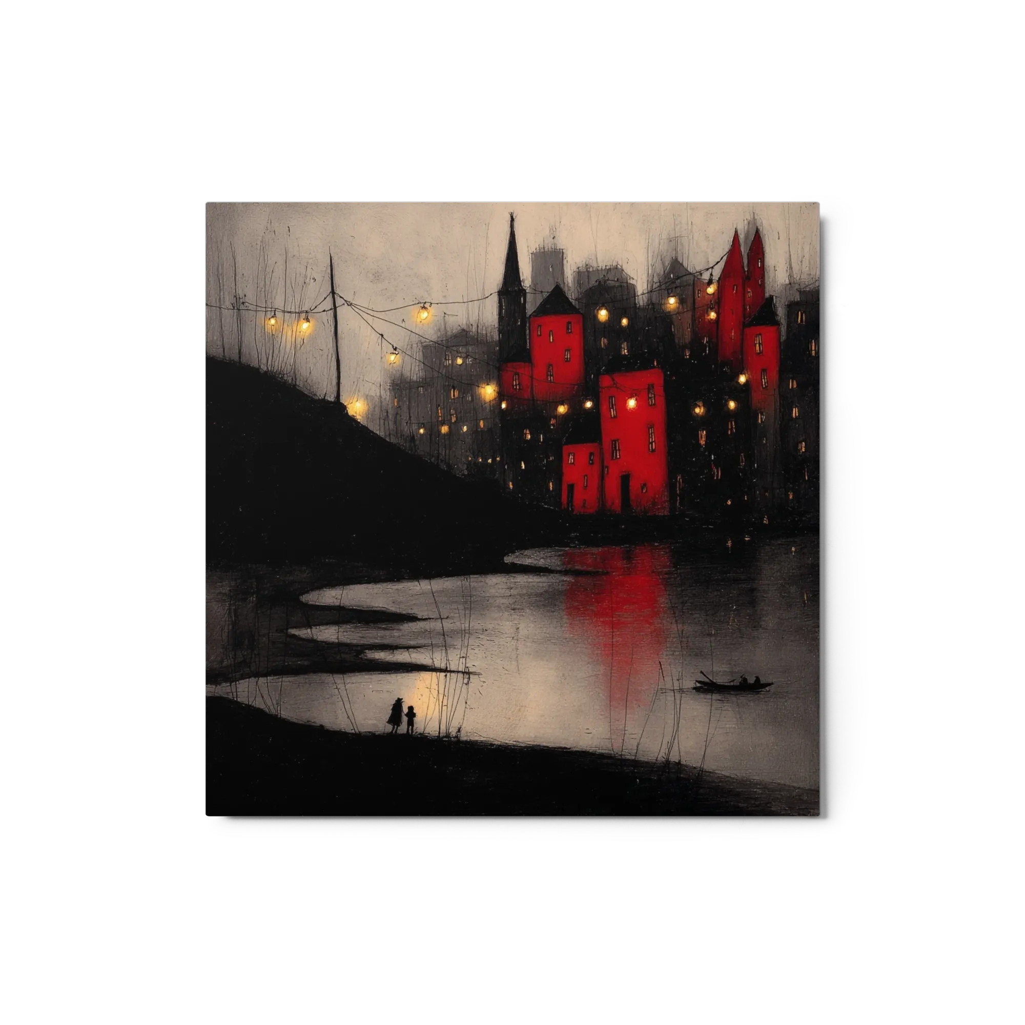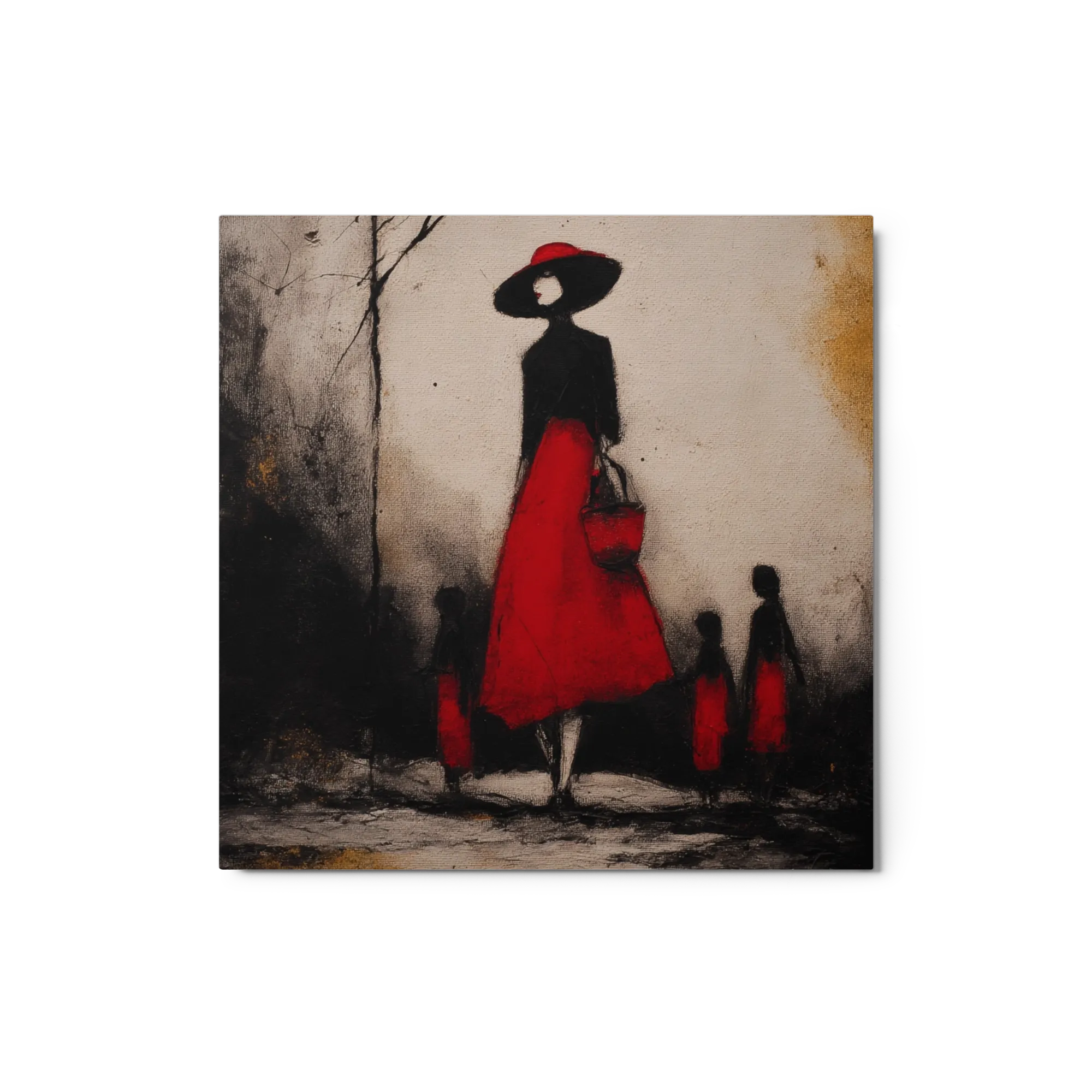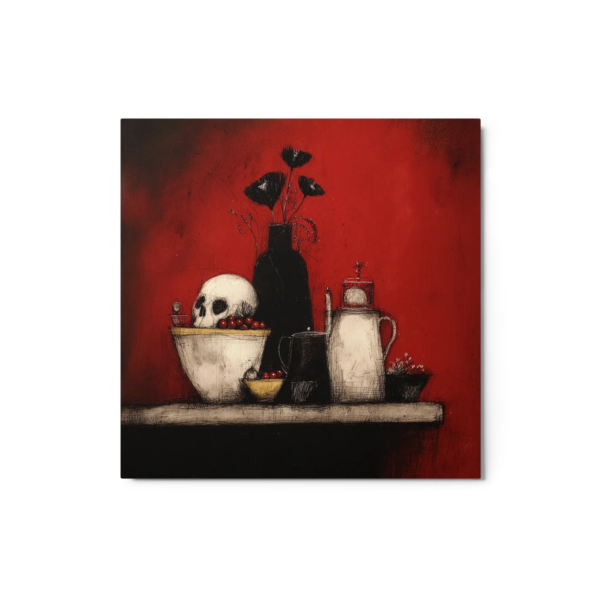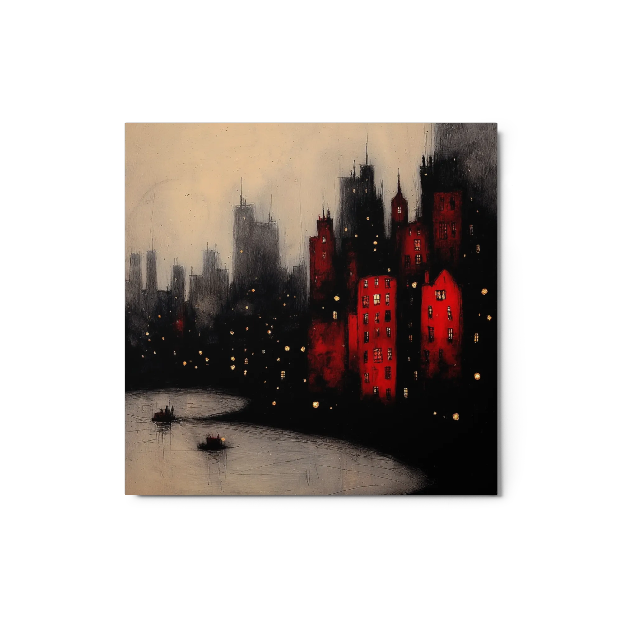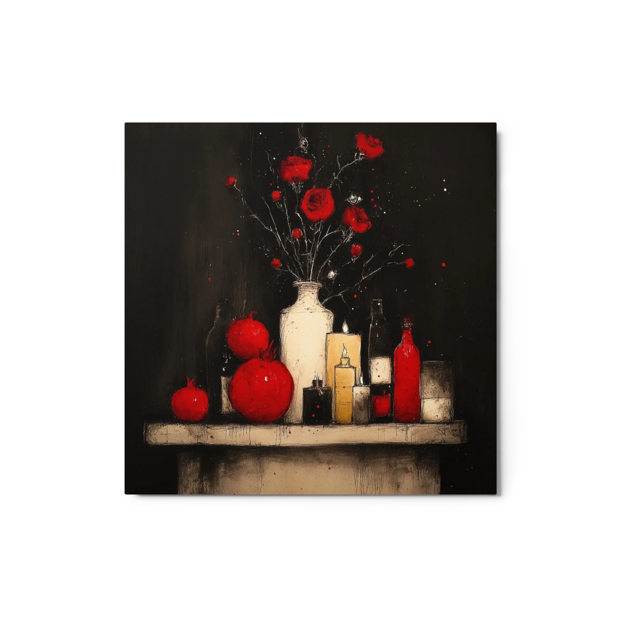
Crimson, vermilion and burgundy prints, from block-print folk art to tactile impasto, made to order in every size and format.
Explore the TextureCrimson, vermilion and burgundy prints, from block-print folk art to tactile impasto, made to order in every size and format.
Explore the Texture

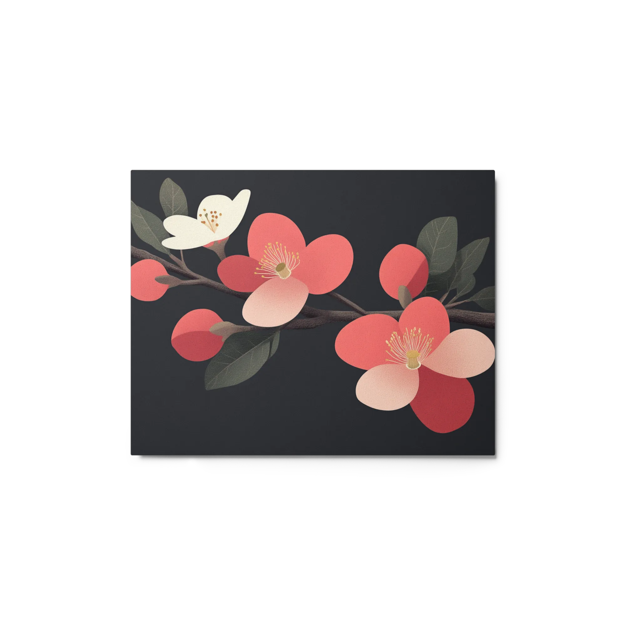
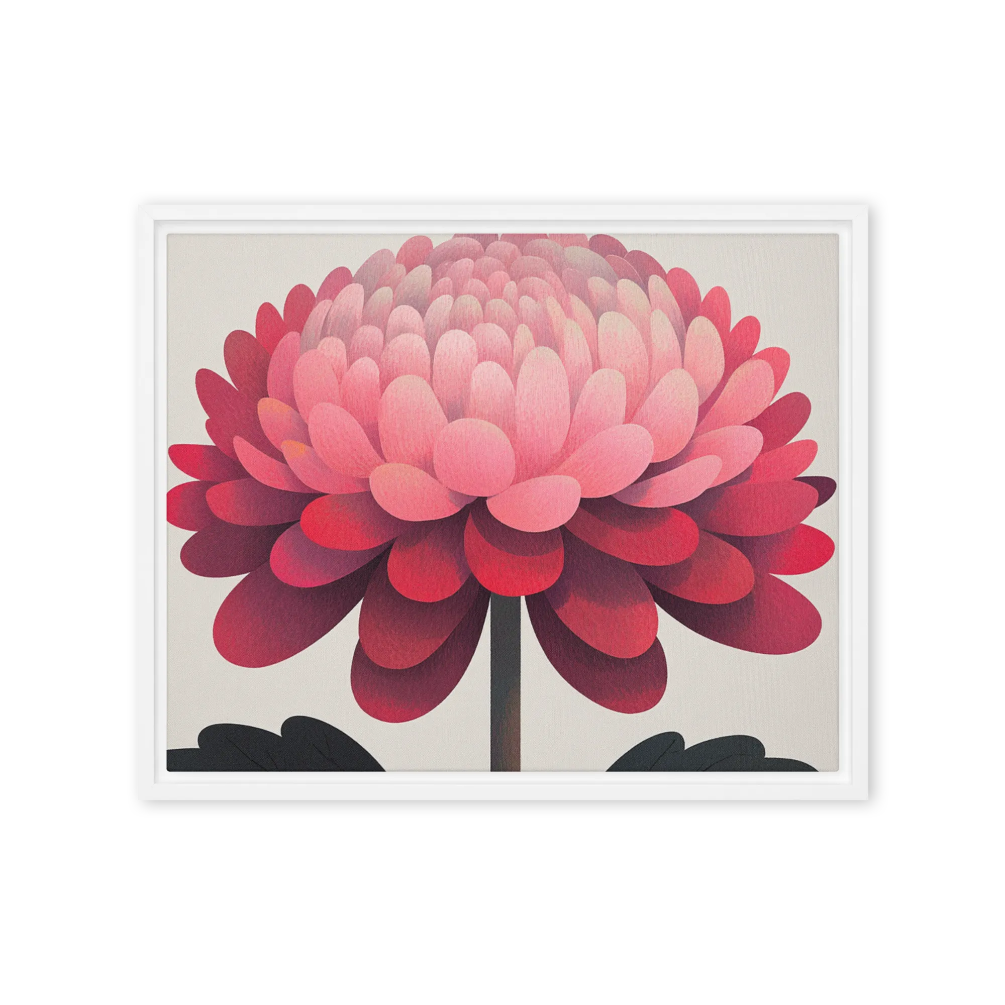
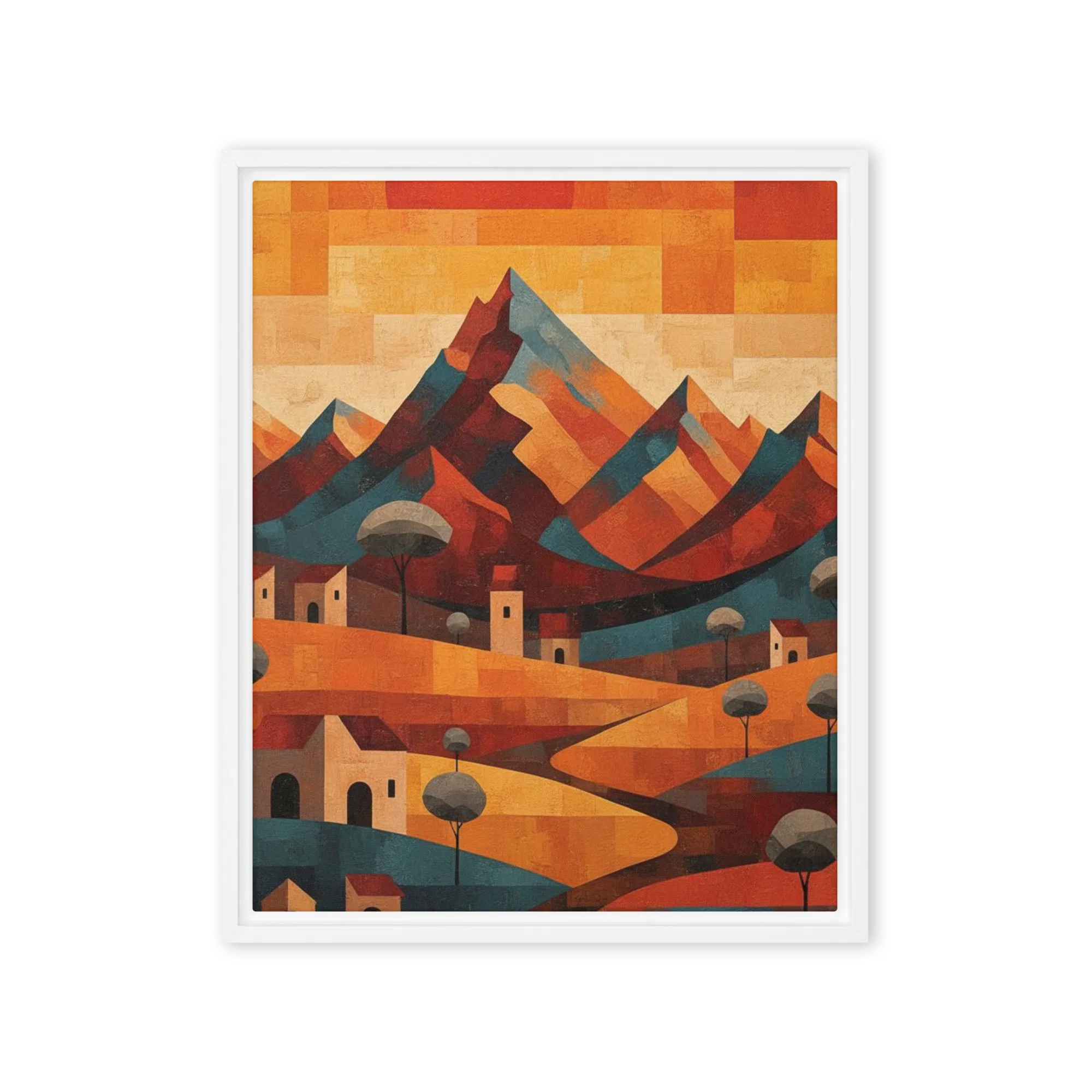
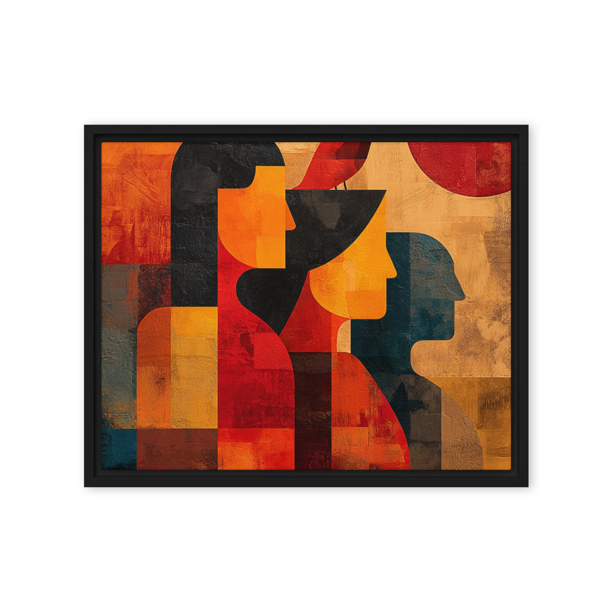
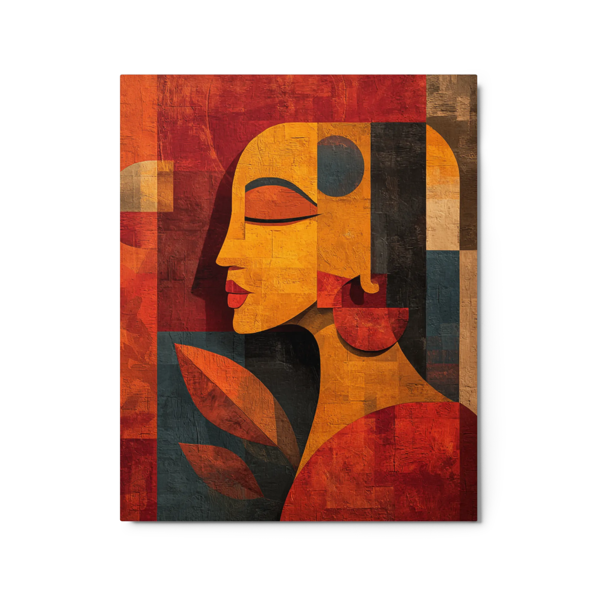
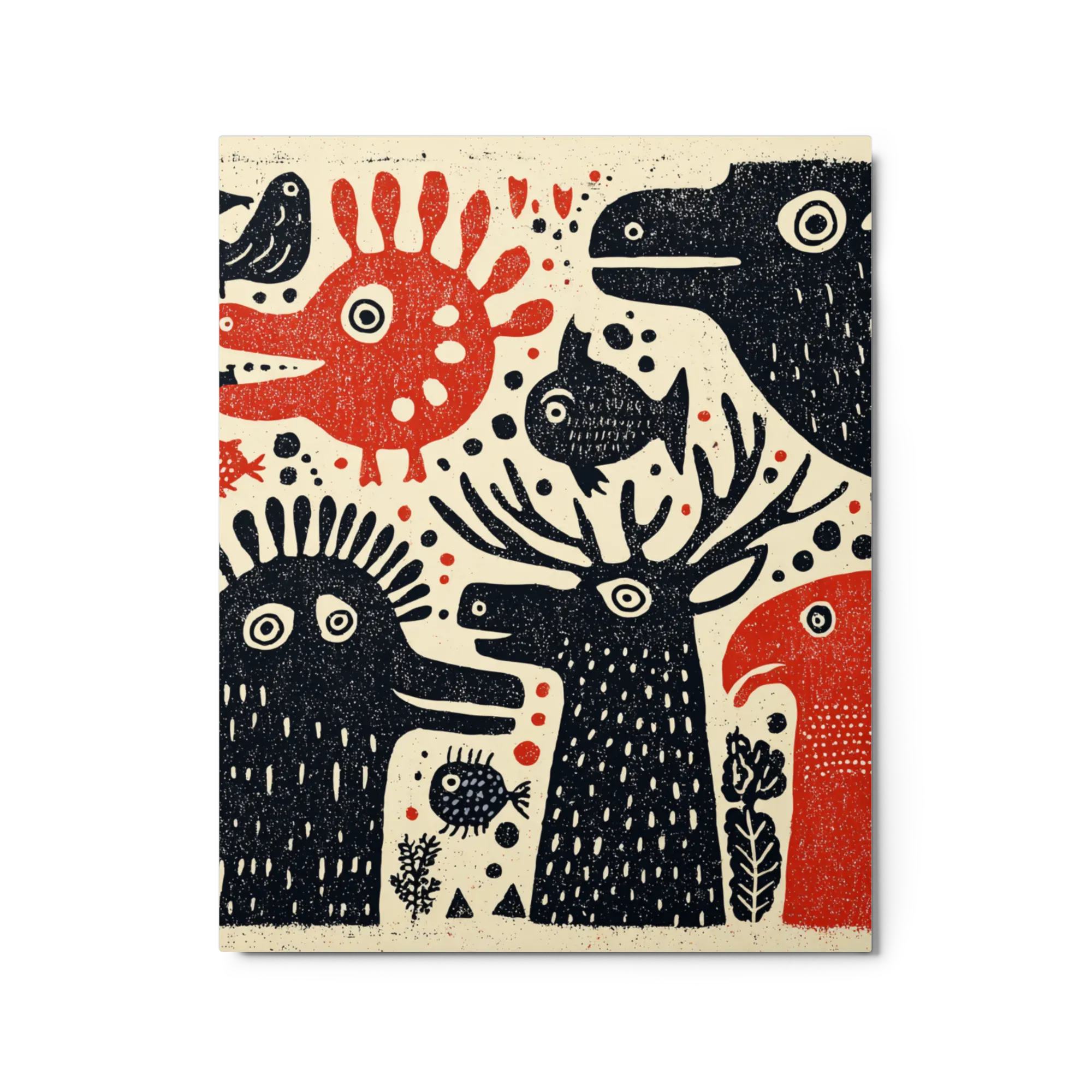
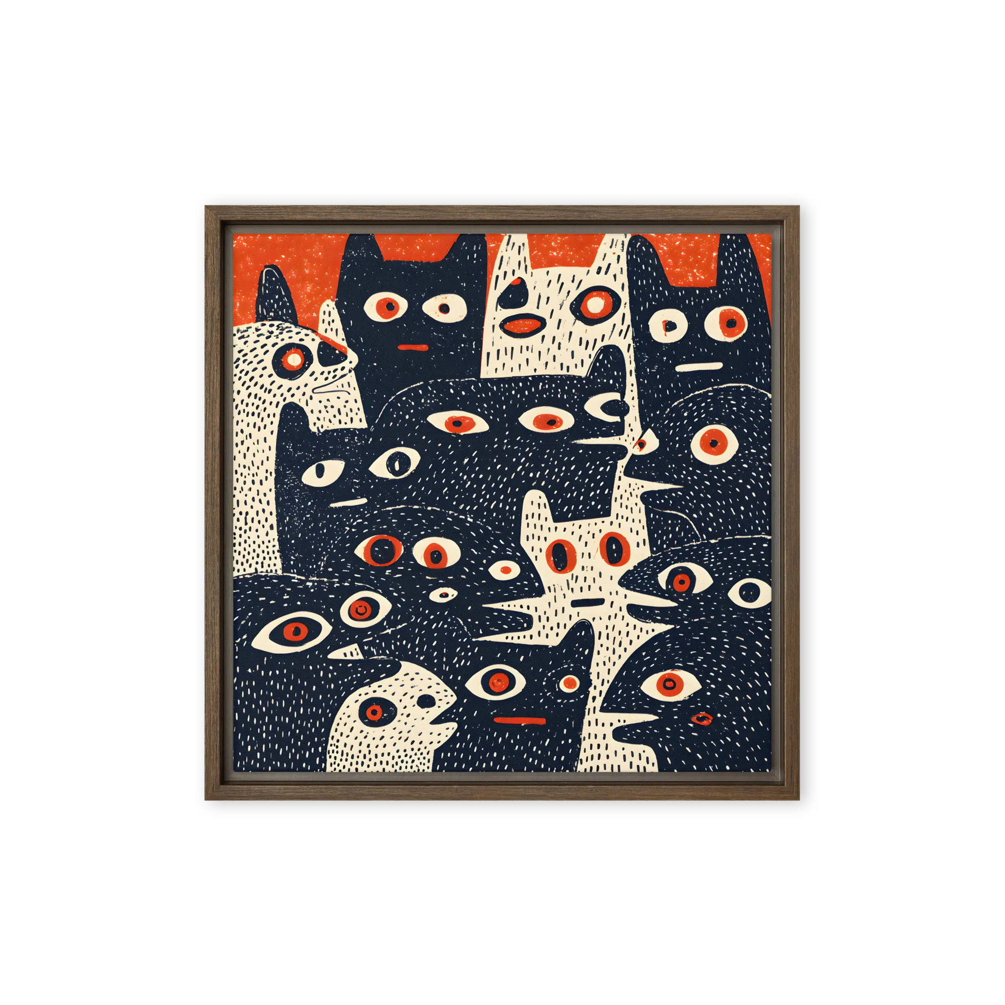
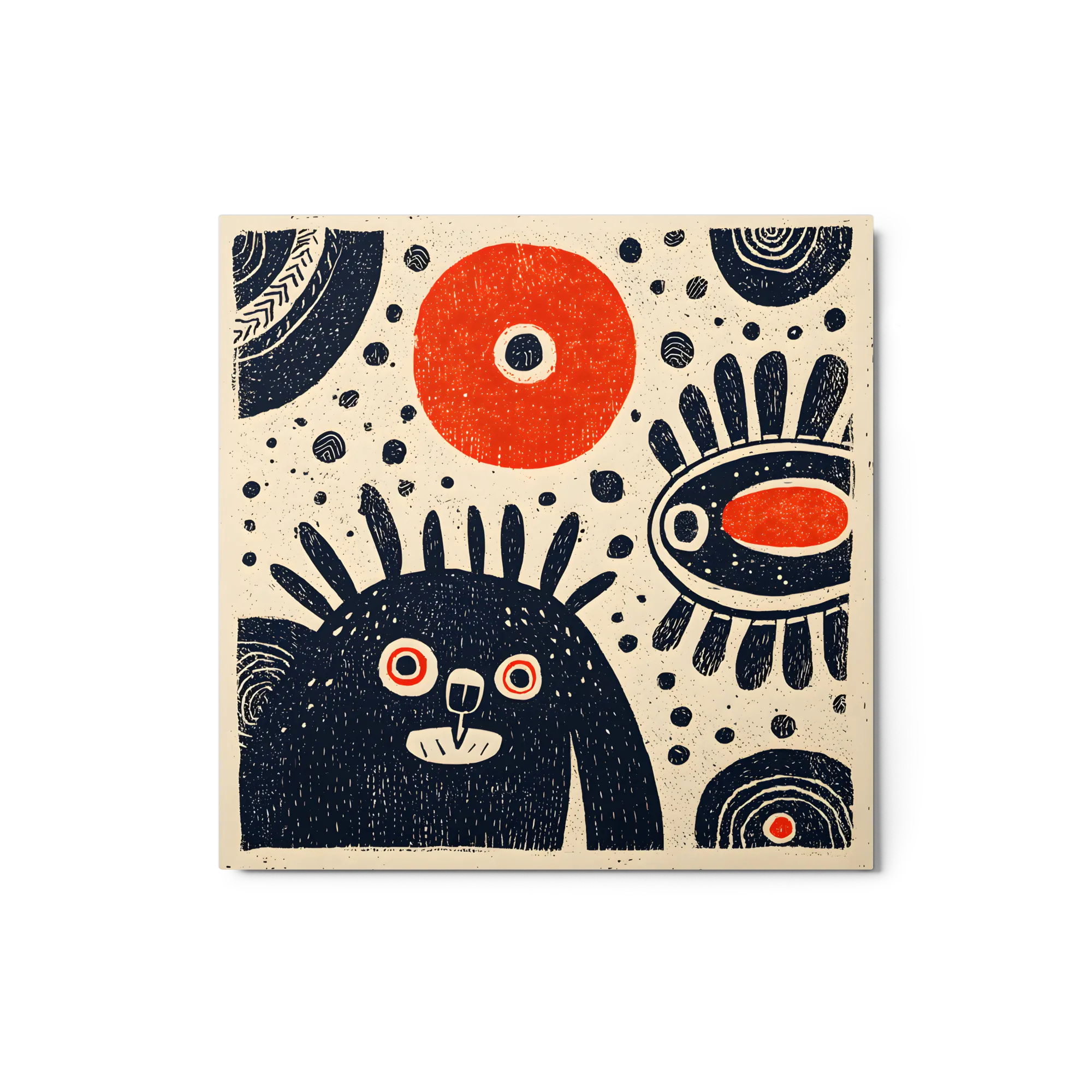
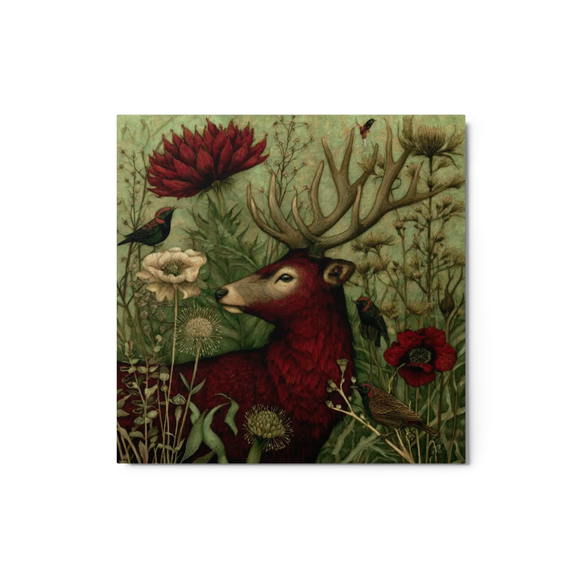
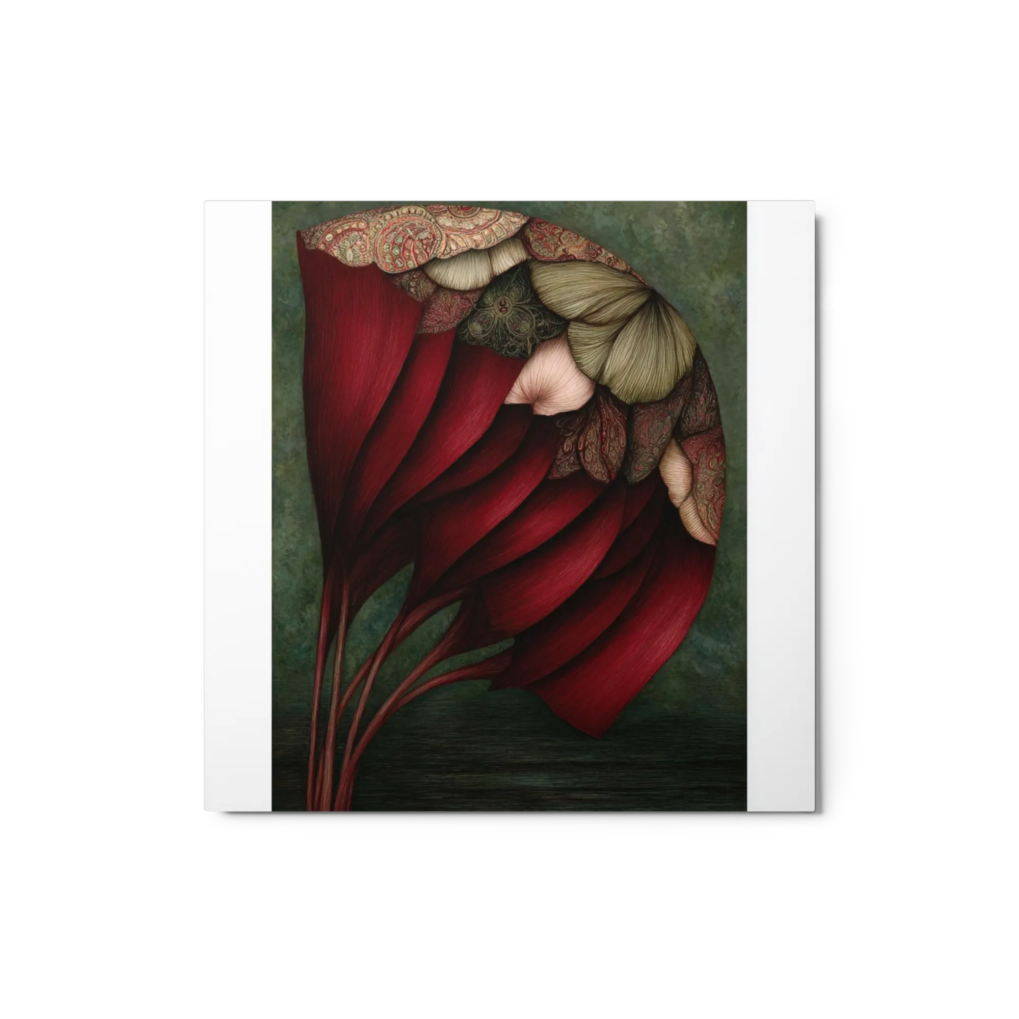
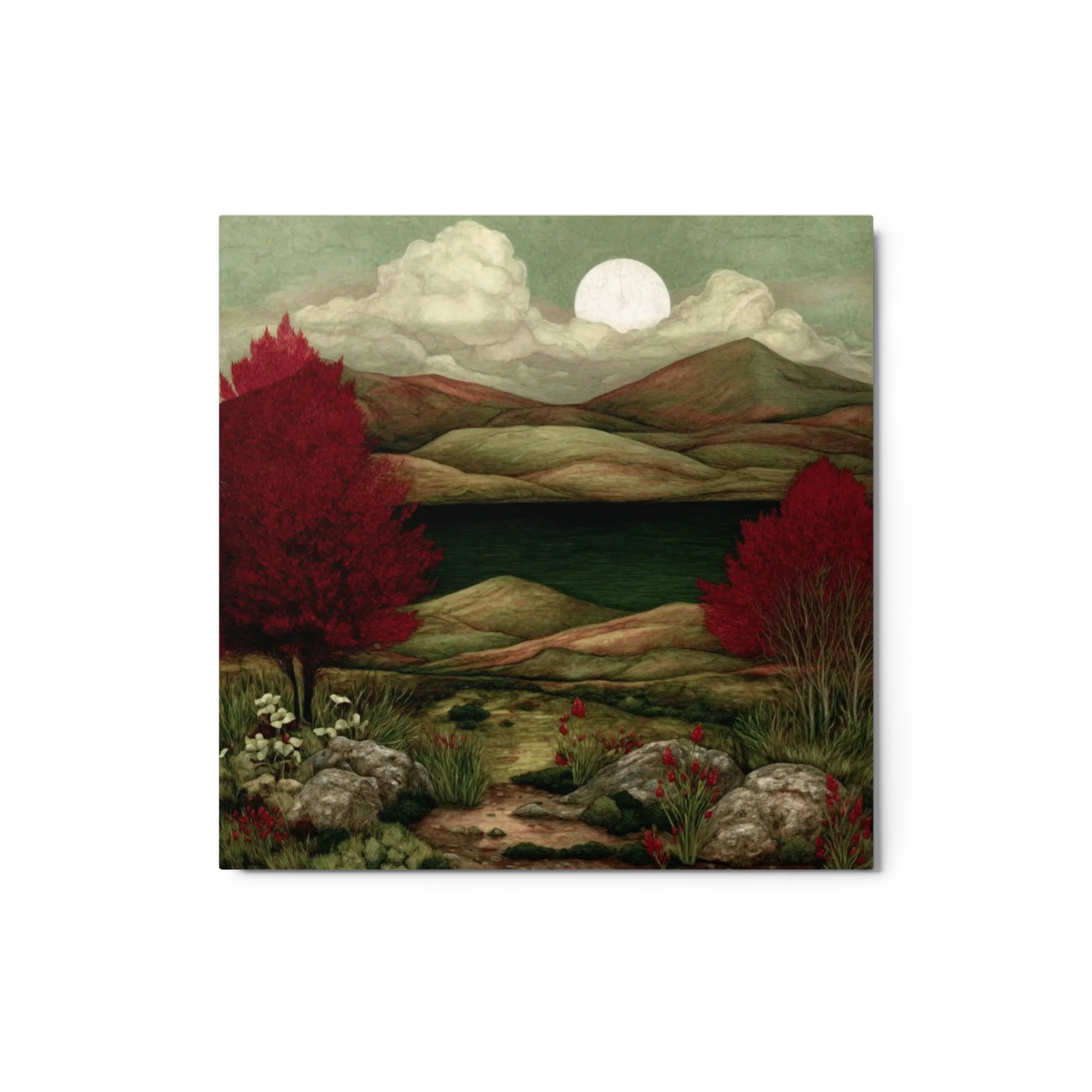
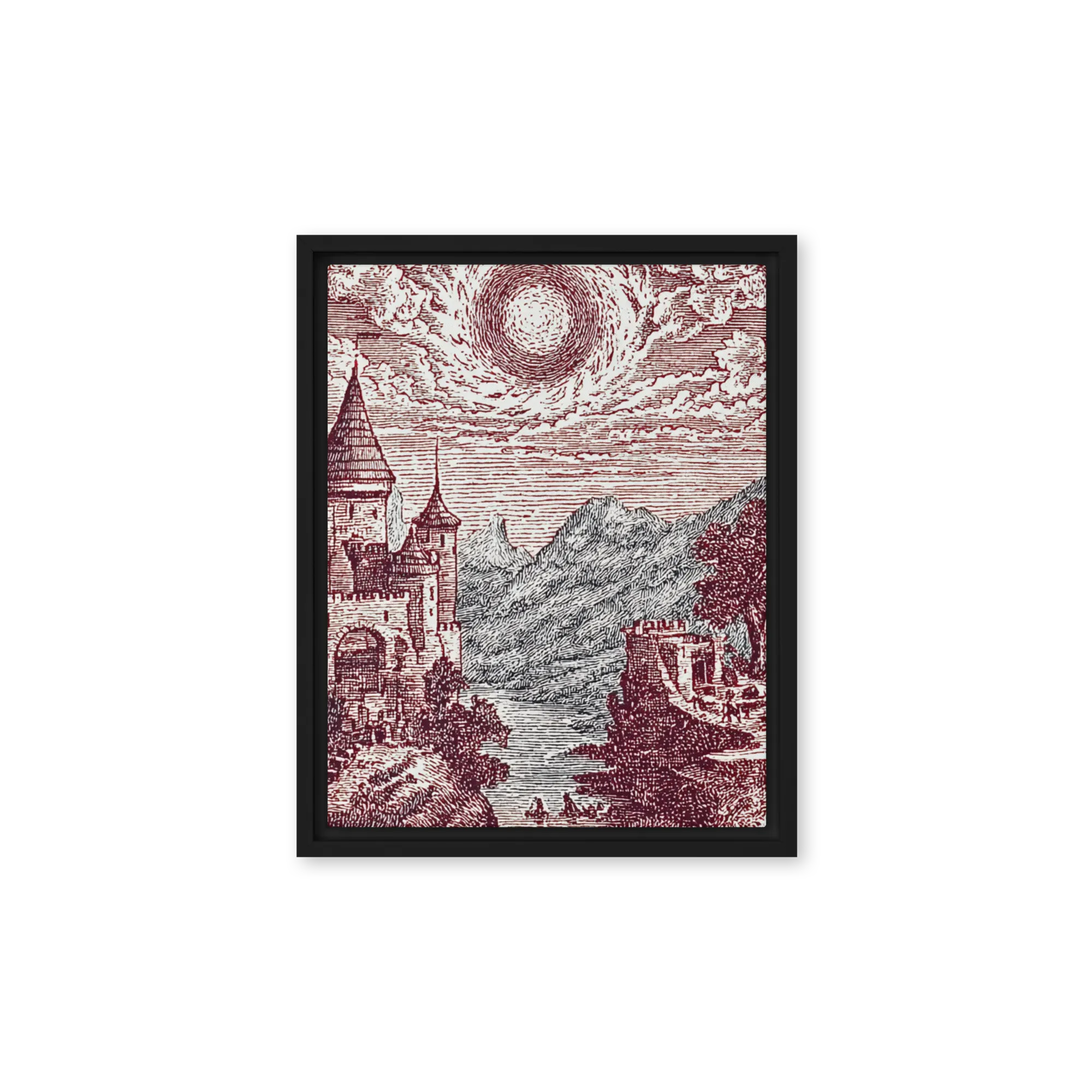
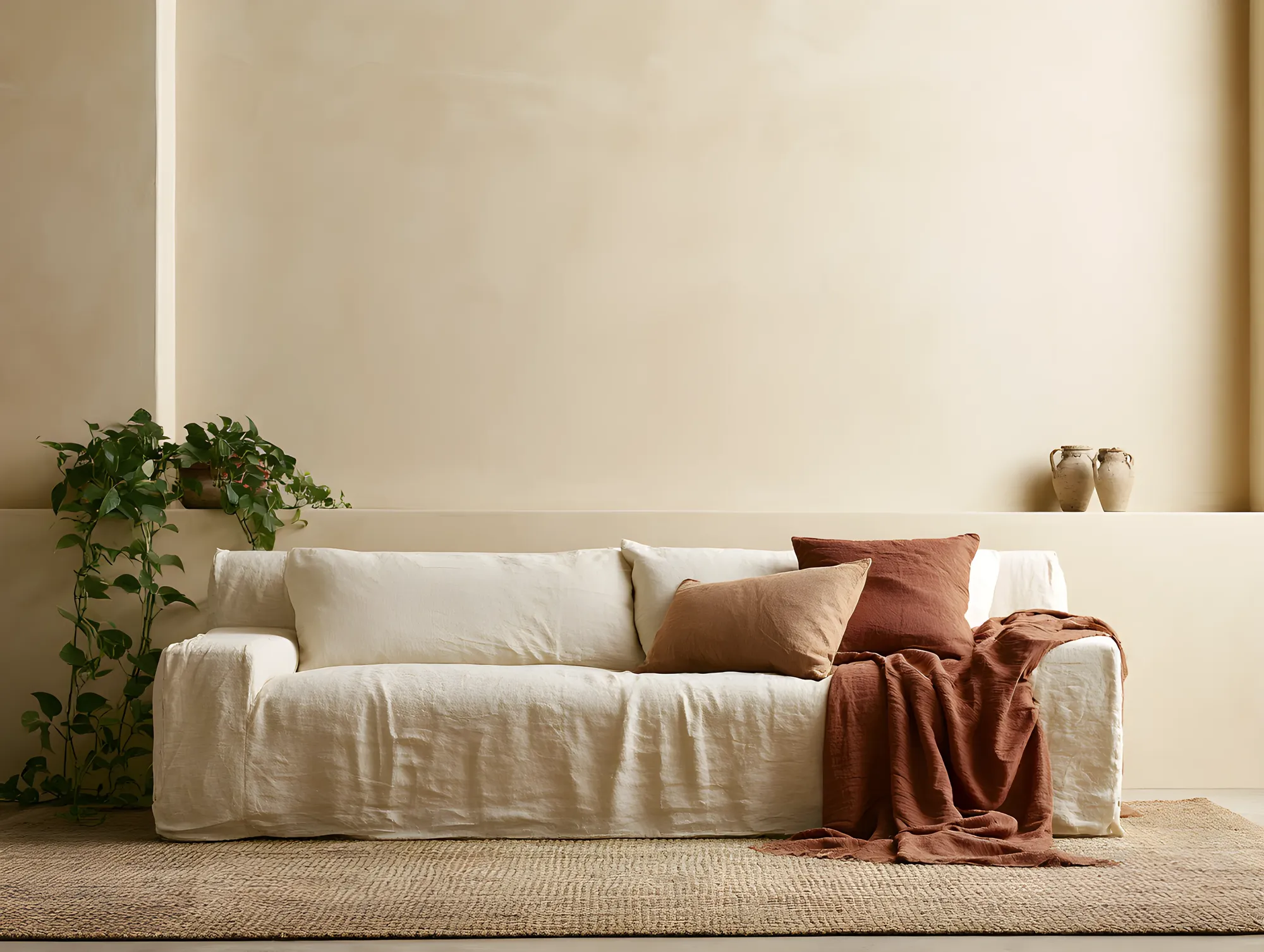
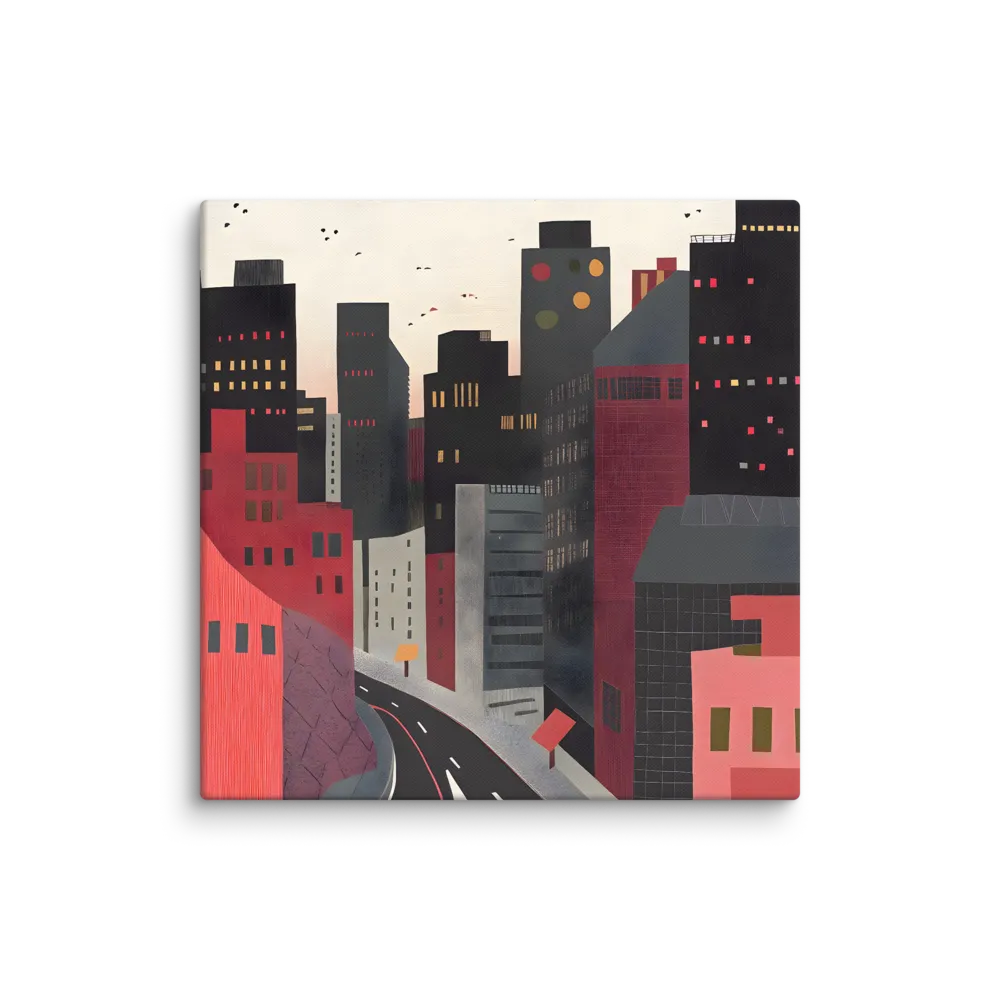
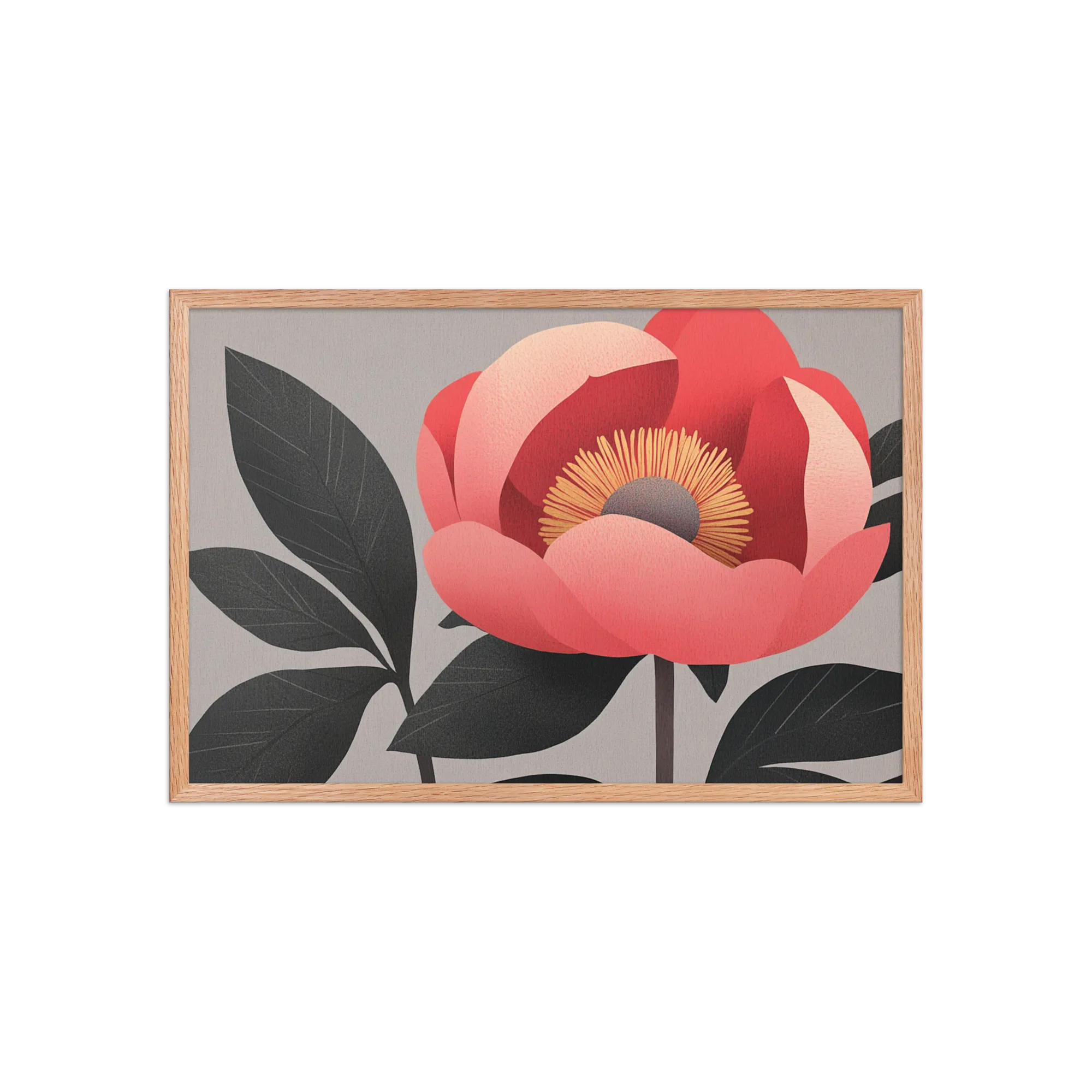
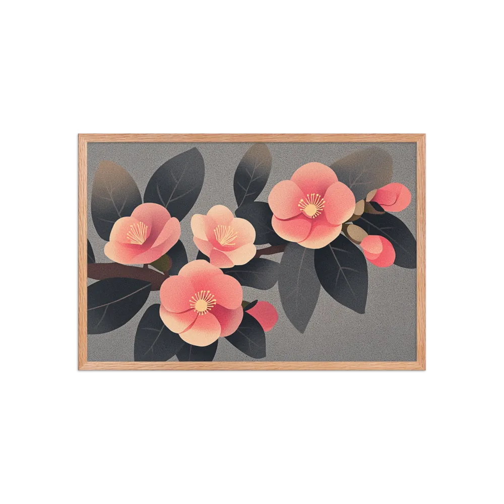
A lined-up row of red art prints mixes cubist terracotta with tactile crimson for a collected, lived-in look.
See Every PrintA lined-up row of red art prints mixes cubist terracotta with tactile crimson for a collected, lived-in look.
See Every PrintRed wall art is an accent, not a backdrop. One large piece above a sofa, or a tight pair flanking a fireplace, does more than five reds scattered across a wall. Confident reds — tomato, crimson, oxblood — read best against cream, charcoal, or warm wood.
If the room is already busy, pick a red wall art piece with a single subject (poppies, an abstract block, a calligraphic stroke) rather than dense pattern. Framed 16x20 or 18x24 prints suit dining and kitchen walls; a 24x36 oxblood canvas anchors a living-room sofa without shouting.
Red sits best against neutral grounds: cream, off-white, warm grey, charcoal, and natural oak. Black frames sharpen scarlet and crimson; brass or unfinished-wood frames soften rust and oxblood. Avoid pairing red art with strongly competing accents (mustard, electric blue) on the same wall — let the red lead.
Not if you size it right and limit it to one piece. A single 18x24 or 24x36 red print becomes the focal point and makes a small room feel intentional rather than busy. The mistake is scattering several small reds — that reads as visual noise. One confident piece on a neutral wall is the rule.
Aim for art roughly two-thirds the width of the table. For a 60-inch dining table that's a single 30-40 inch wide piece, or a balanced pair totalling that width. Hang the bottom of the frame 6-12 inches above the table so it reads as part of the setting, not floating in space.
It can, but lean toward deeper reds — oxblood, brick, dusty rose-red — rather than bright tomato or scarlet. Saturated red is stimulating and works against the calm a bedroom wants. A single deep-red abstract or a botanical study with red as one of several tones is a safer pick.

 By Palette
 Black & White
 Colorful
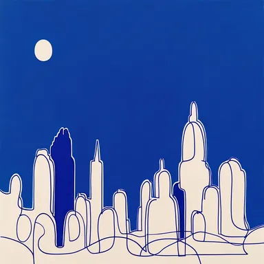 Feeling Blue
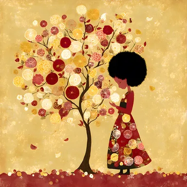 Golden Touch
 Purple Reign
 Burnt Orange
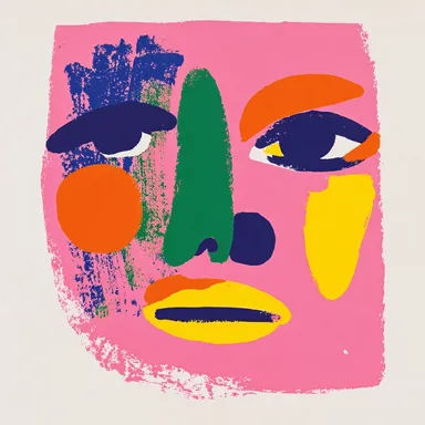 In the Pink
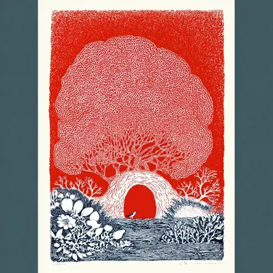 Seeing Red
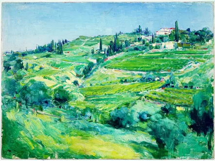 Evergreen
 Maps & City Lovers
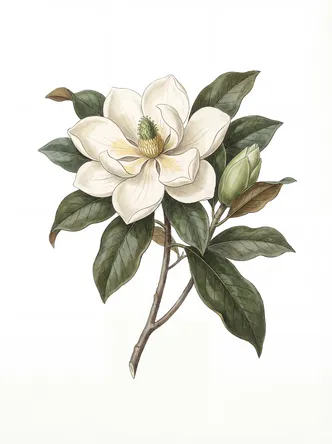 Landscape & Nature
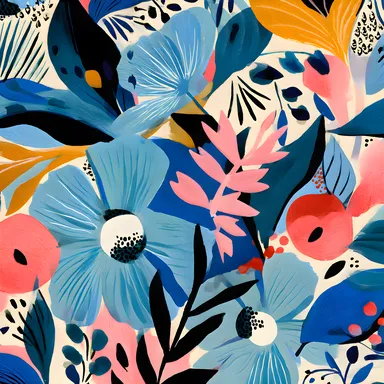 Botanical & Floral
 Figurative & Portraits
 Travel
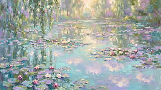 Vintage & Famous Art
 Photography
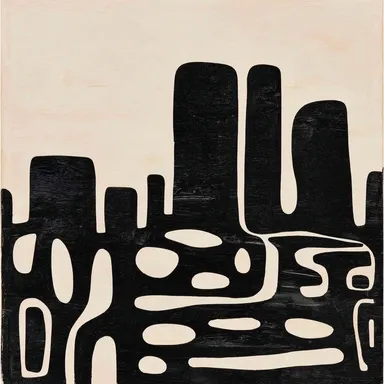 Abstract
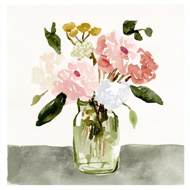 Watercolors
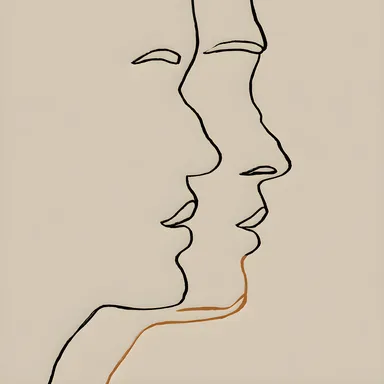 Line Art
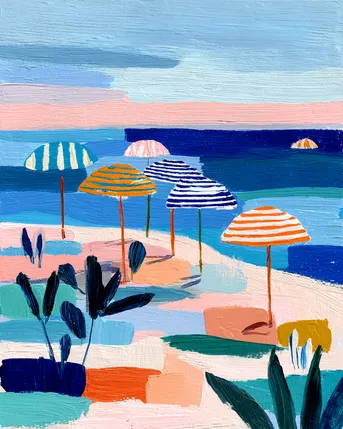 Pastels
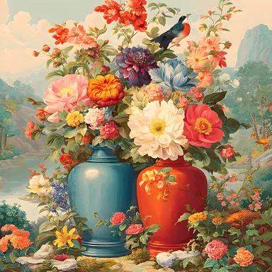 Vintage & Retro
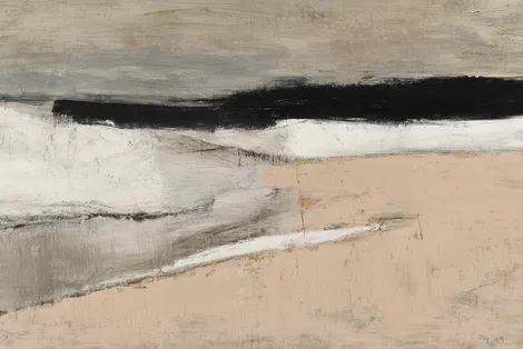 Minimalist
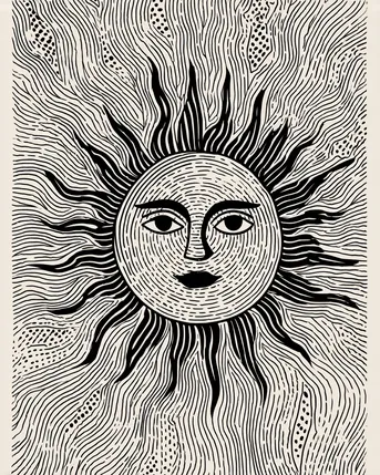 Block Prints & Linocuts
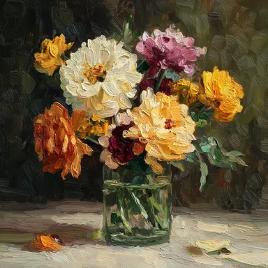 Impasto & Texture
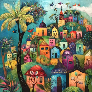 Folk & Naive
 By Room
 Living Room
 Bedroom
 In the Office
 Kitchen
 Nursery Room
 Children's Room
 In the Bathroom
 For Your Business
 By Colour
 Botanical & Floral
 Maps & Cities
 Line Art & Figures
 Minimalist & Modern
 Vintage & Retro
 Floral & Botanical
 Cats & Animals
 Abstract & Geometric
 Botanical
 Four-Legged Friends
 Landscapes
 Photography
 Pop Art & Bold Graphics
 Art Nouveau
 The Impressionists
 Monochromes
 Dinosaurs