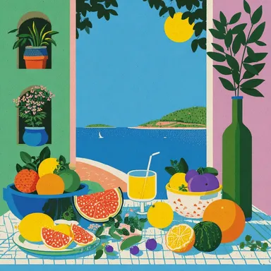
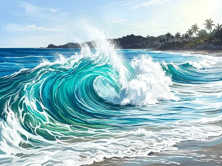
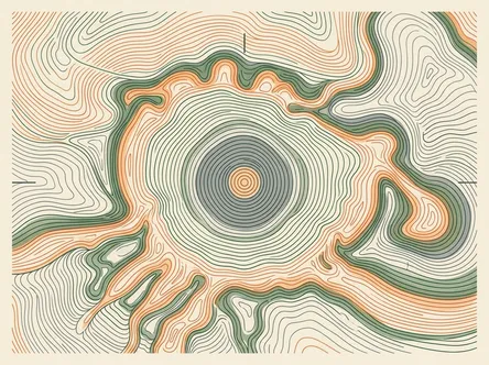
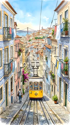
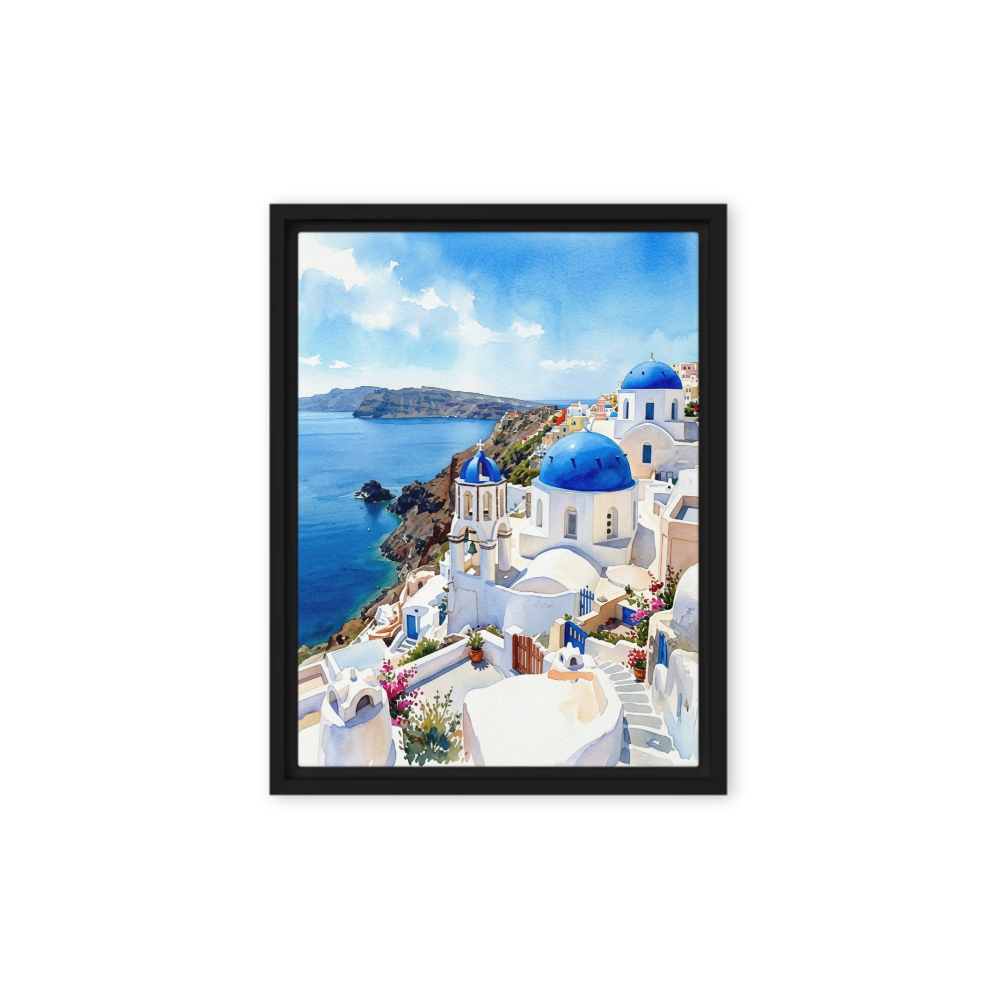
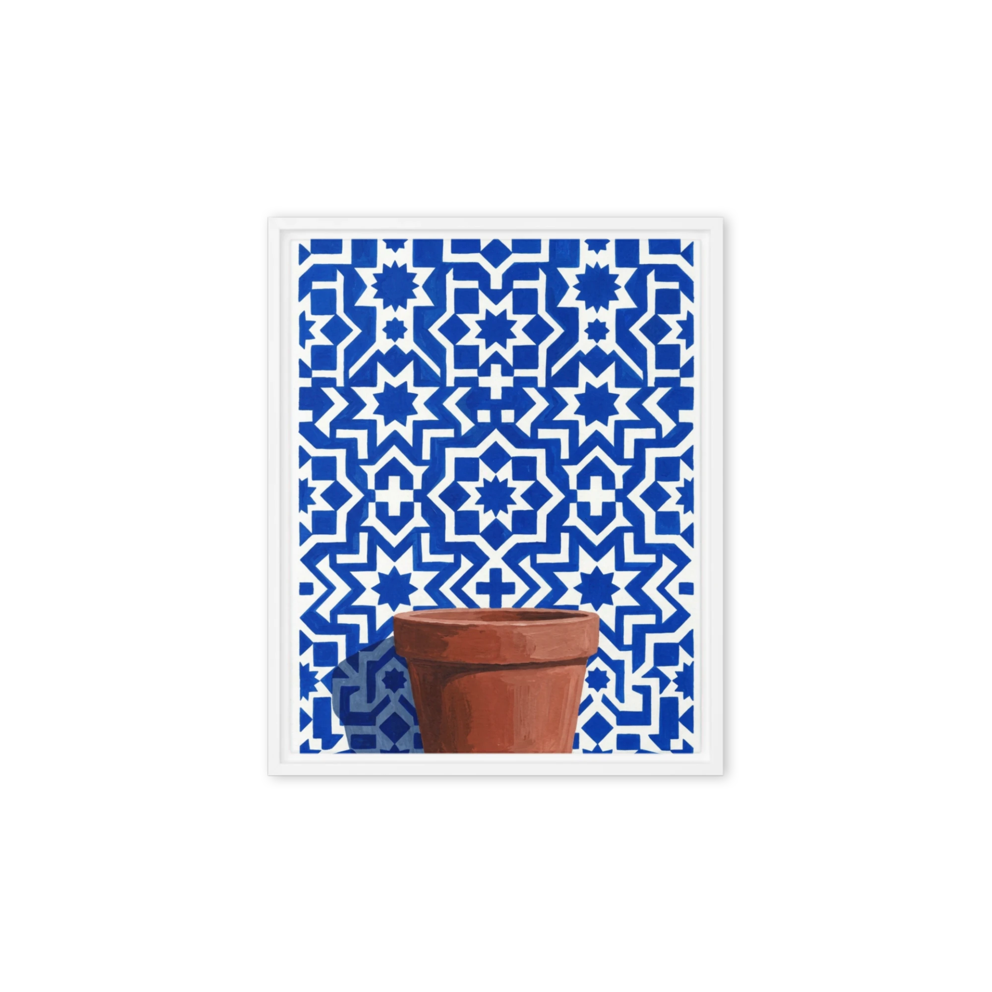
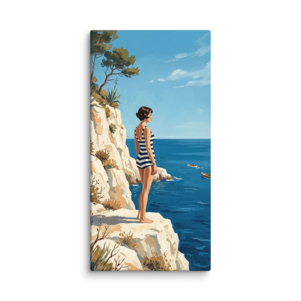
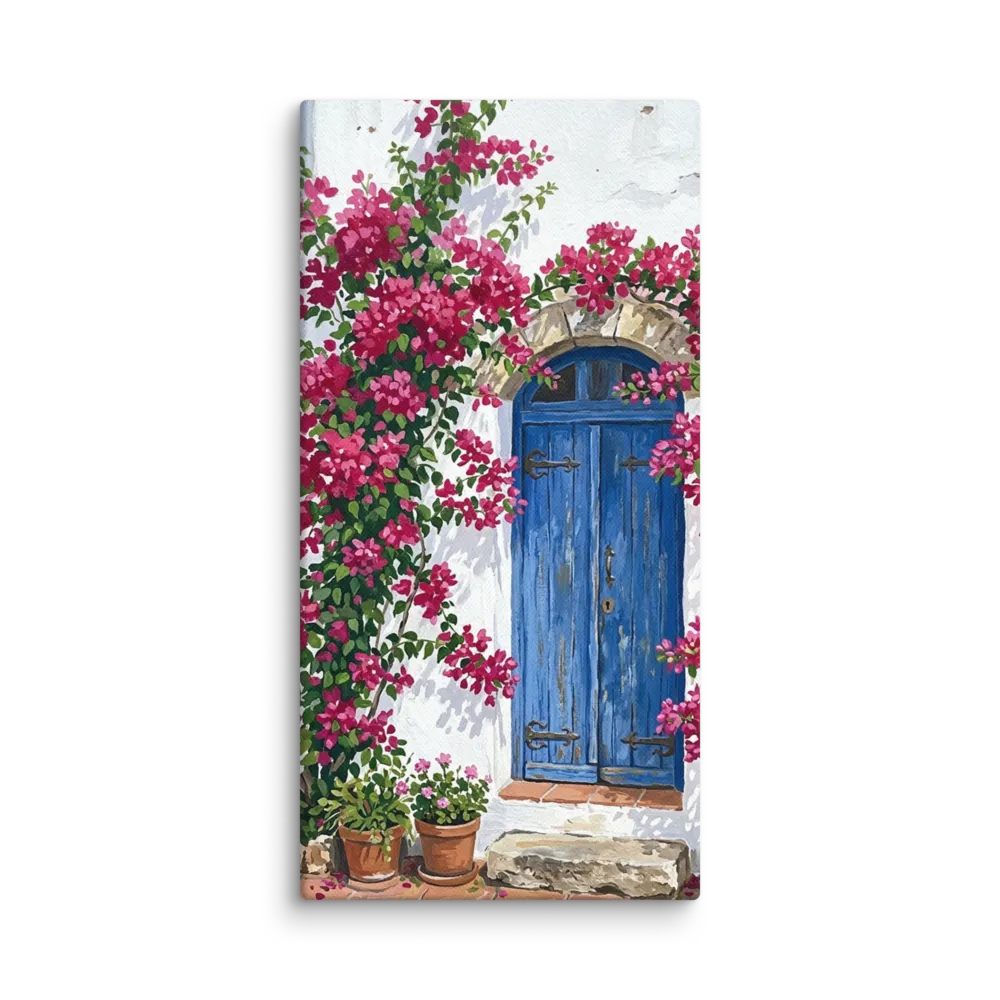
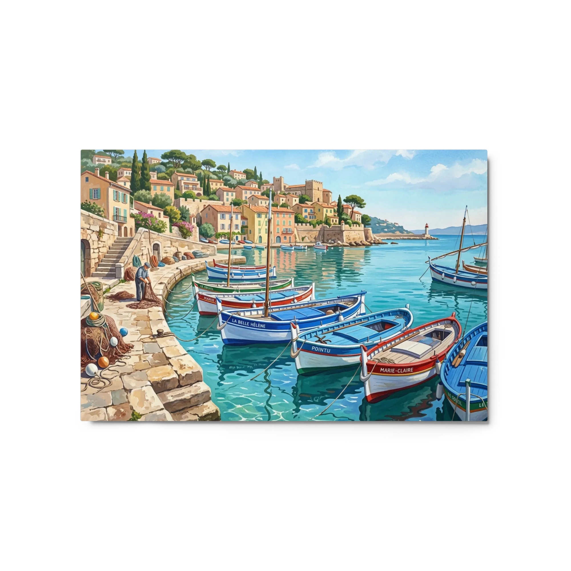
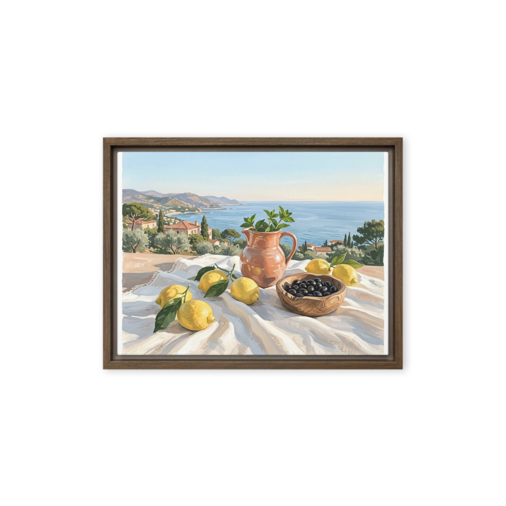
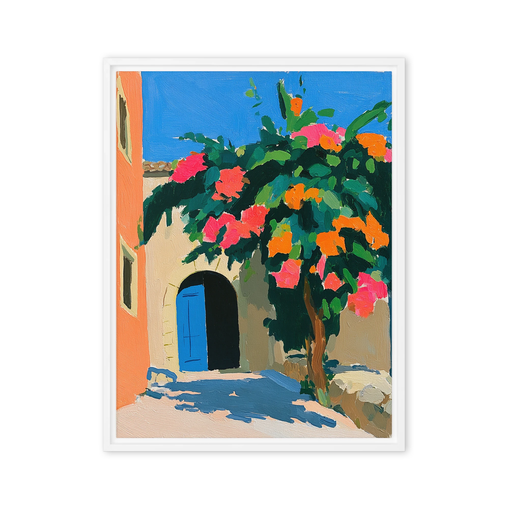
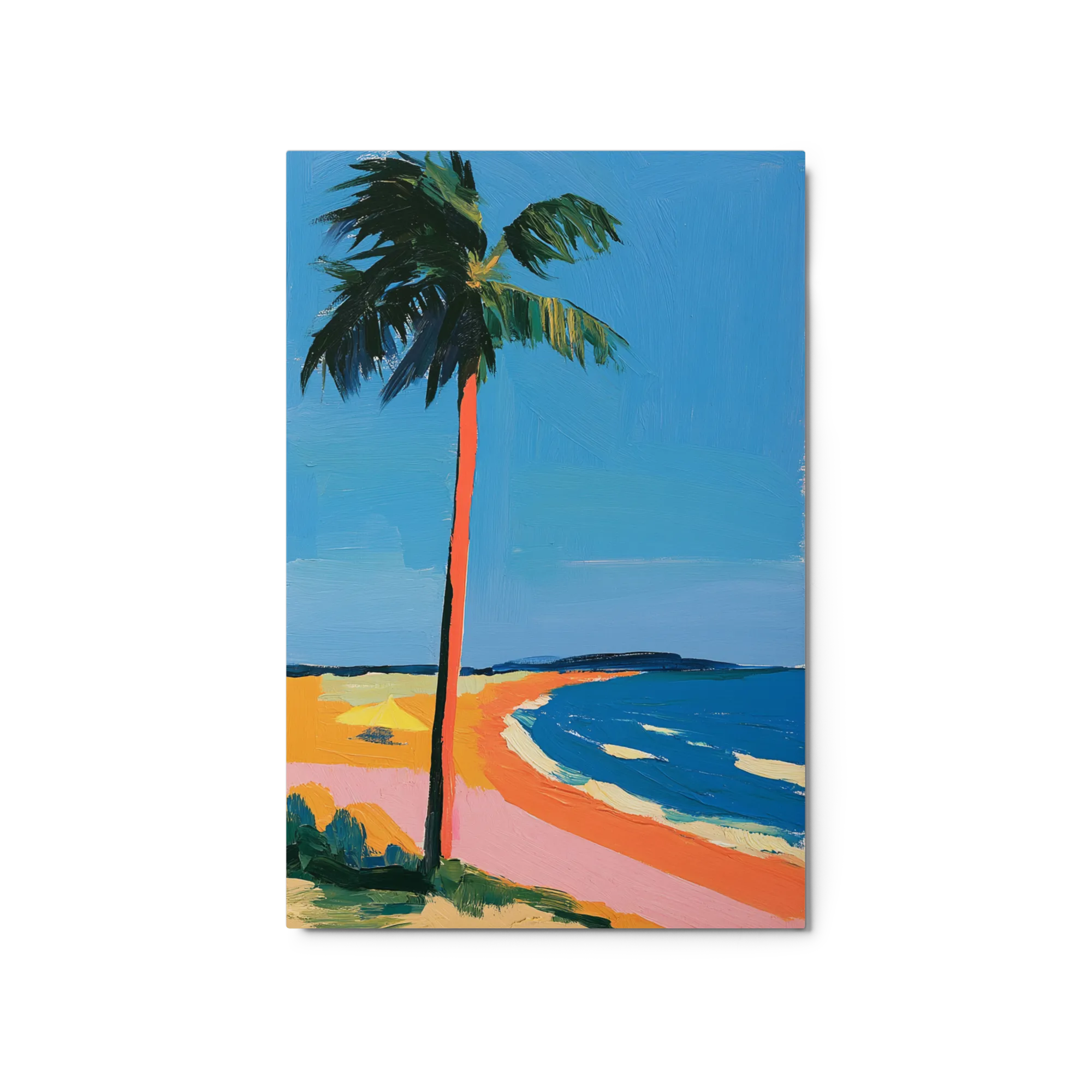
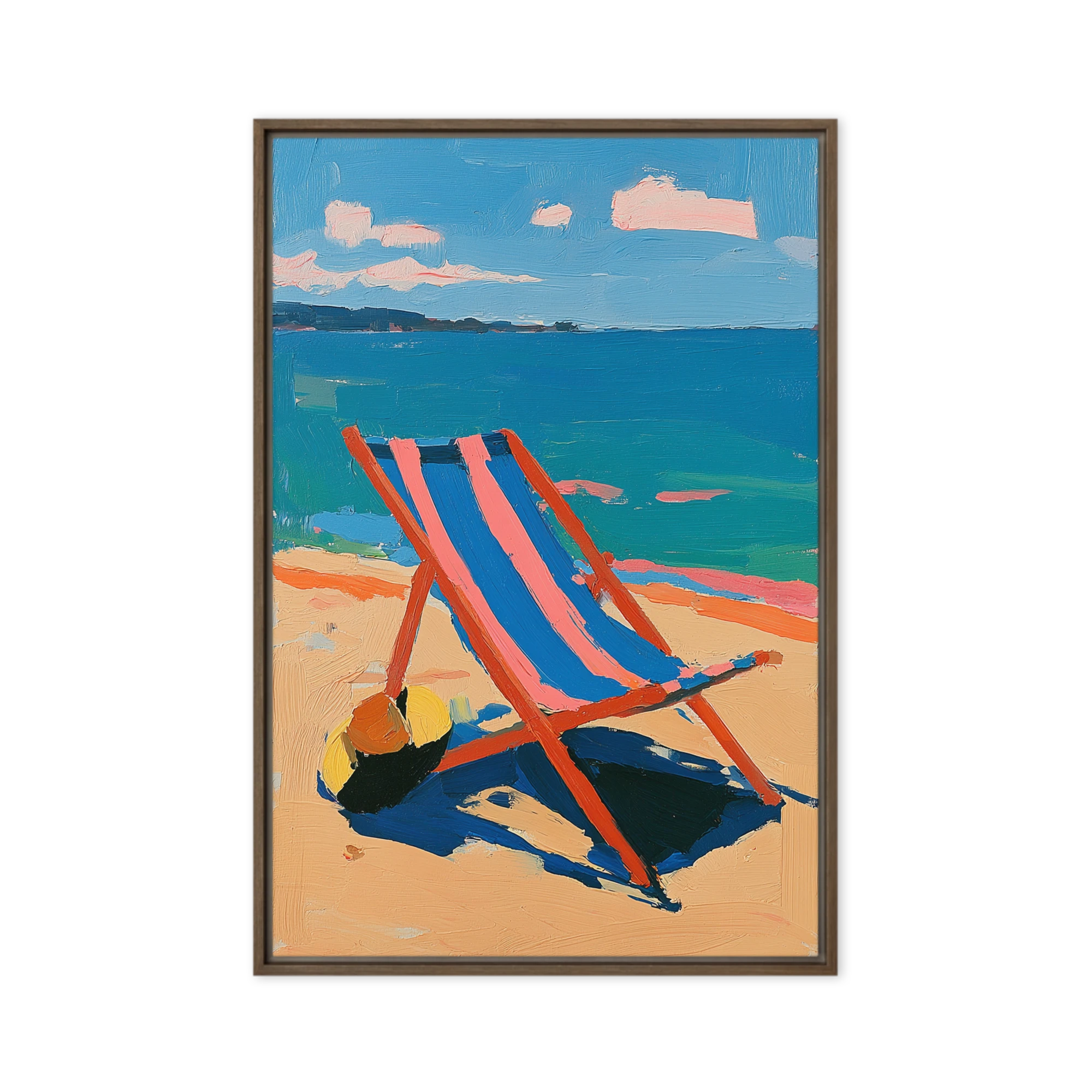
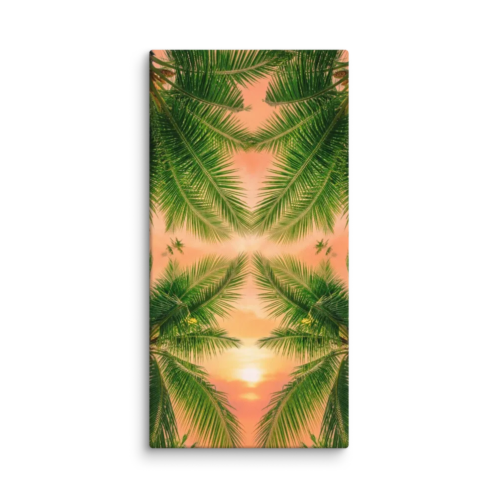
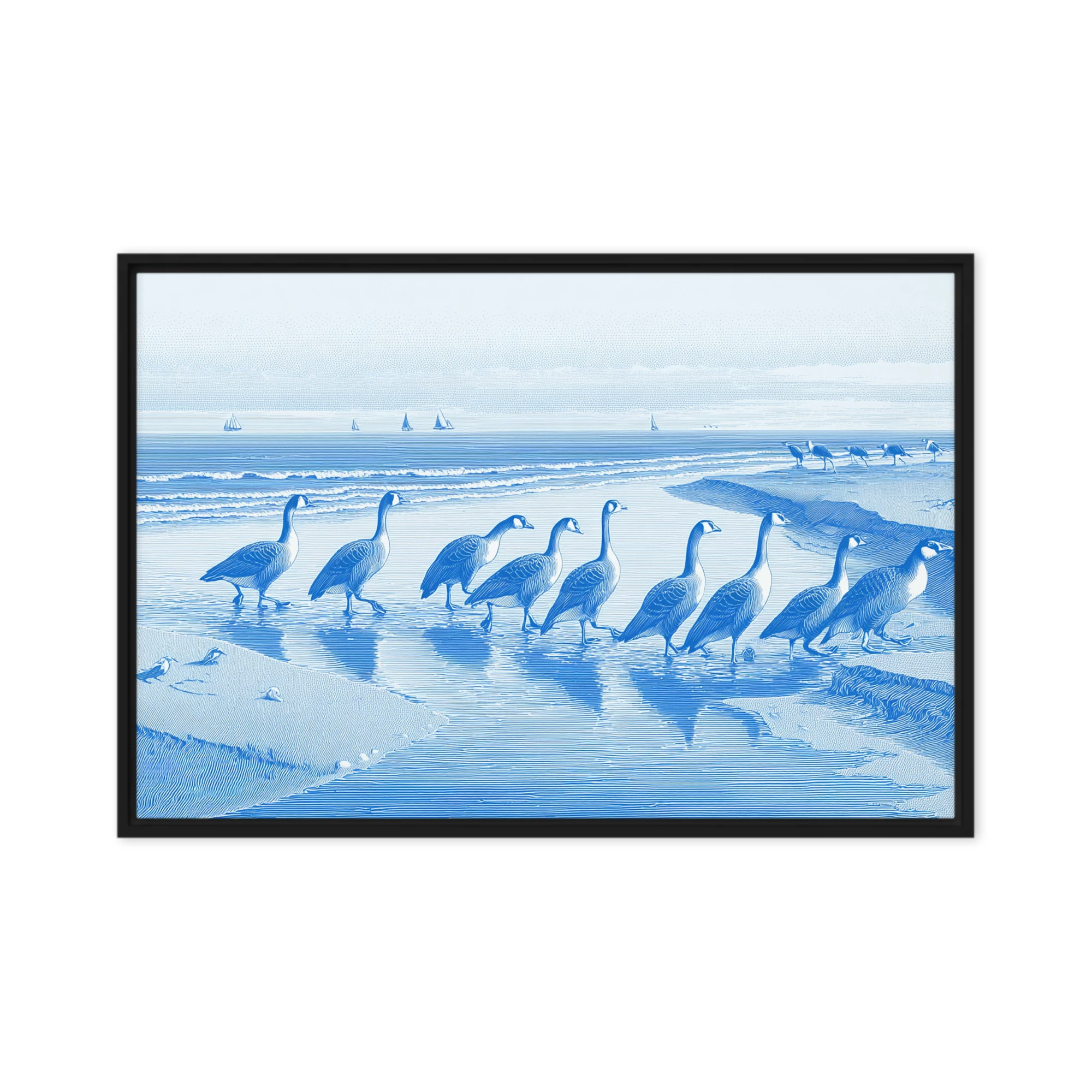
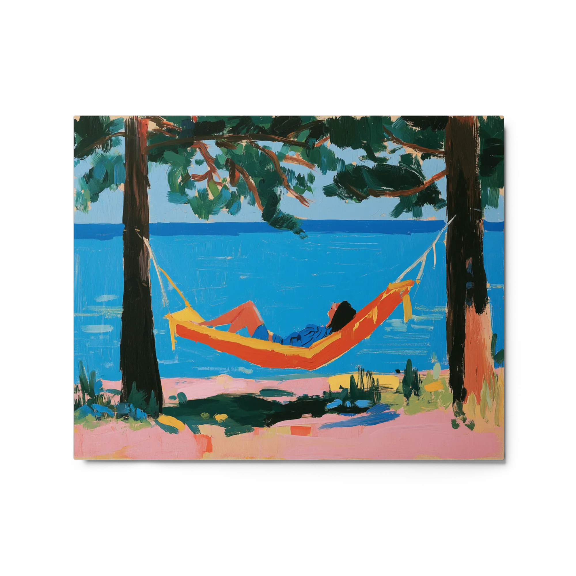
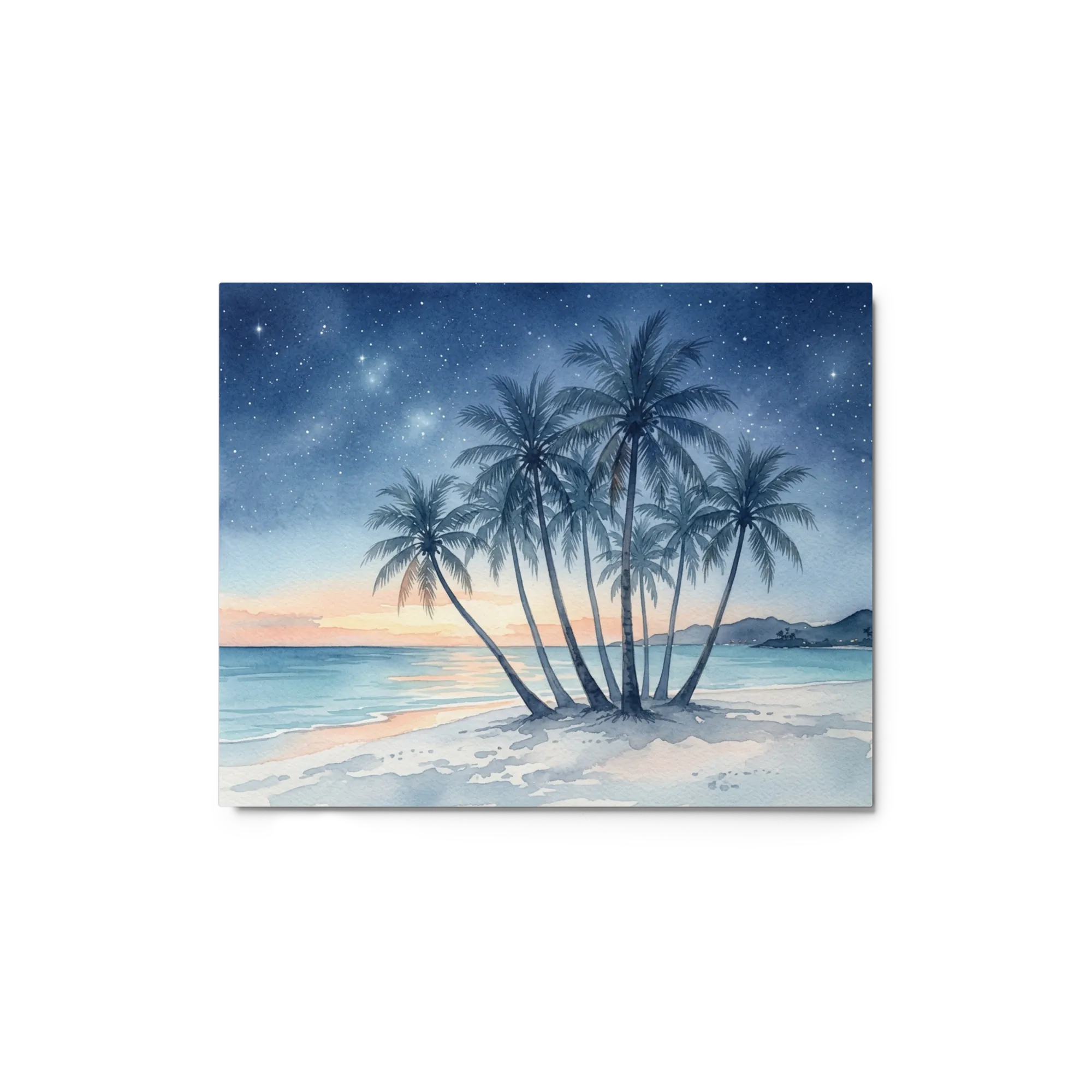
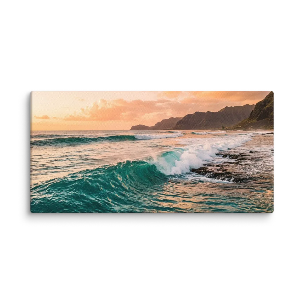
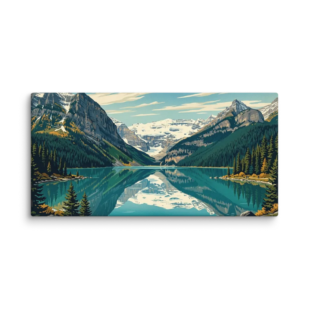
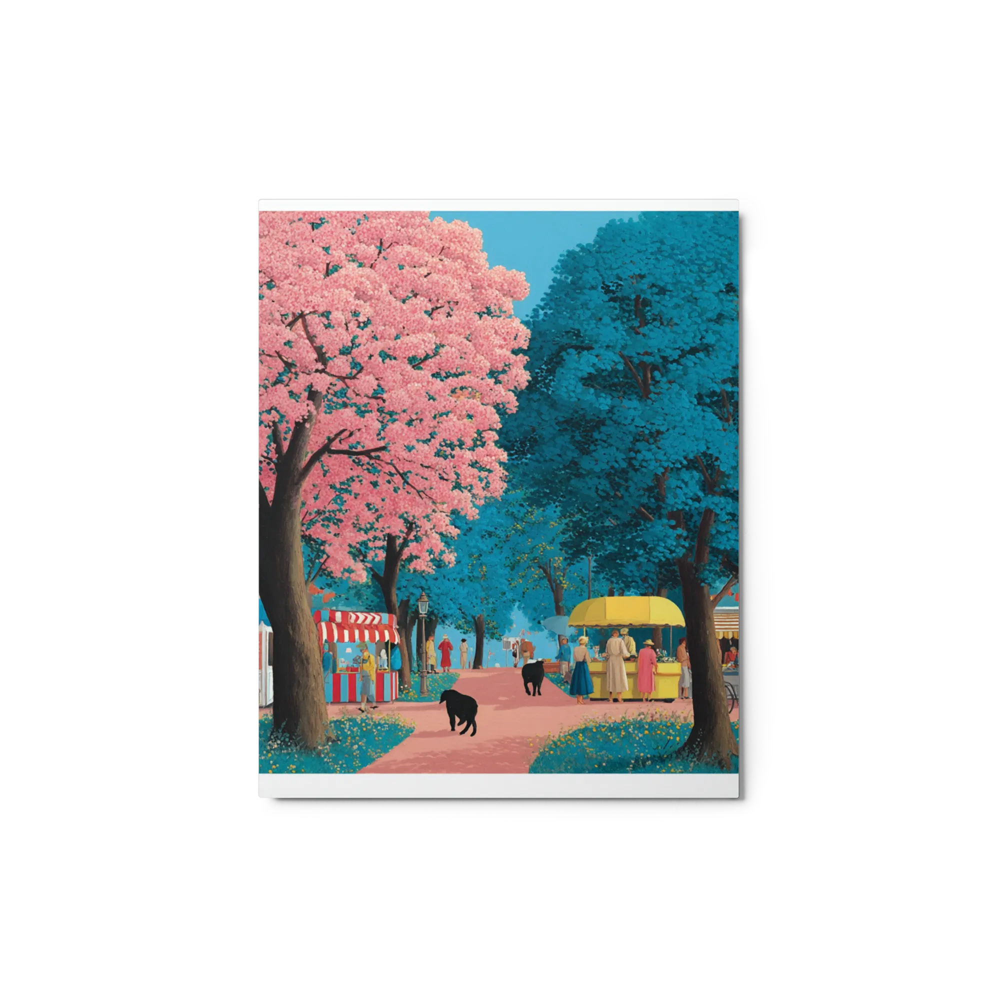
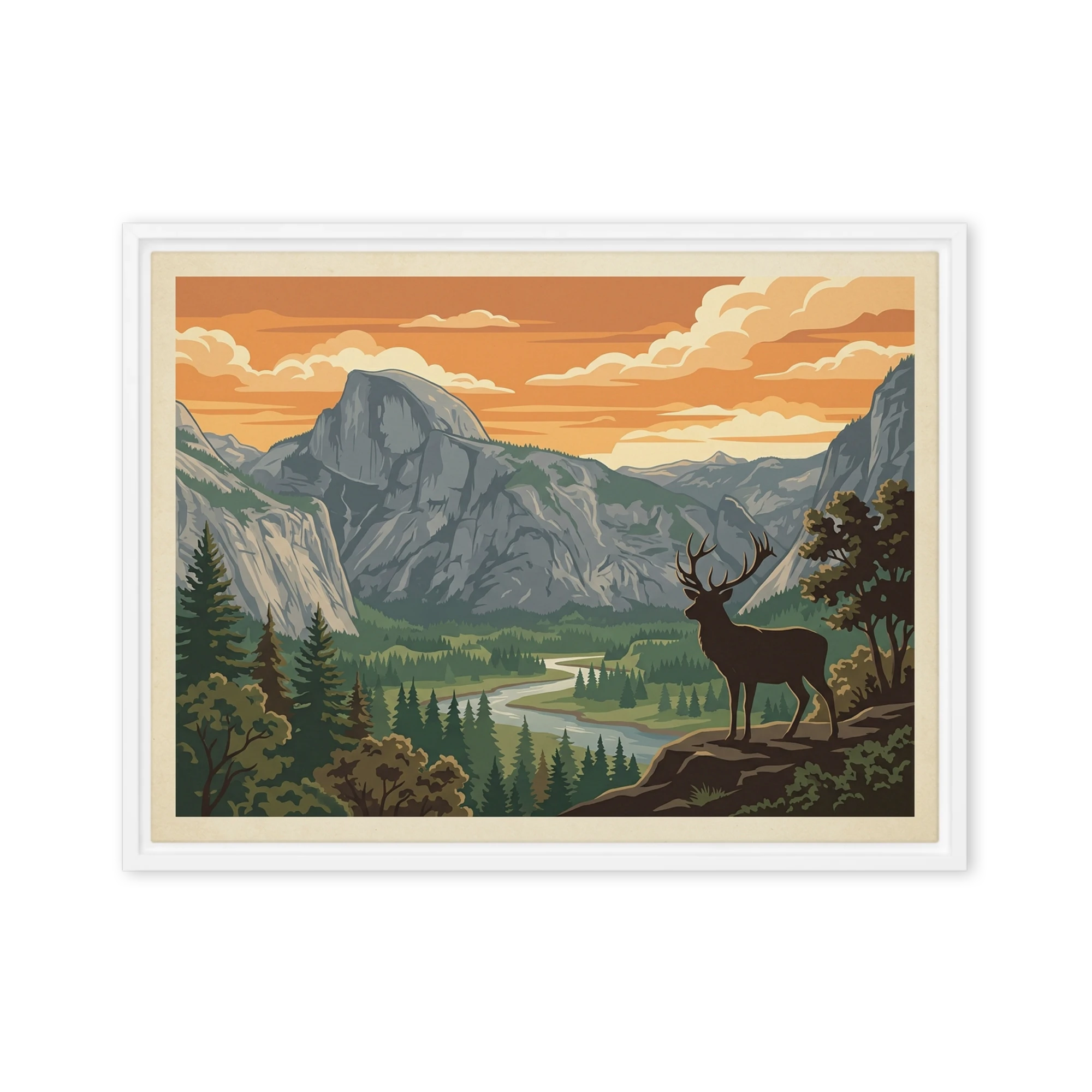
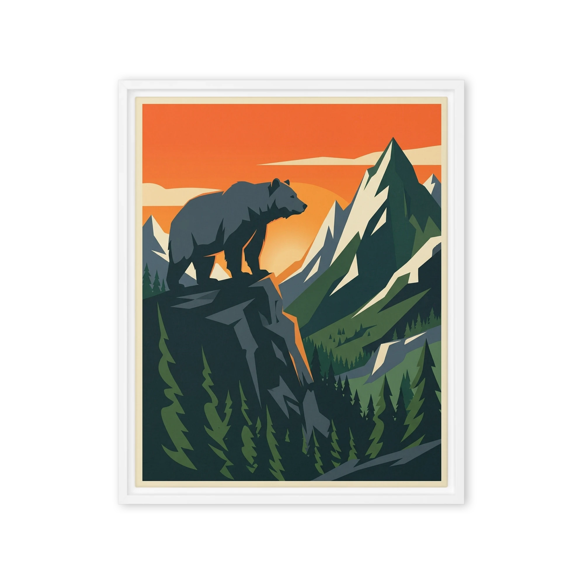
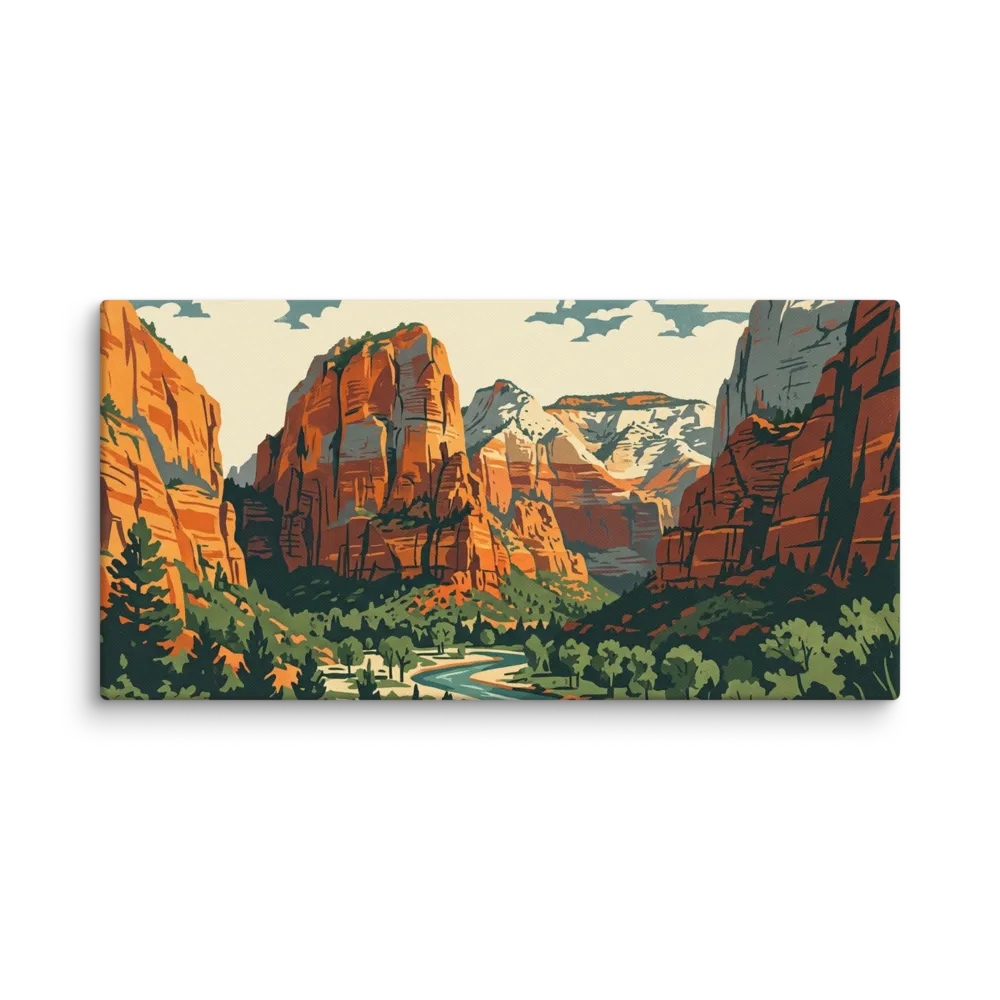
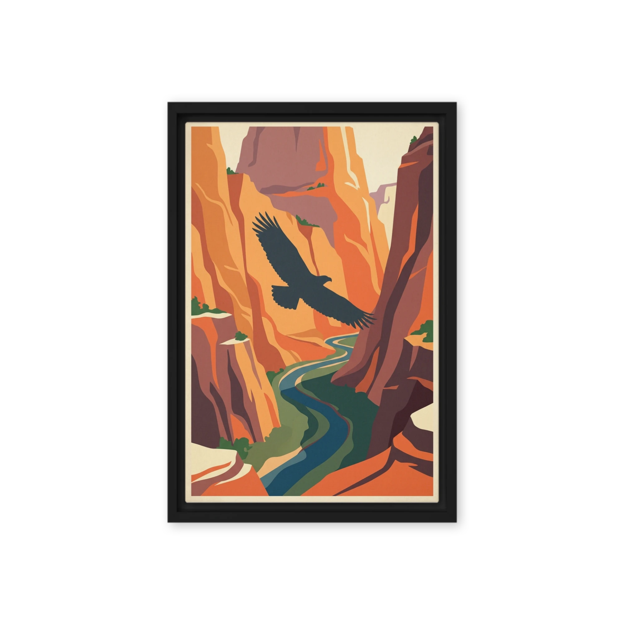
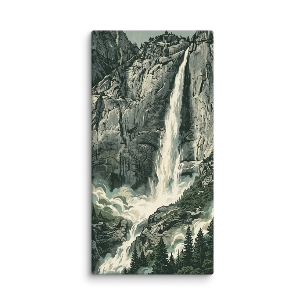
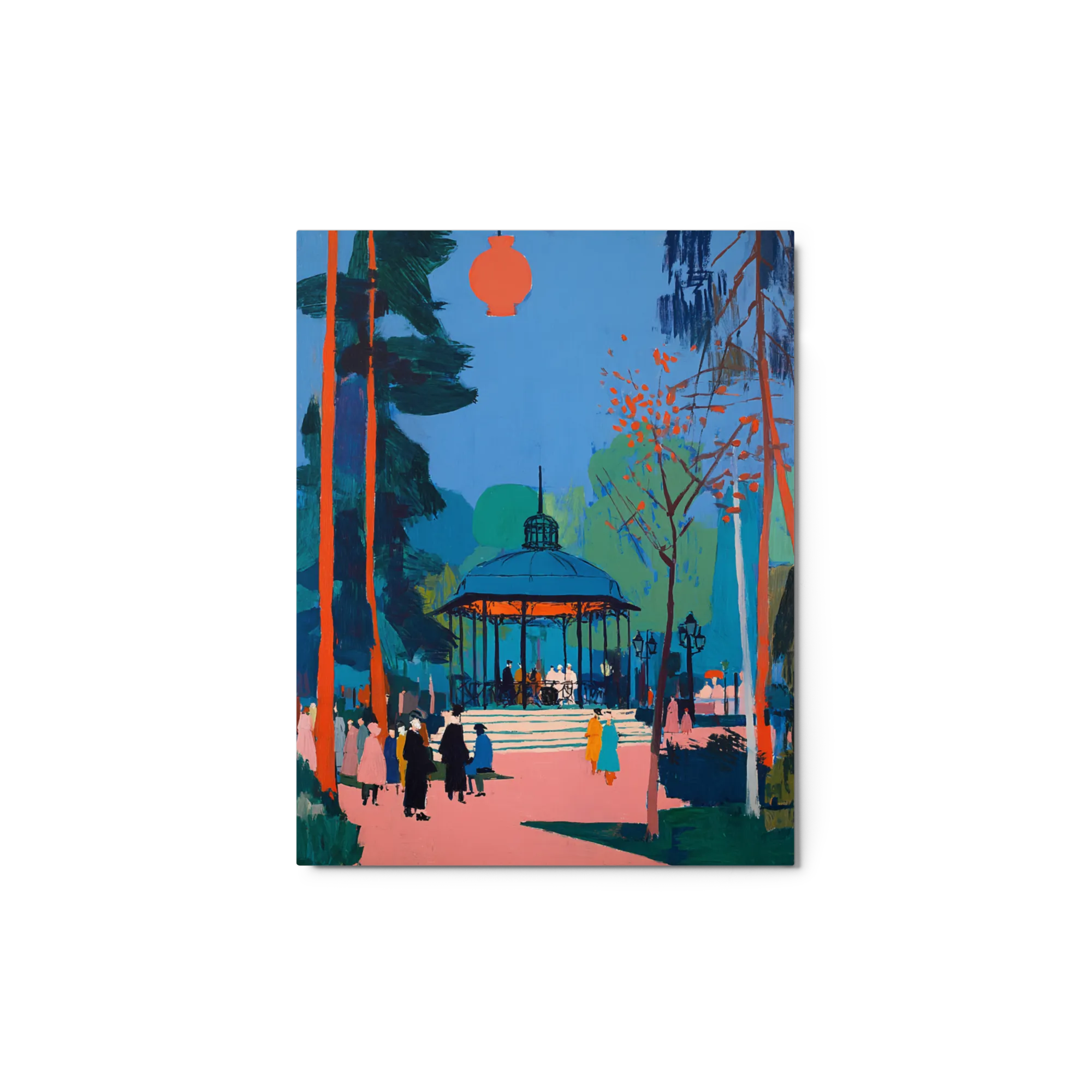
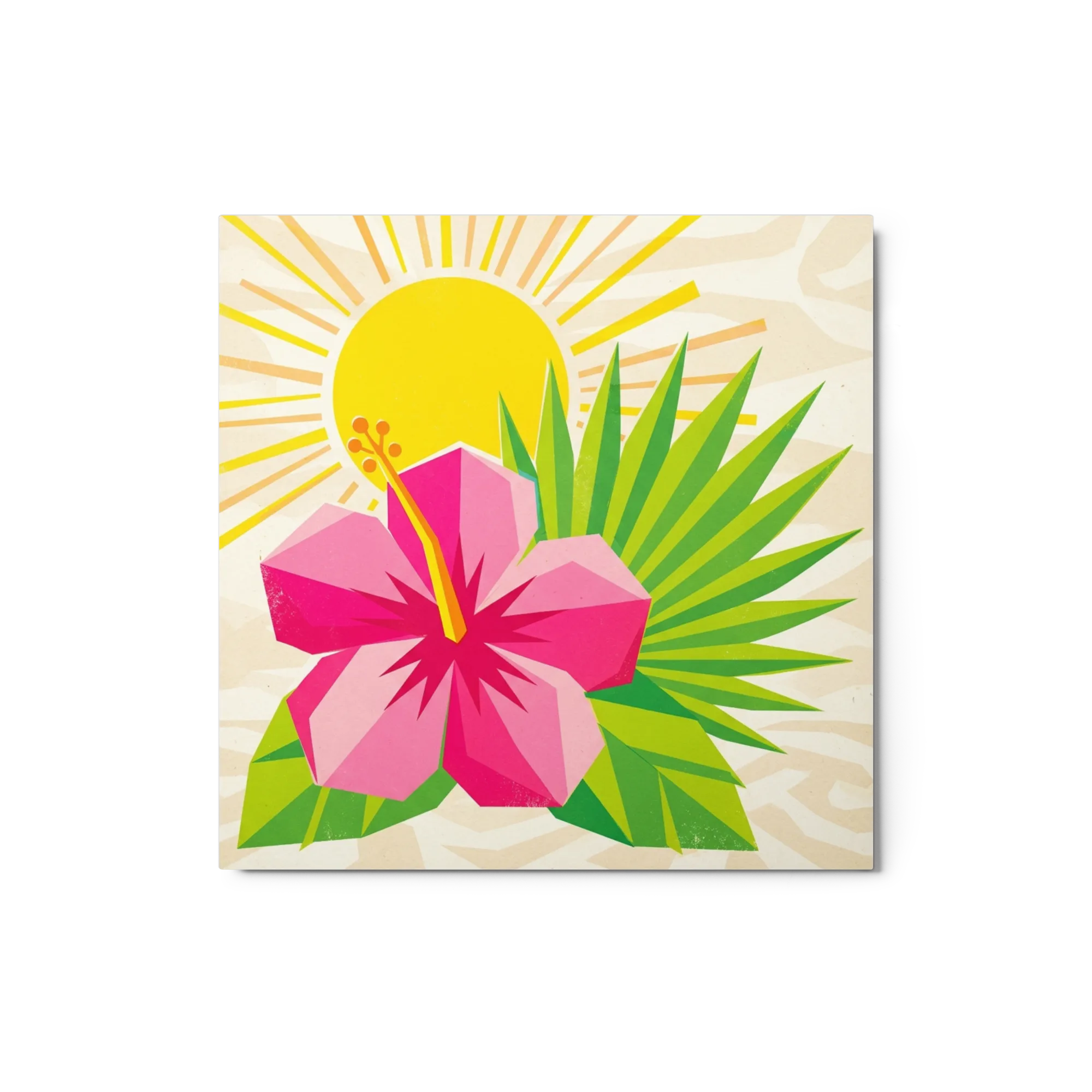
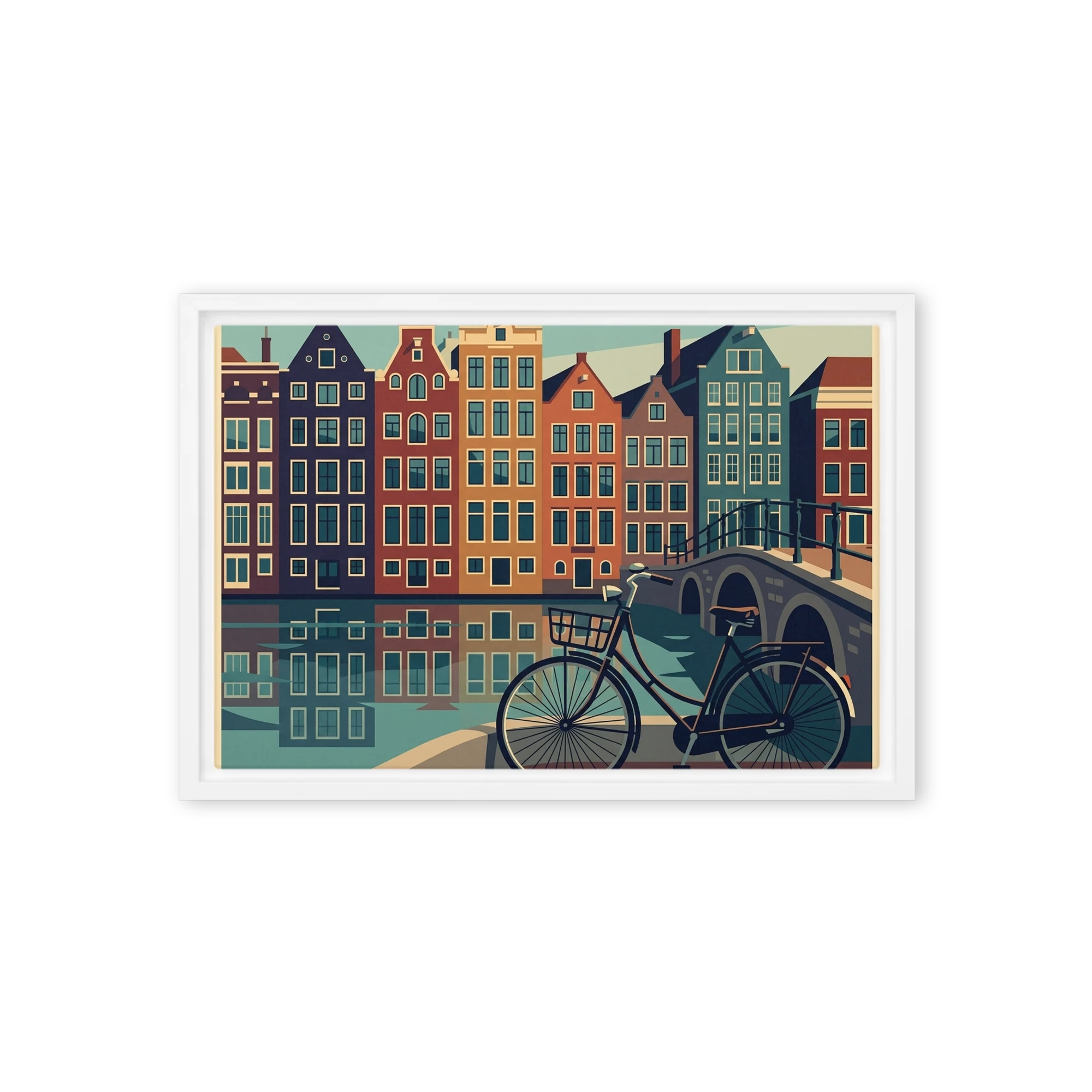
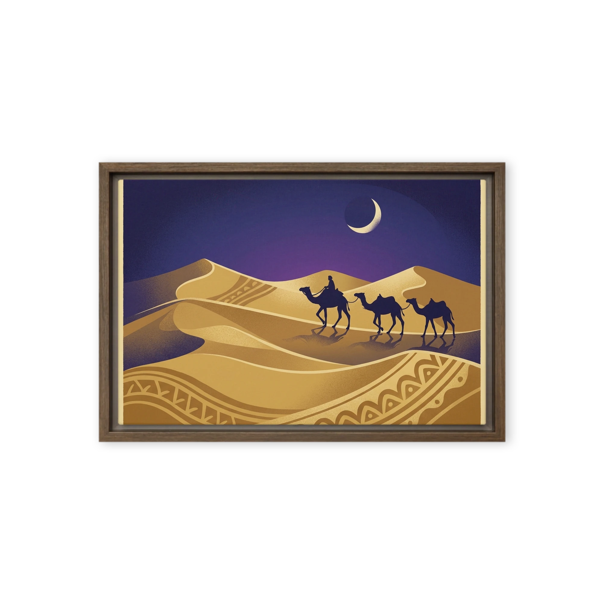
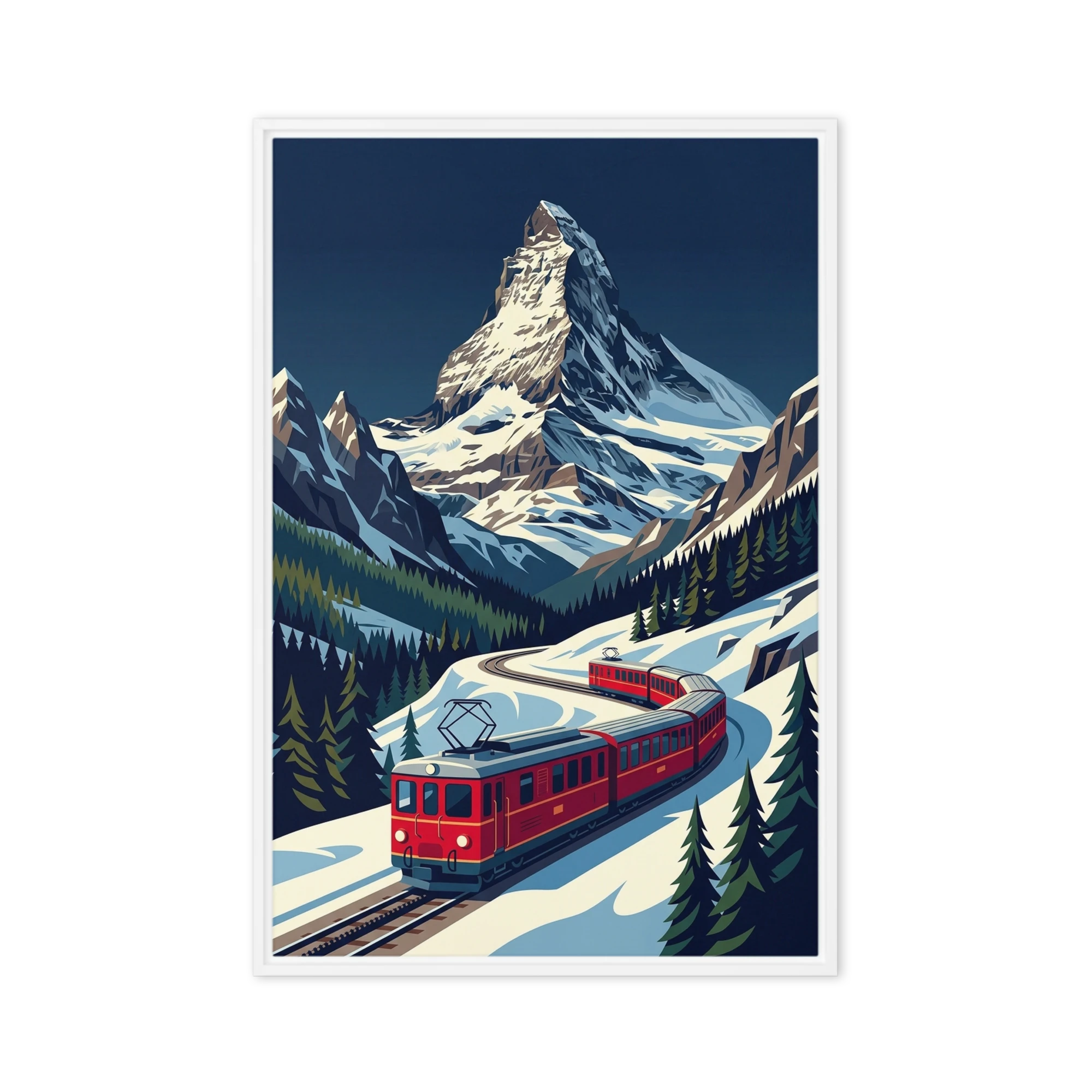
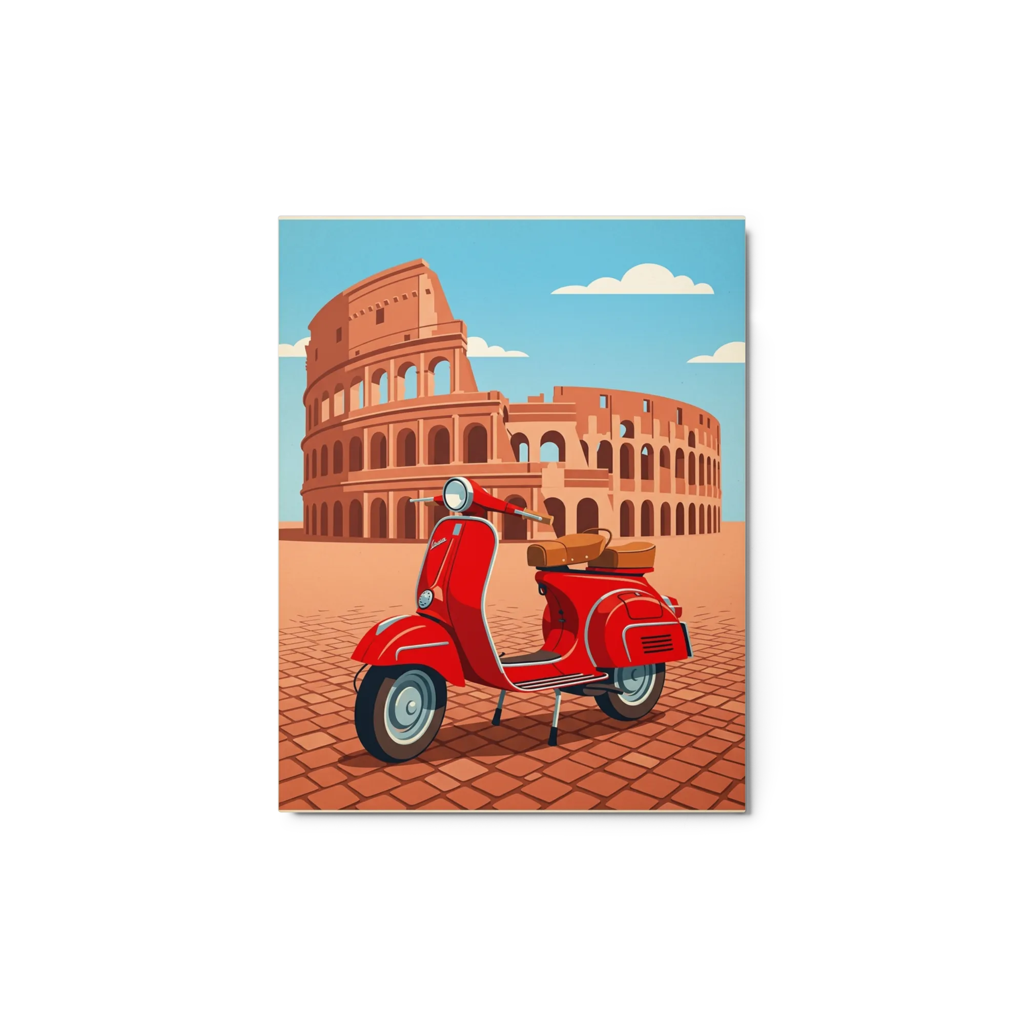
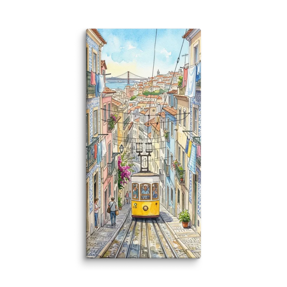
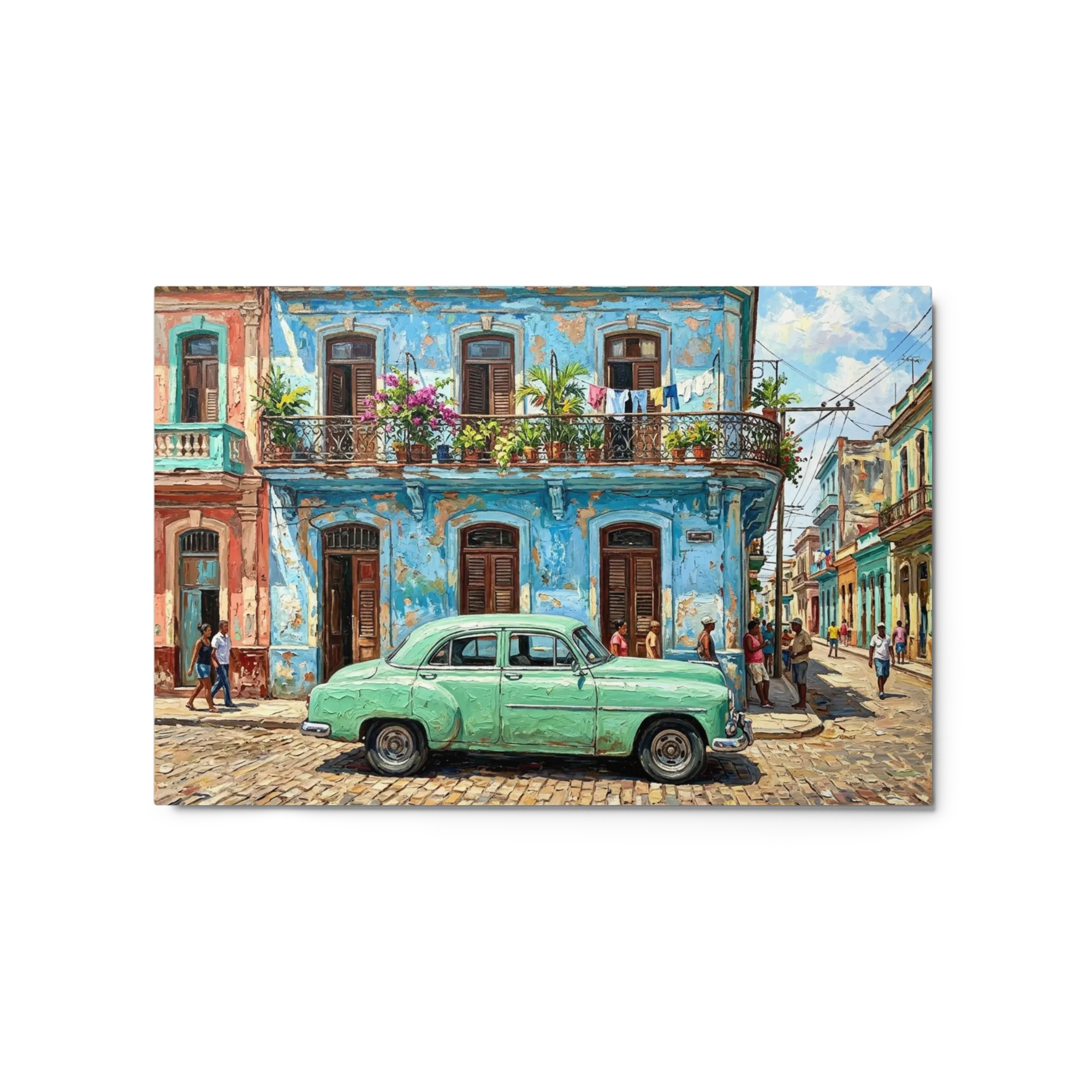
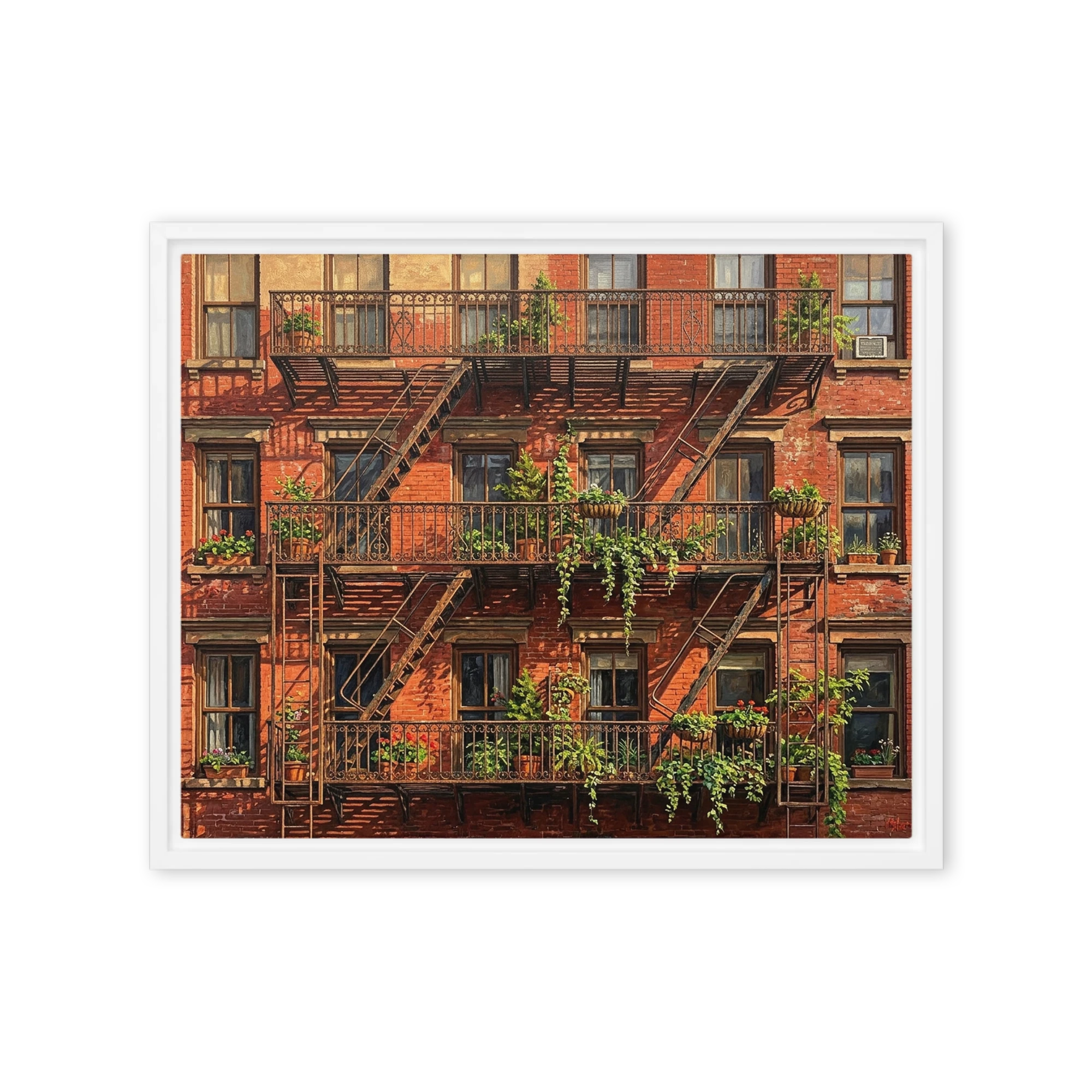
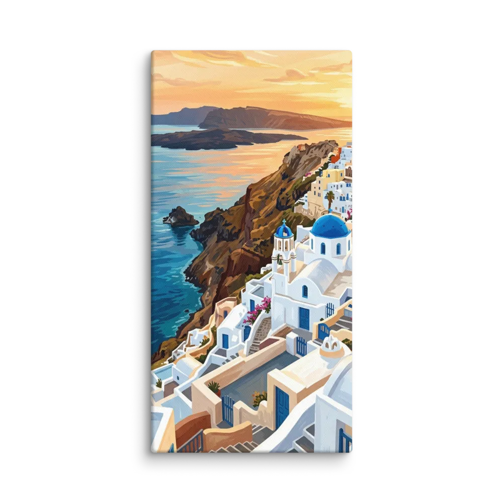
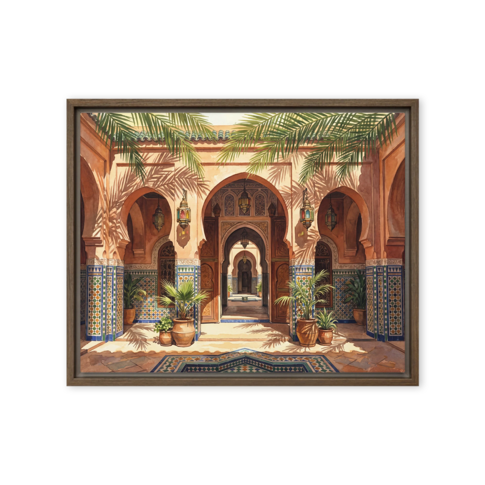
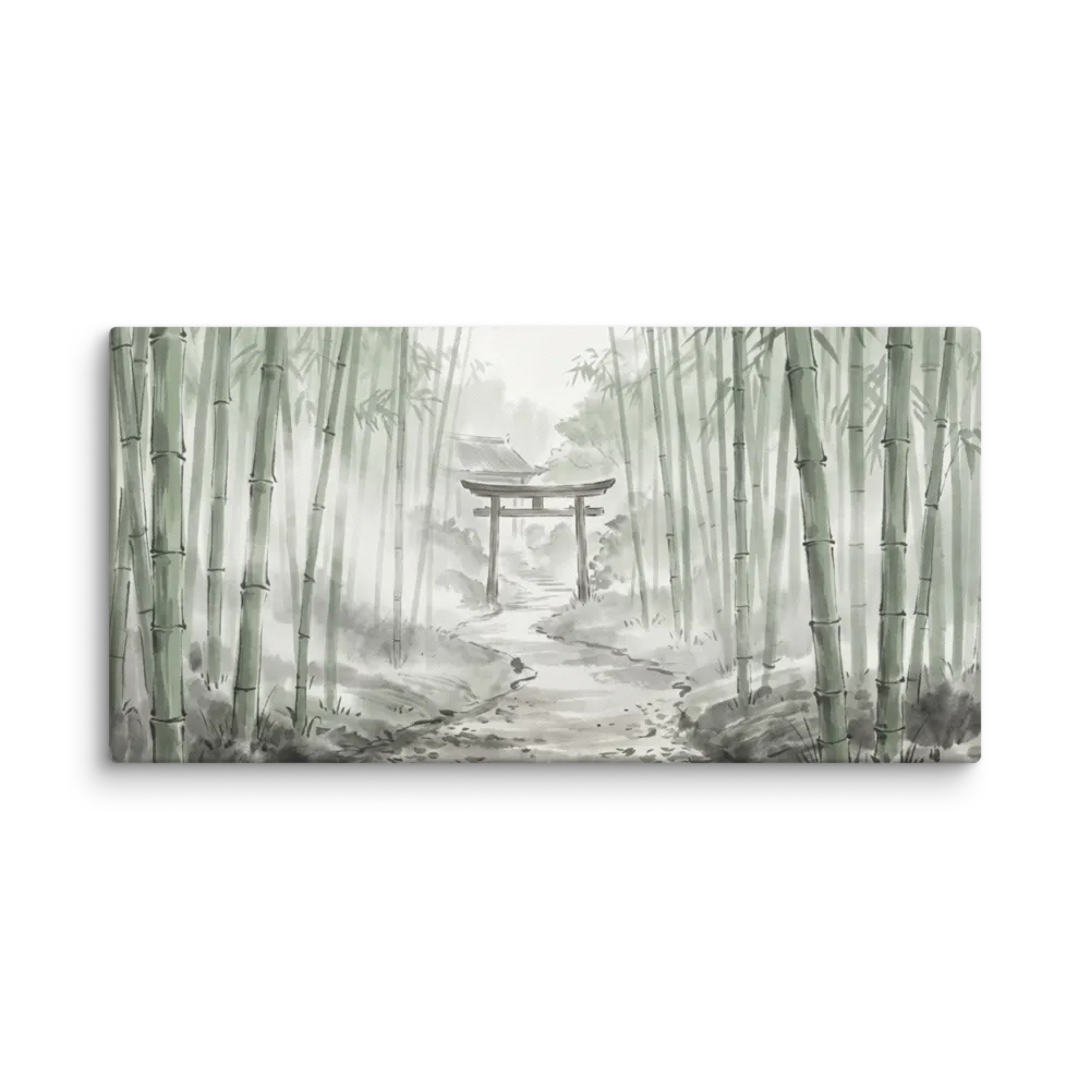
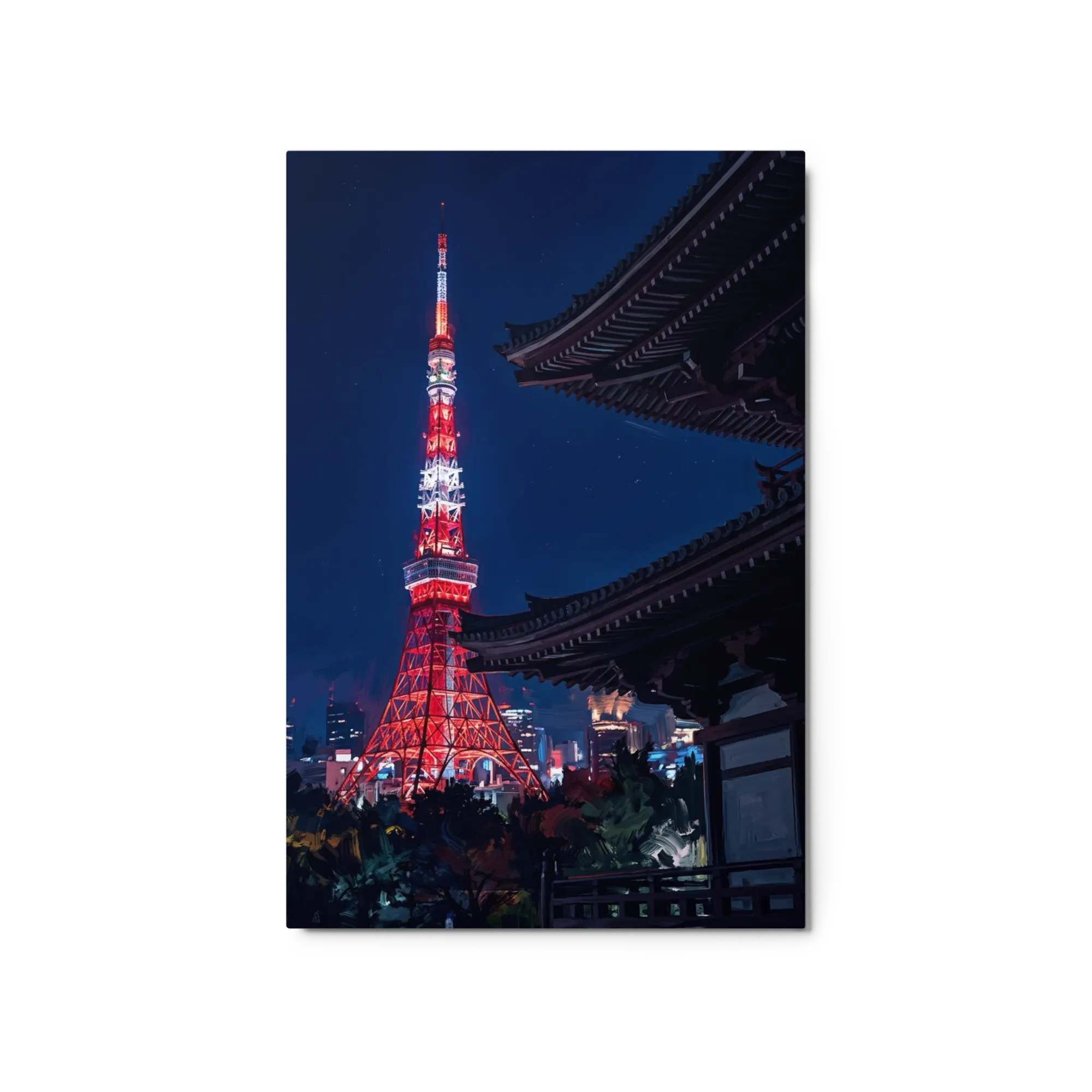
Travel wall art ranges from vintage 1920s-60s tourism-poster pastiche (Paris, Tokyo, Amalfi, national parks) to softer painted destination scenes, photographic coastal places, and tropical-destination illustrations. The signature is place-anchoring — viewers should recognise the city, park, or coast on sight.
For a single anchor piece, a 24x36 vintage travel poster above a sideboard, in a hallway, or above a sofa carries the wall. For travel-enthusiast homes, a gallery wall of four to six 11x14 or 12x16 vintage travel-poster pastiches in matching oak frames reads collector. Stay genuinely period-correct on vintage posters.
Most vintage travel posters sold today are reproductions or modern pastiche of the original 1920s-60s tourism posters — the originals are collectors' items in the hundreds-to-thousands of dollars. Quality reproductions preserve the period palette and slight halftone. Modern pastiche extends the style to destinations the originals never covered.
A balanced sequence of three or four 11x14 or 12x16 travel-poster prints in matching slim black or oak frames, evenly spaced along the hallway, reads as a journey rather than a single declaration. Hang the centre of each piece at 57-60 inches from the floor. Single larger pieces suit shorter hallway walls or a stair landing.
Either approach works — places visited add a personal story; places you want to visit make the wall aspirational. The pitfall is treating travel wall art as a passport stamp wall, which feels like a brag. A small sequence of three to four destinations you genuinely connect with reads warmer than a wall of every place.
Loosely yes. Vintage-poster pastiche in warm cream, ochre, and faded teal sits with most interiors, but if your room is strongly cool-toned (charcoal, navy, cool grey), pick travel posters with cooler palettes (Alpine, coastal Nordic, mountain-park). Mismatched palettes read as art floating against the wall.

 Star Map
 Pet Portrait
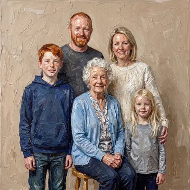 Portraits
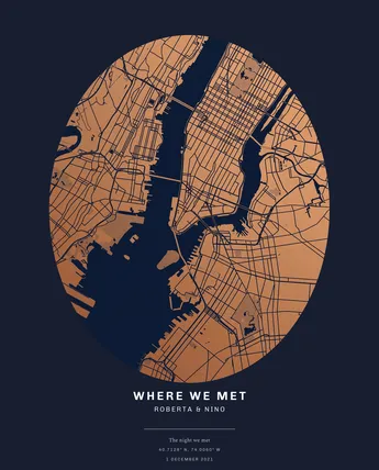 Maps
Maps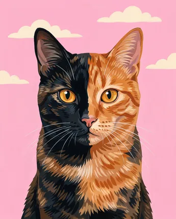 Cats
Cats Family
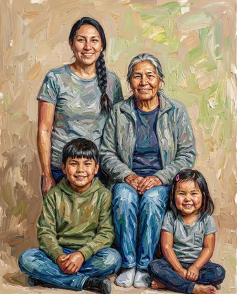 Multi-Generation
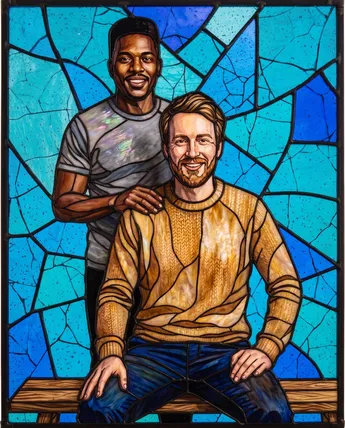 Couple
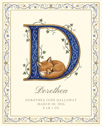 New Baby
 Black & White
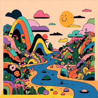 Colorful
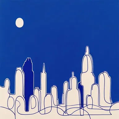 Feeling Blue
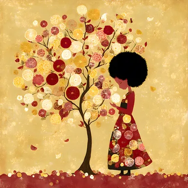 Golden Touch
 Purple Reign
 Burnt Orange
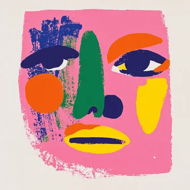 In the Pink
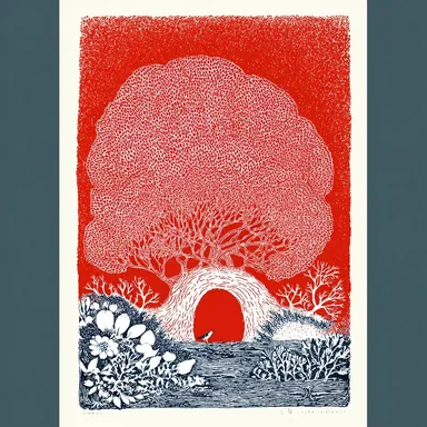 Seeing Red
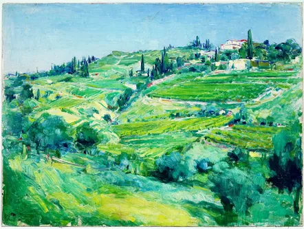 Evergreen
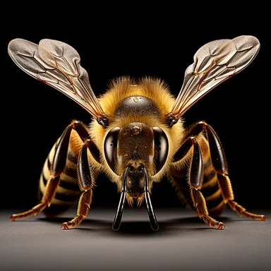 Earthy Browns
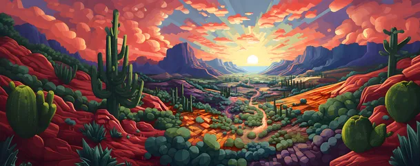 Explore by Theme
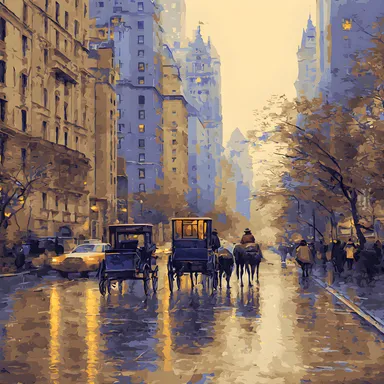 Maps & City Lovers
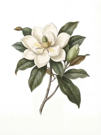 Landscape & Nature
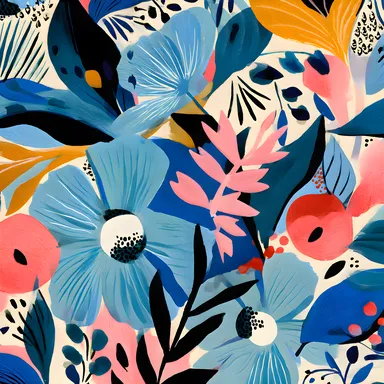 Botanical & Floral
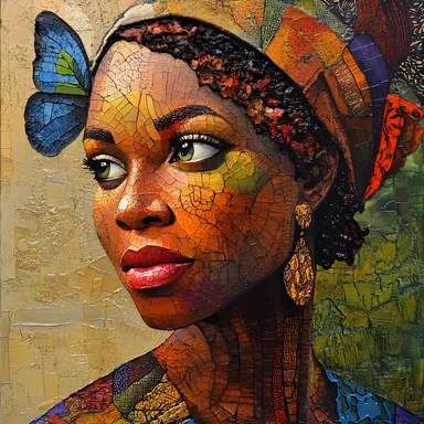 Figurative & Portraits
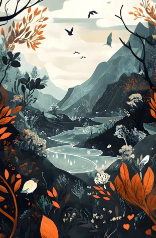 Travel
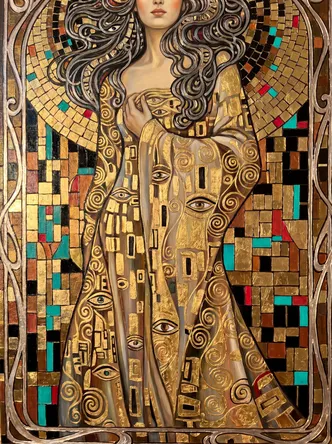 Vintage & Famous Art
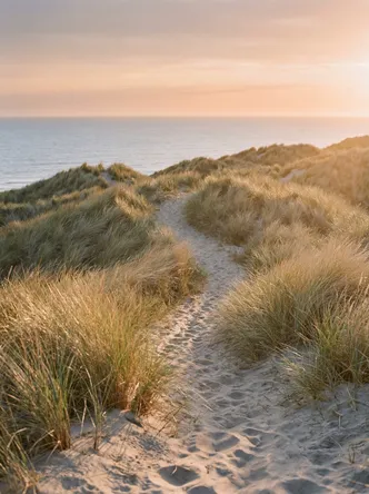 Photography
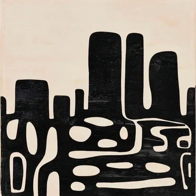 Abstract
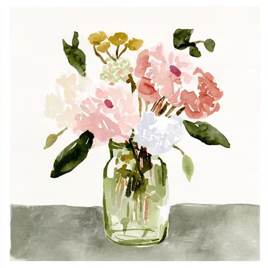 Watercolors
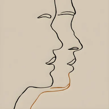 Line Art
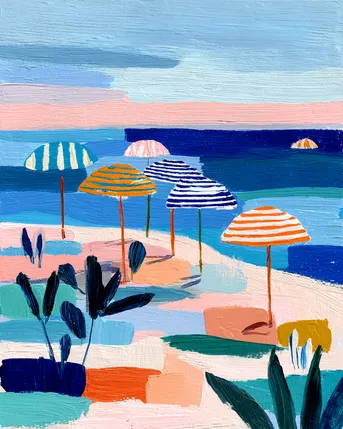 Pastels
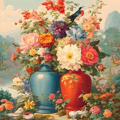 Vintage & Retro
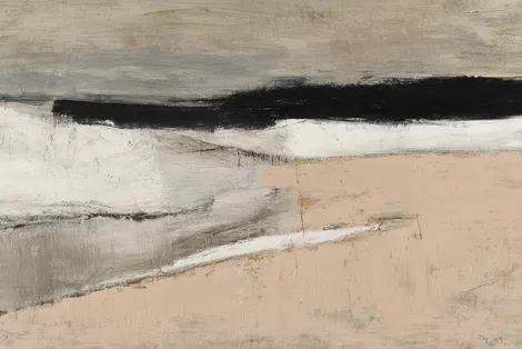 Minimalist
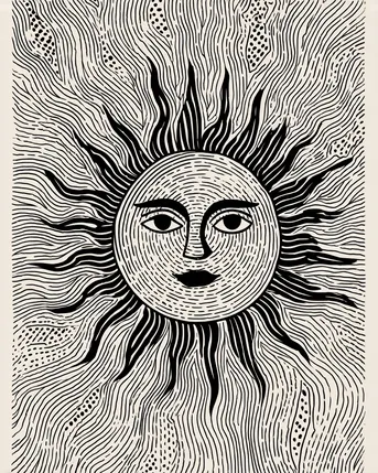 Block Prints & Linocuts
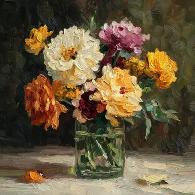 Impasto & Texture
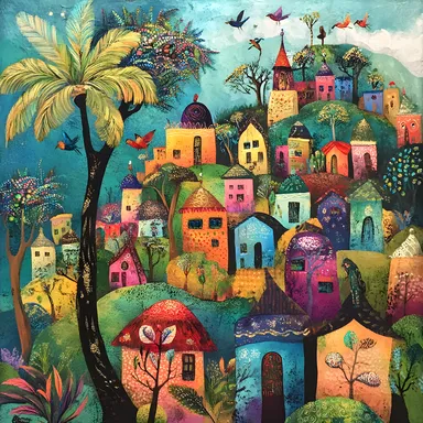 Folk & Naive
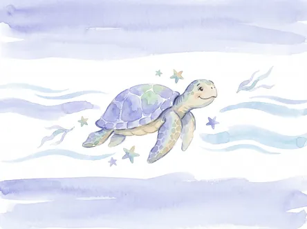 By Room
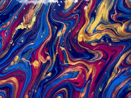 Living Room
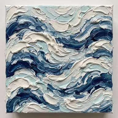 Bedroom
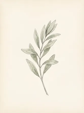 In the Office
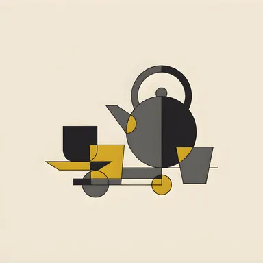 Kitchen
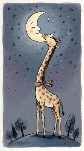 Nursery Room
 Children's Room
 In the Bathroom
 For Your Business
 Minimalist & Modern
 Vintage & Retro
 Cats & Animals
 Abstract & Geometric
 Floral & Botanical