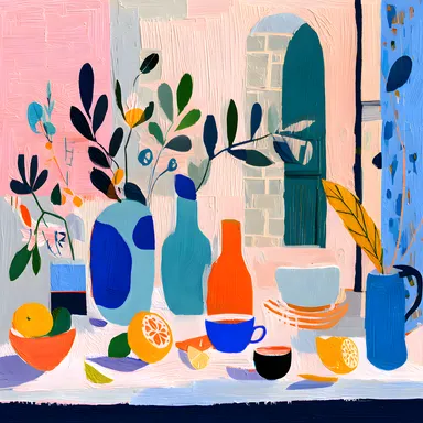
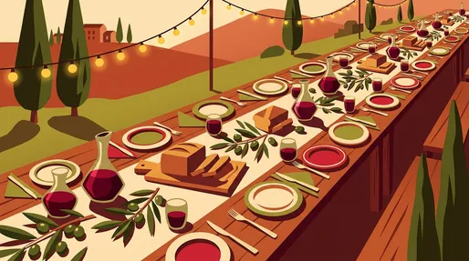
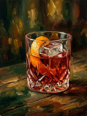
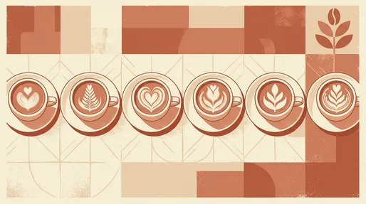
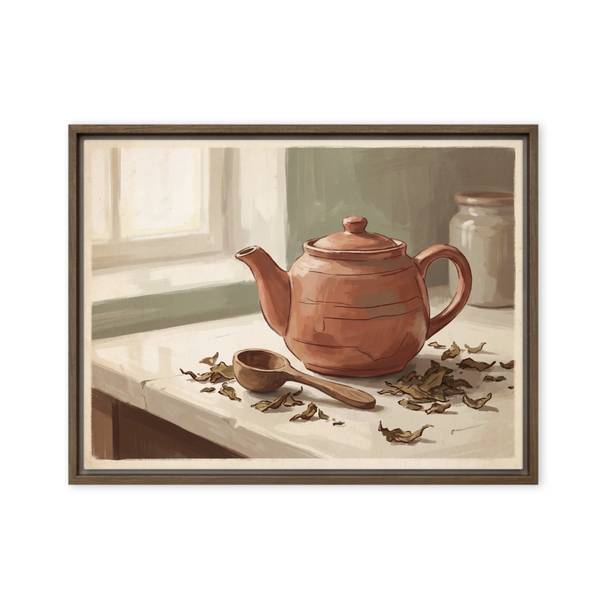
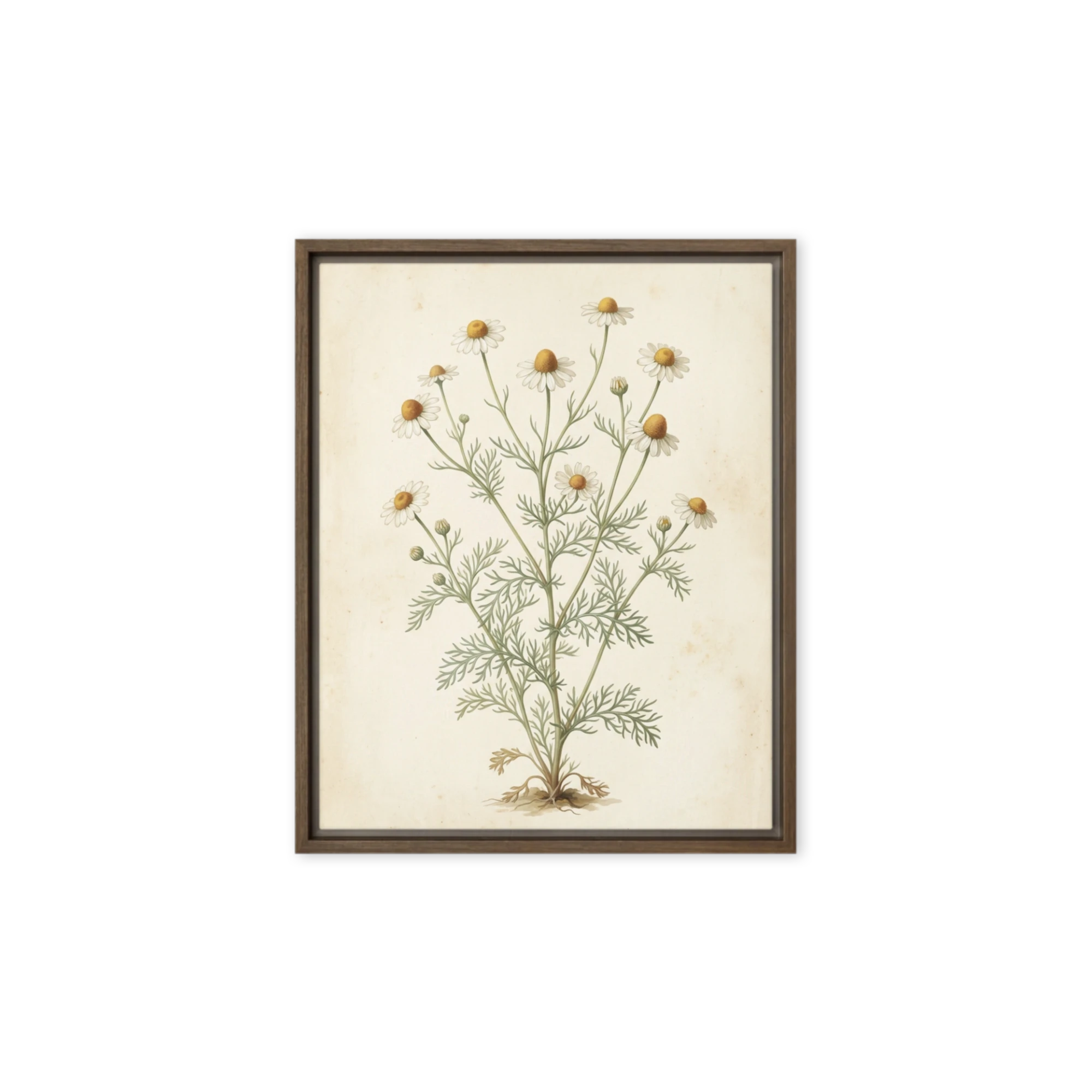
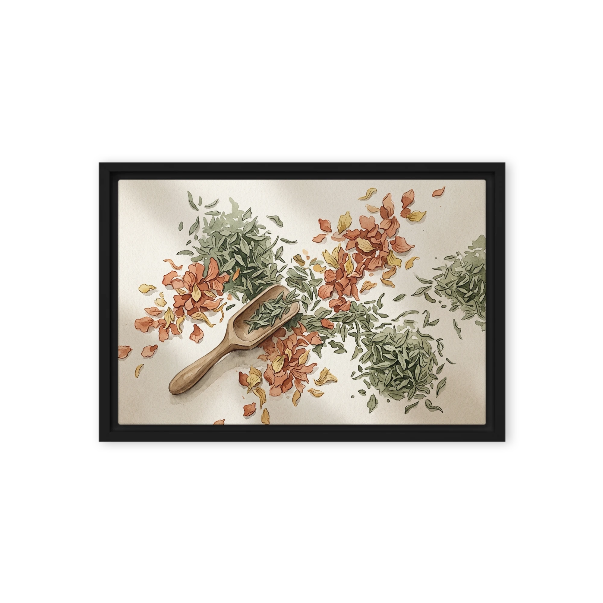
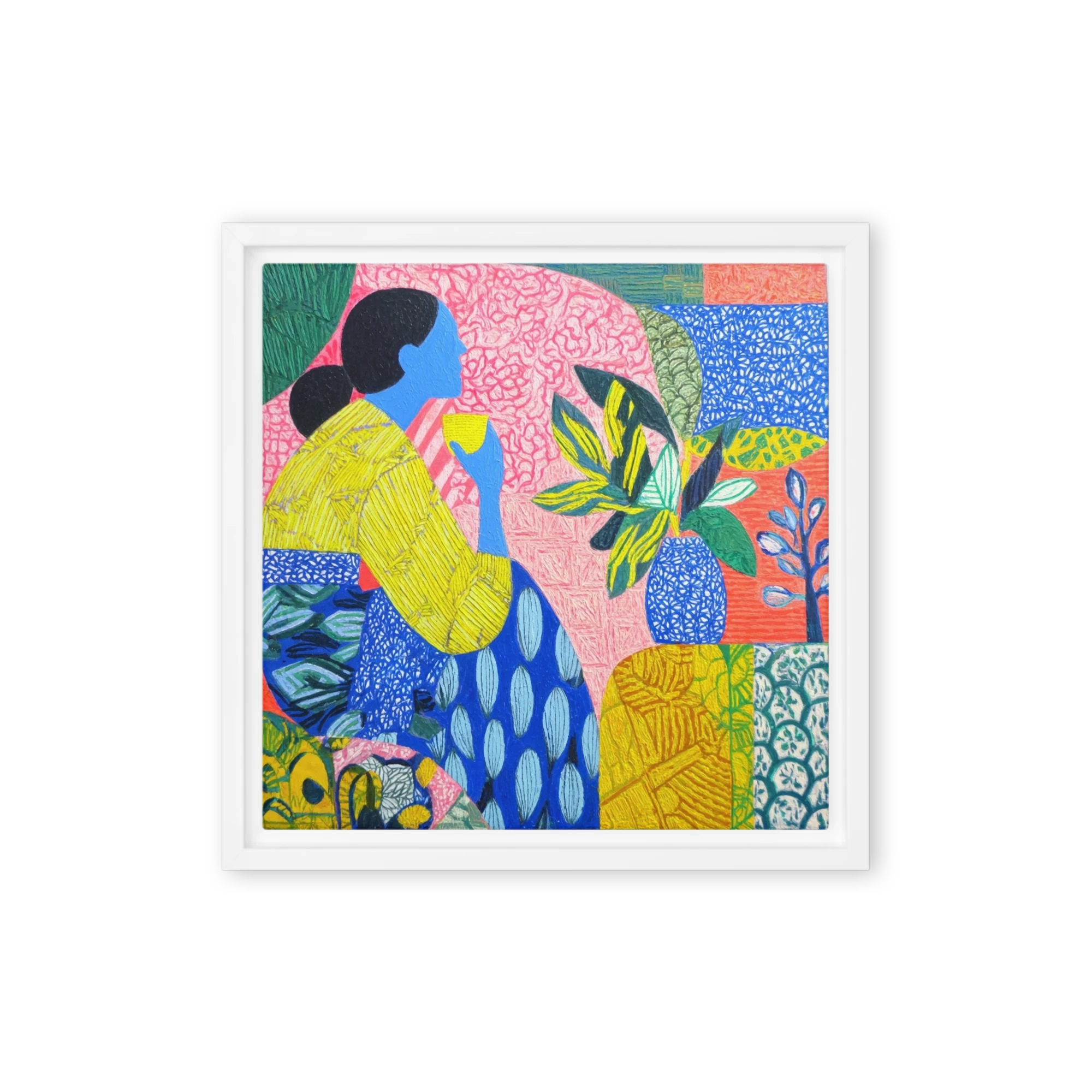
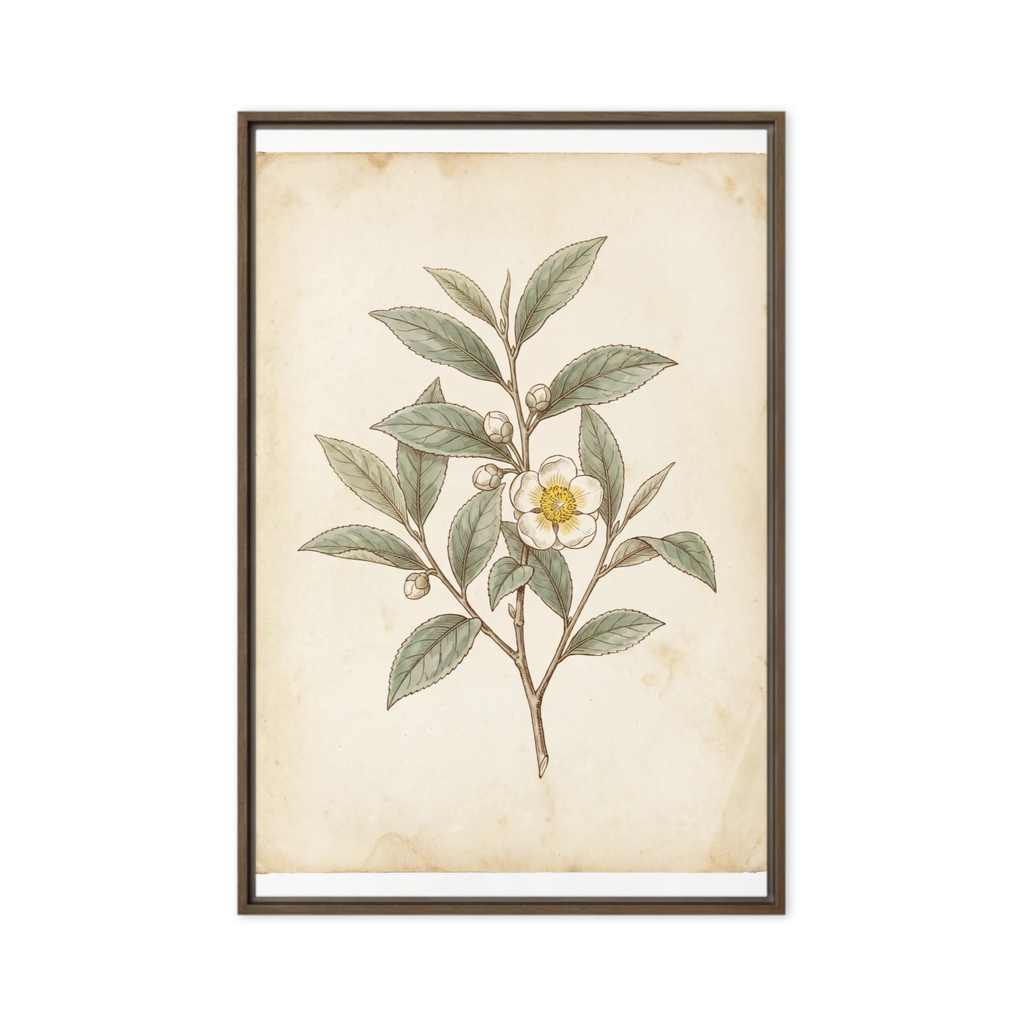
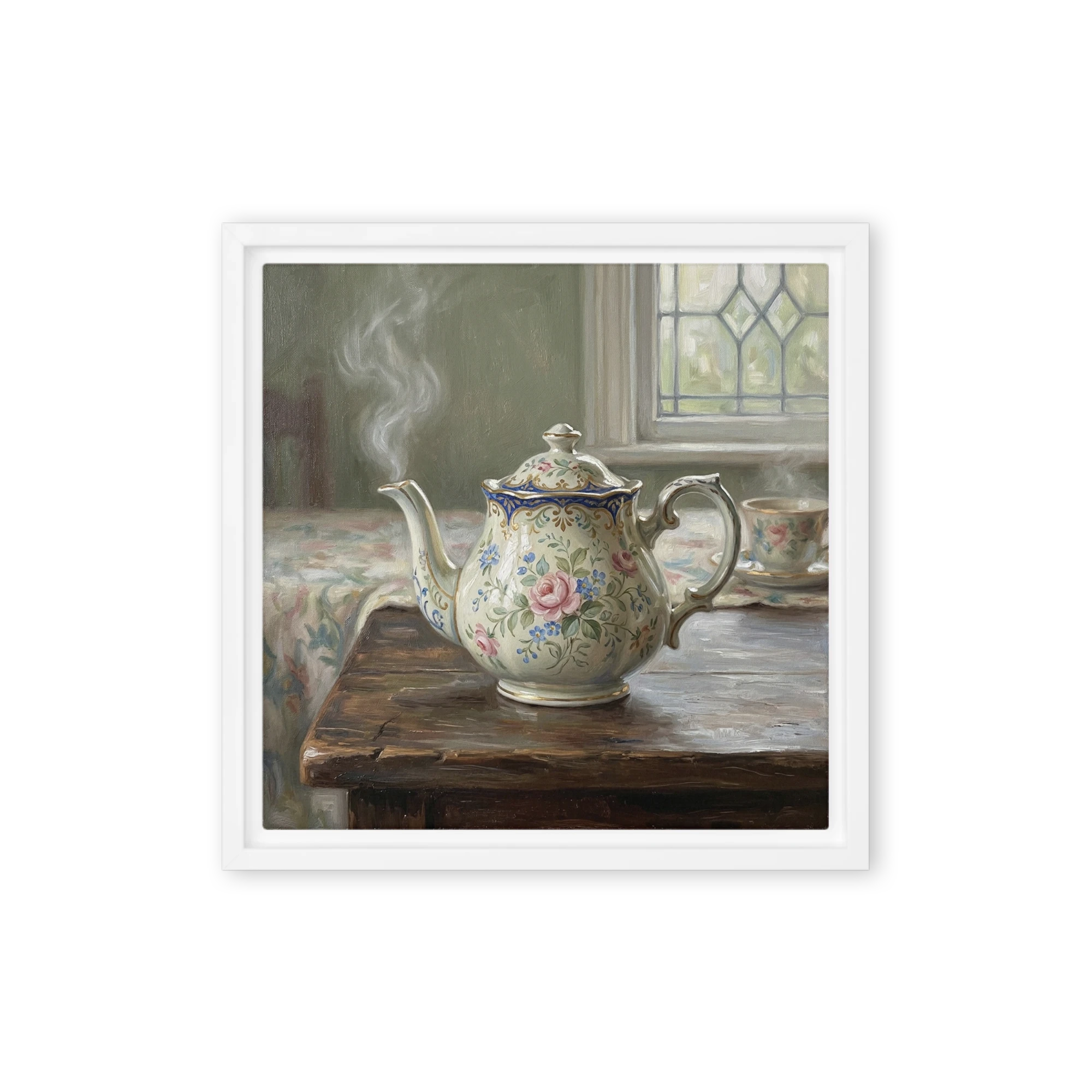
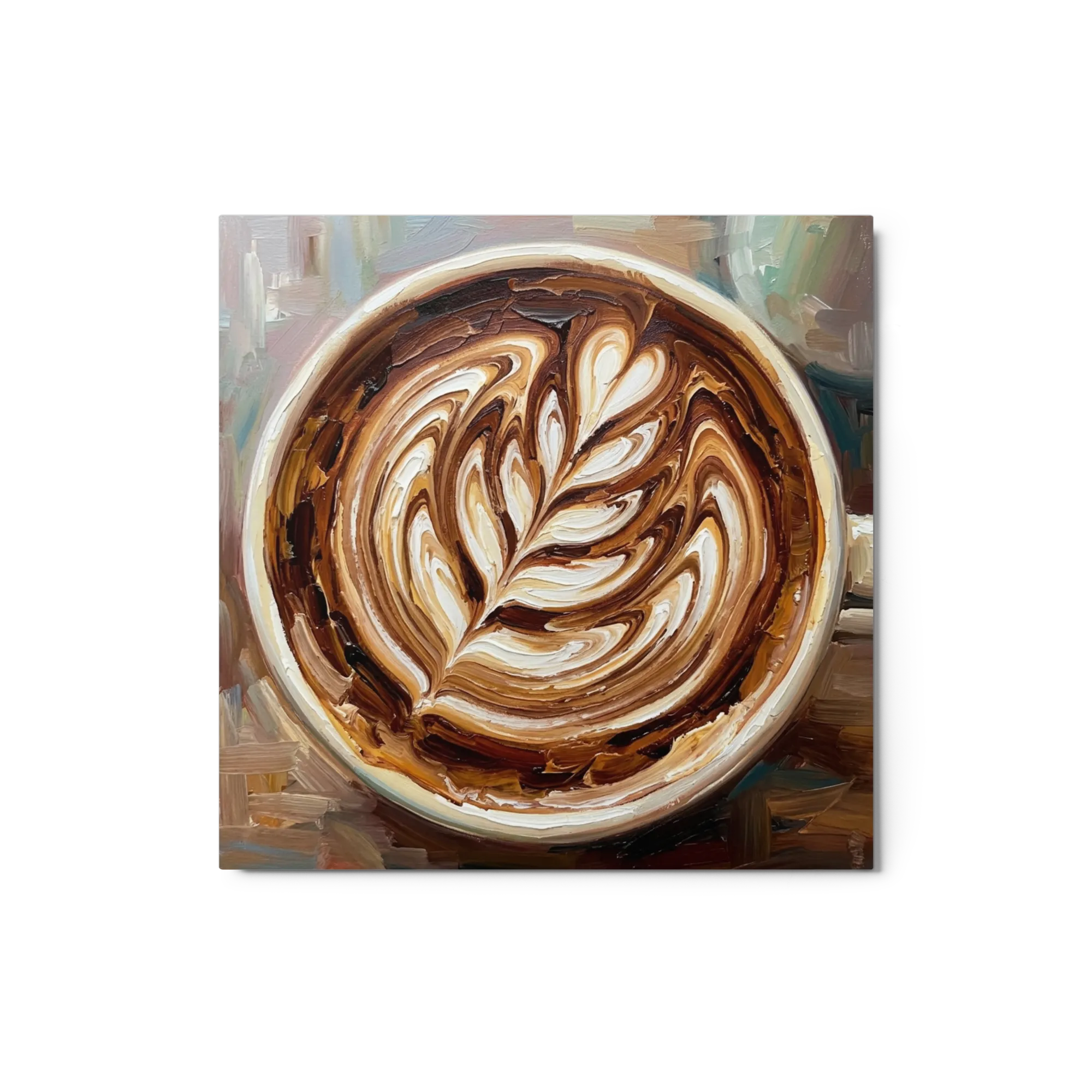
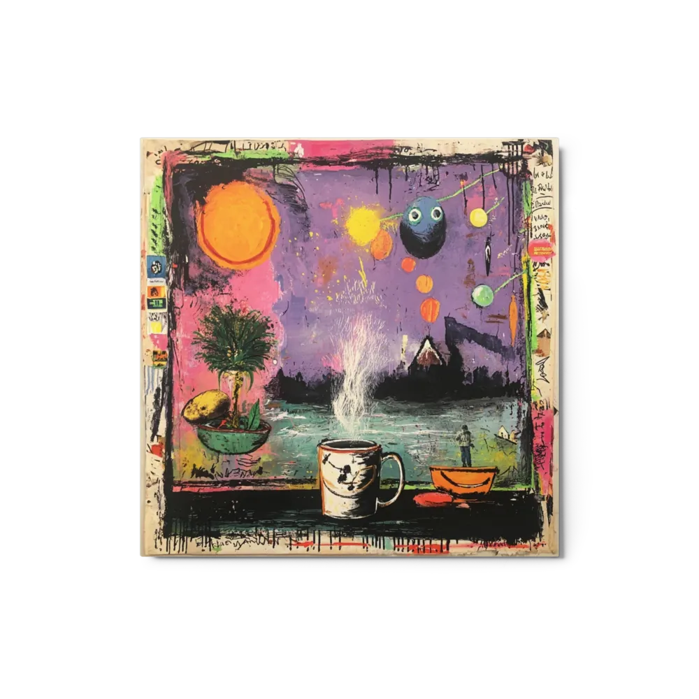
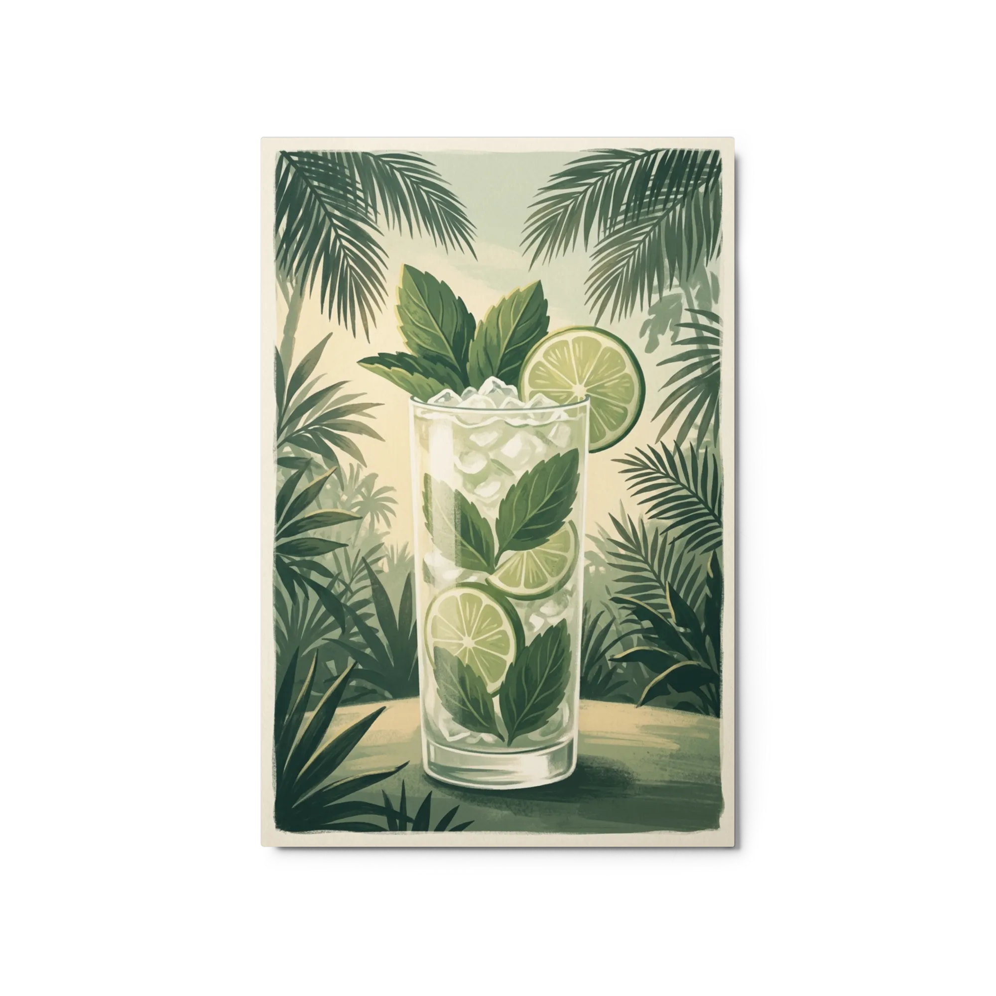
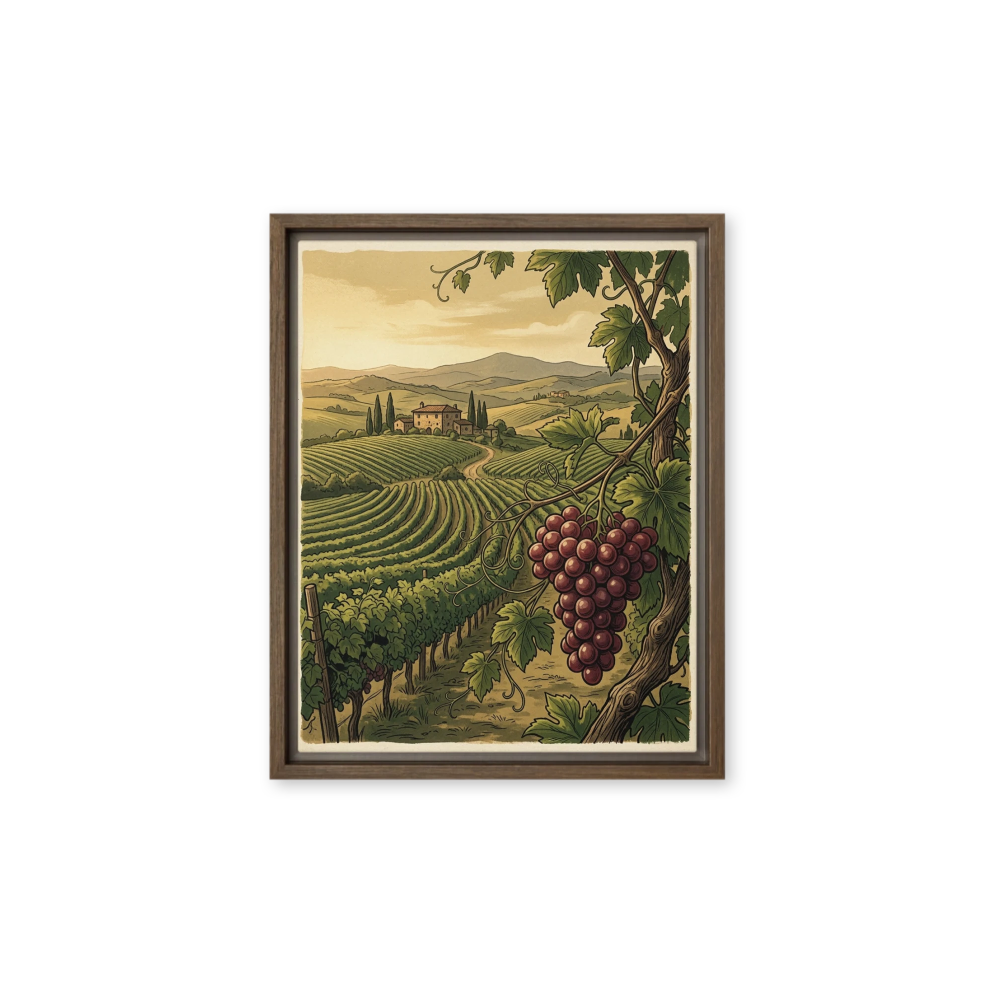
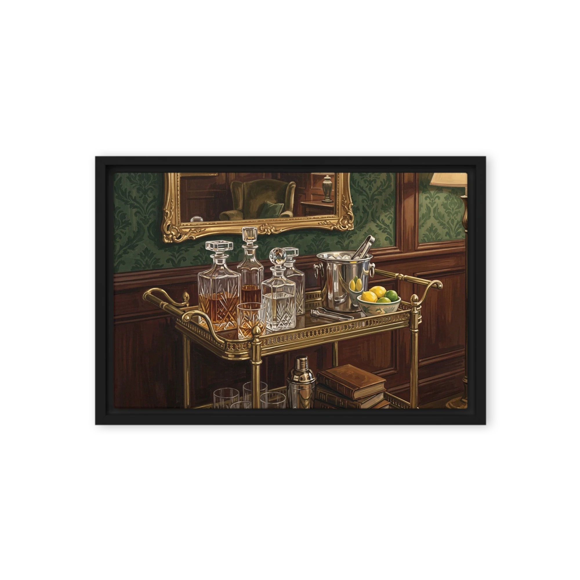
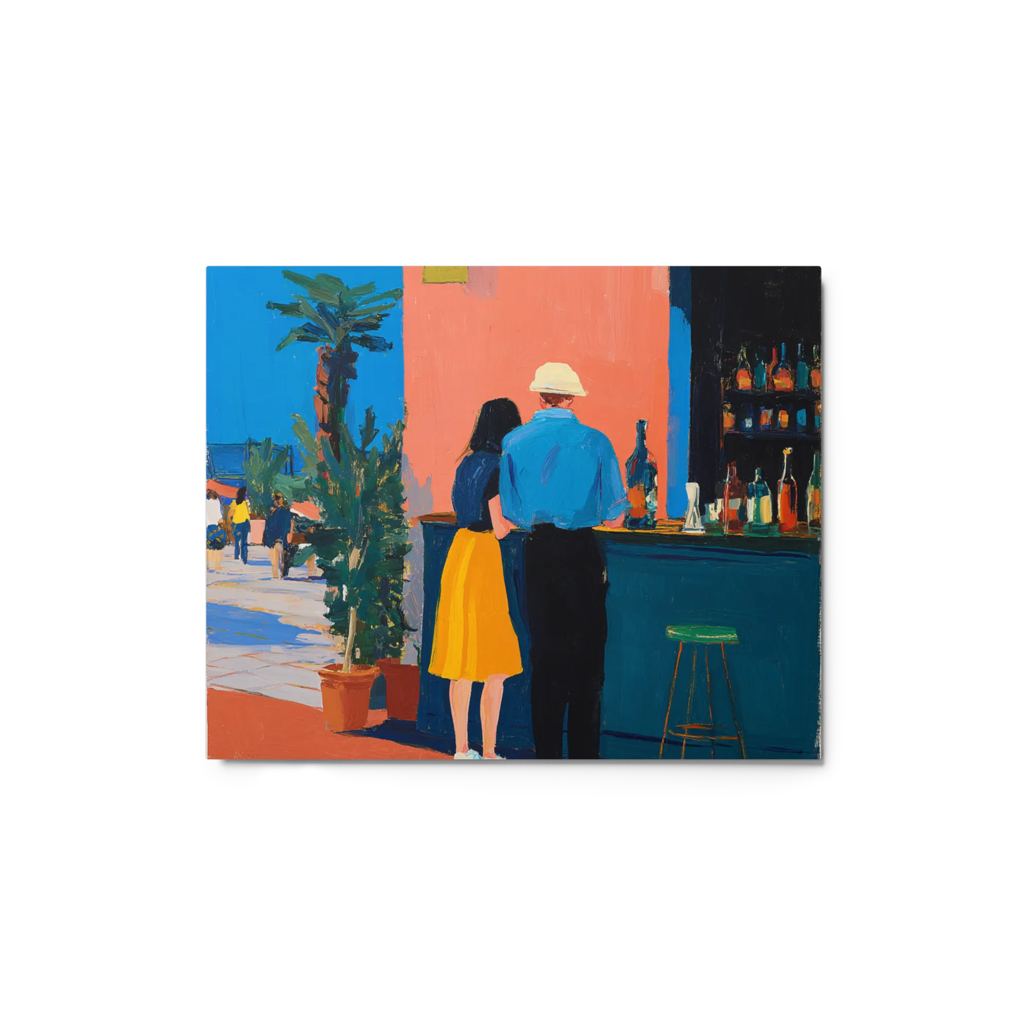
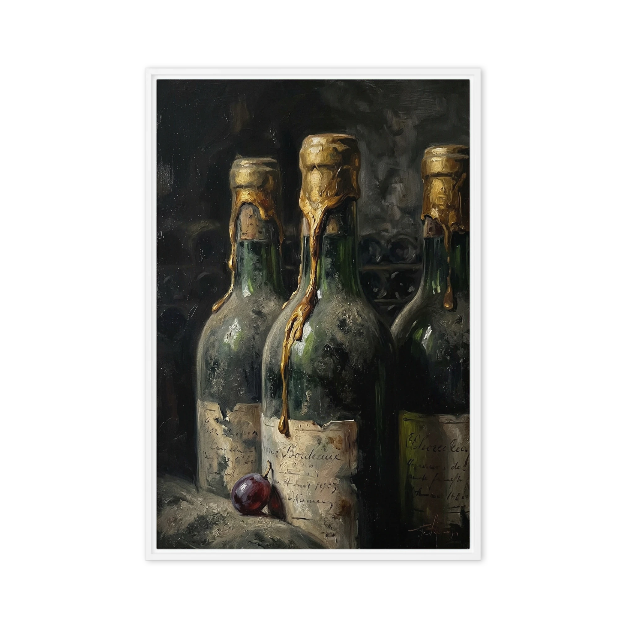
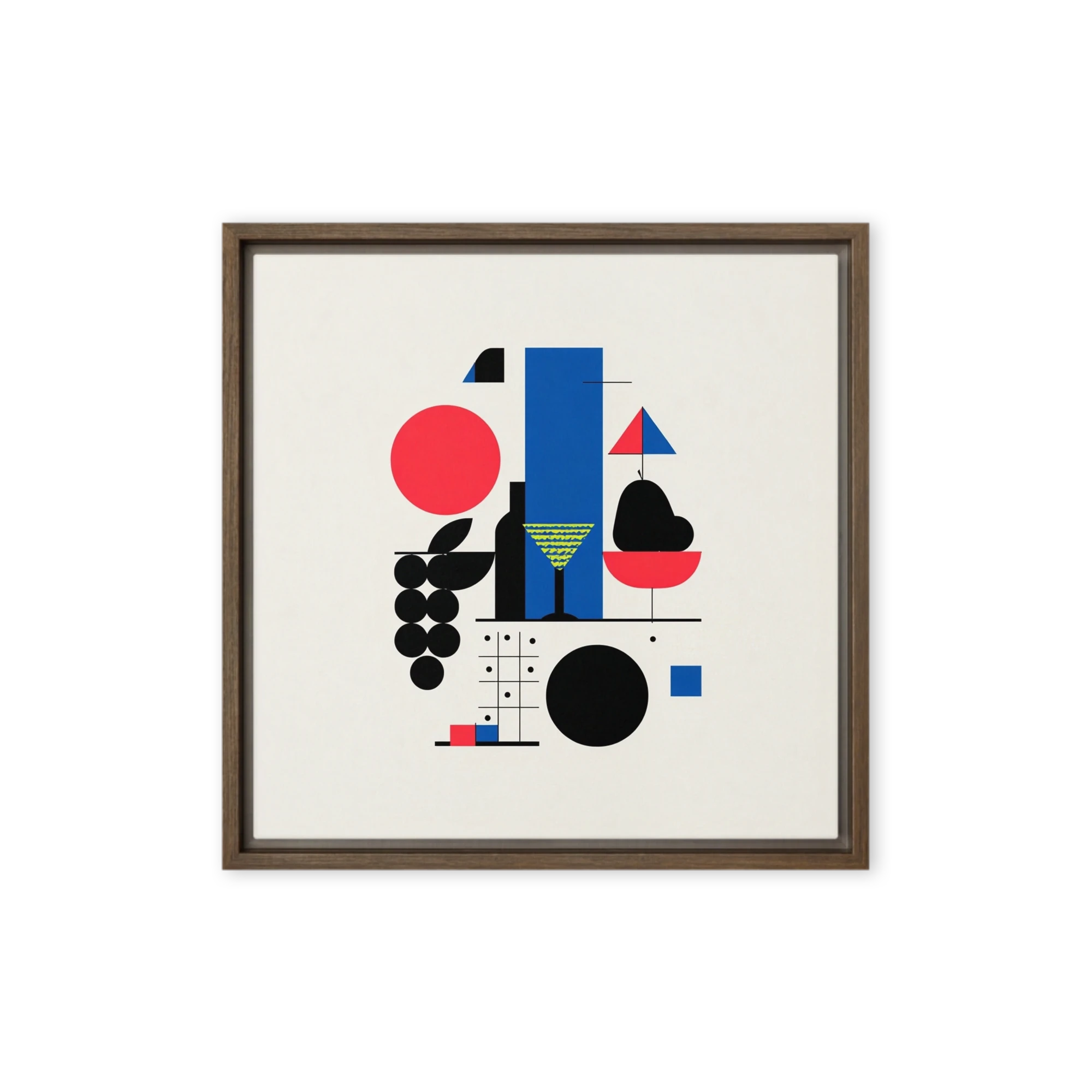
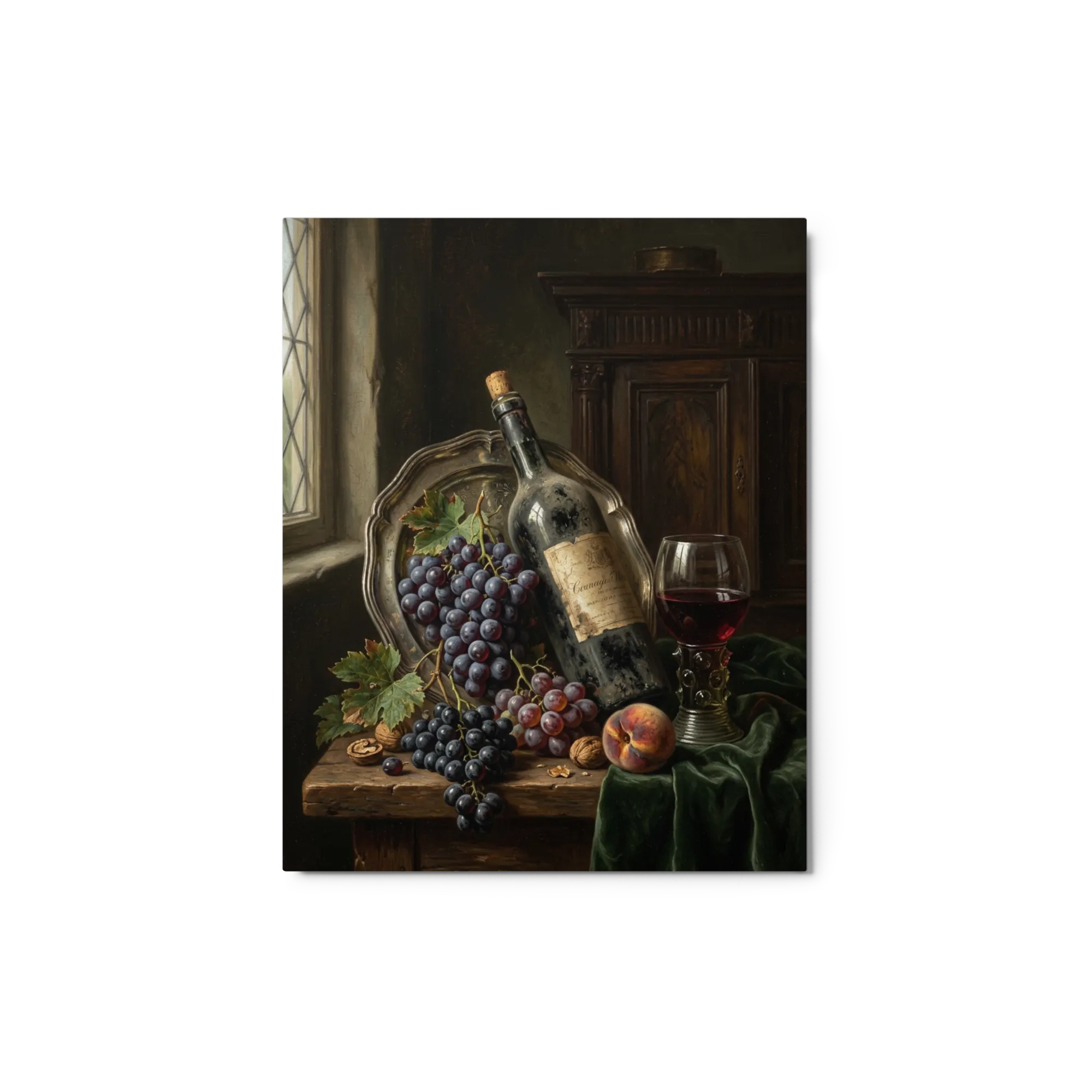
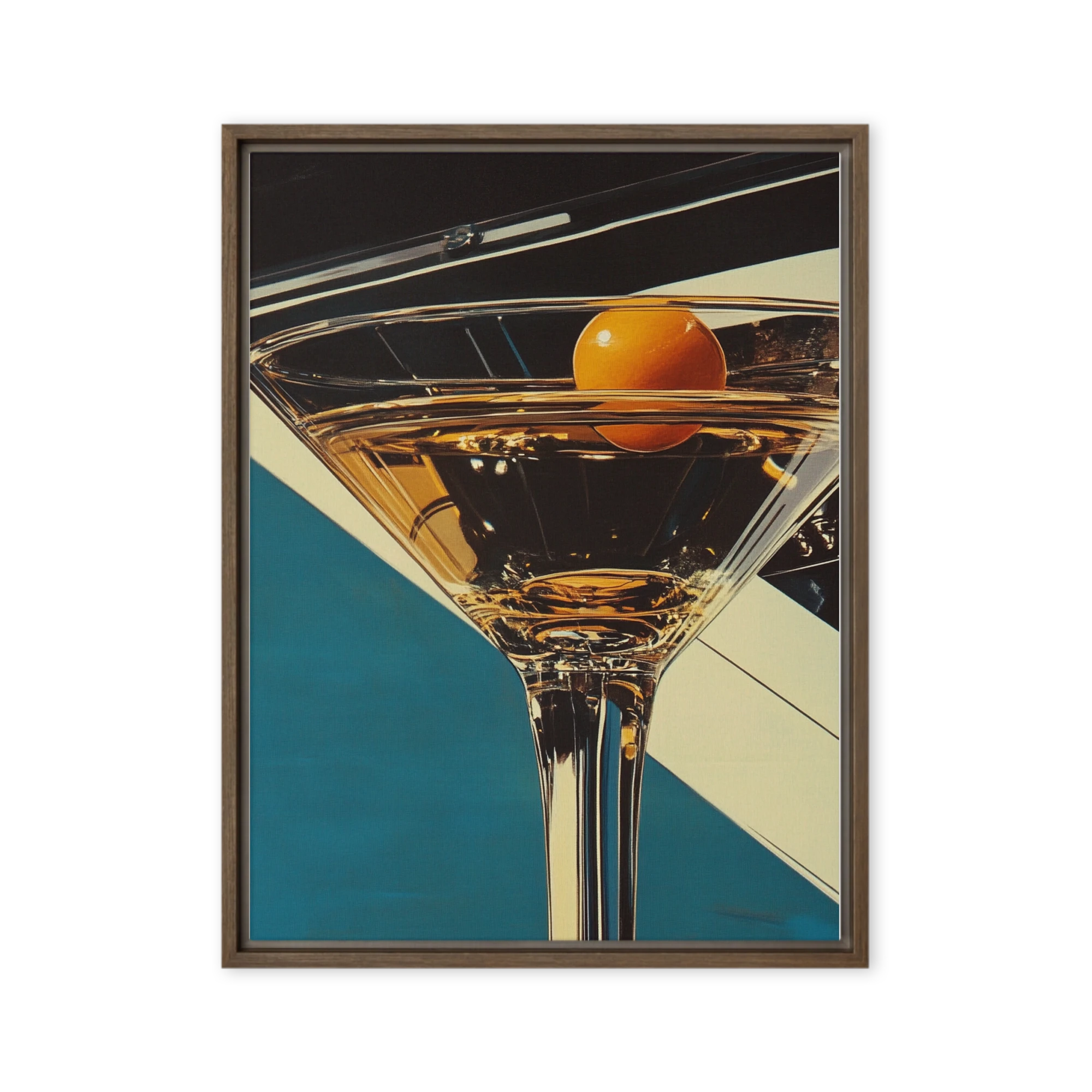
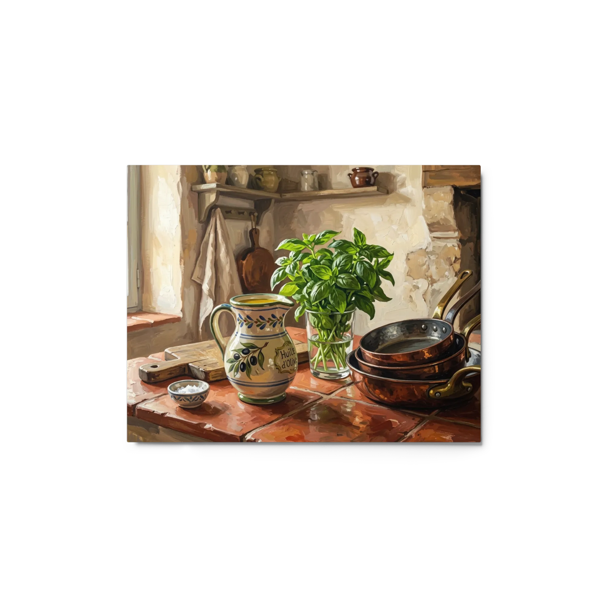
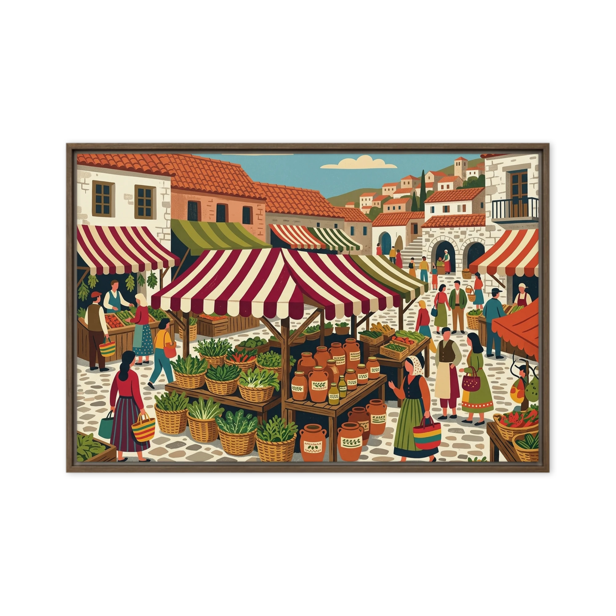
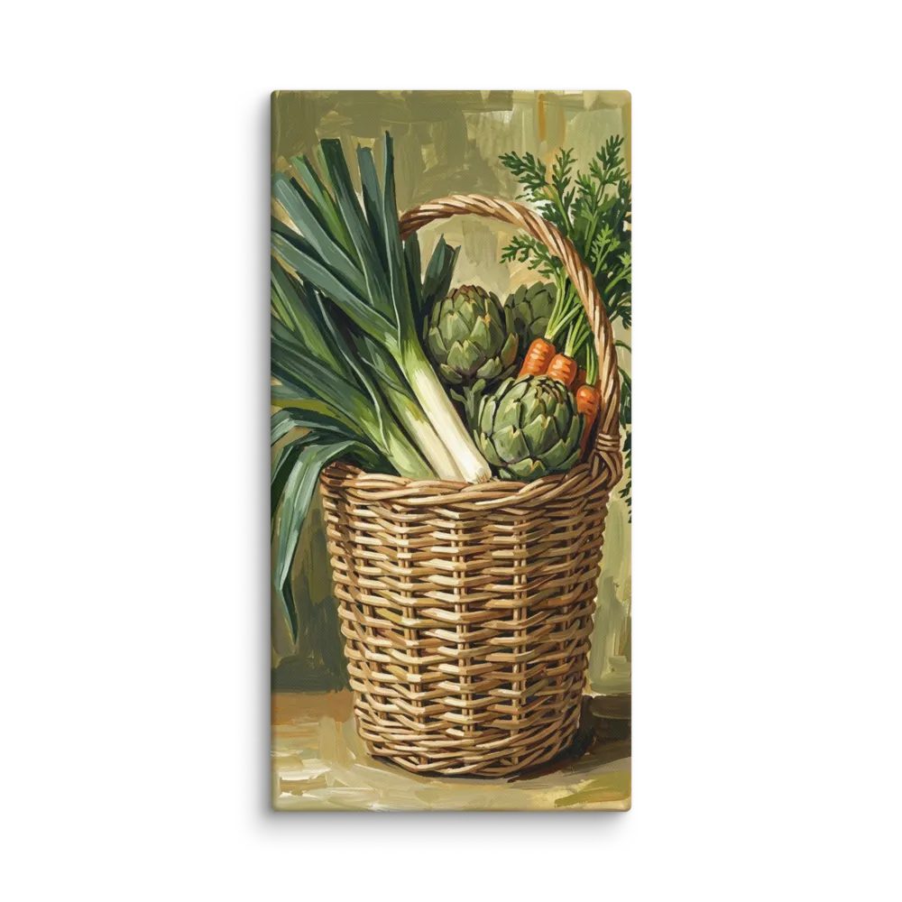
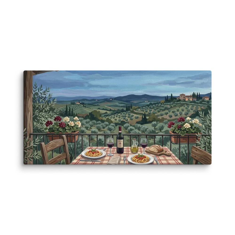
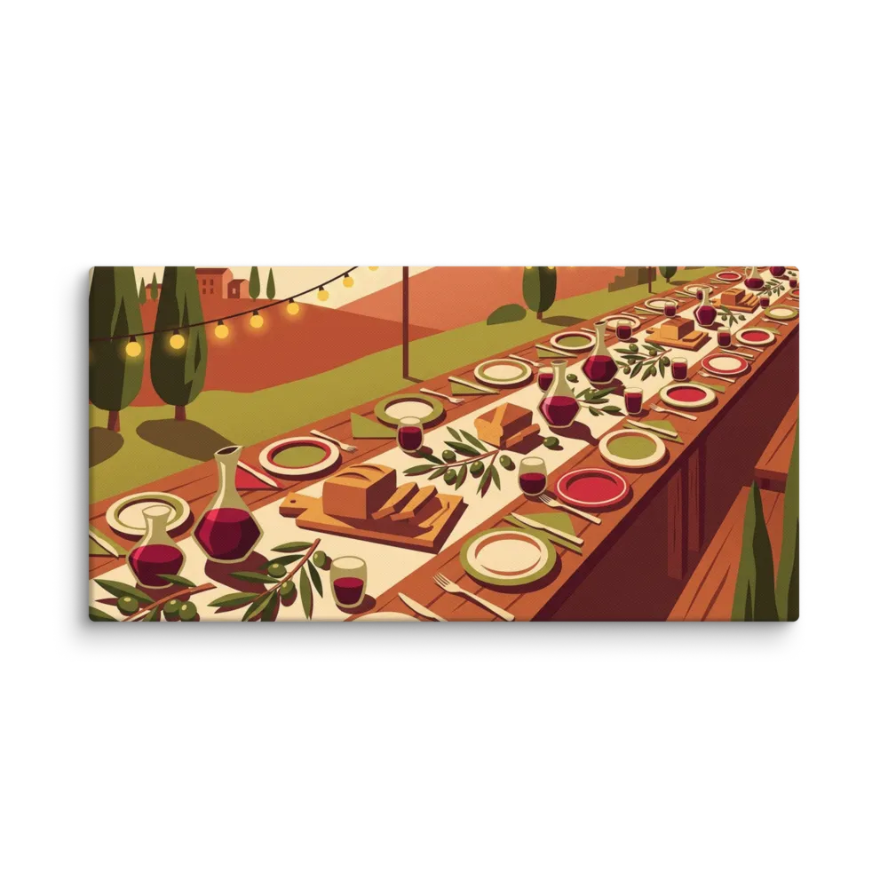
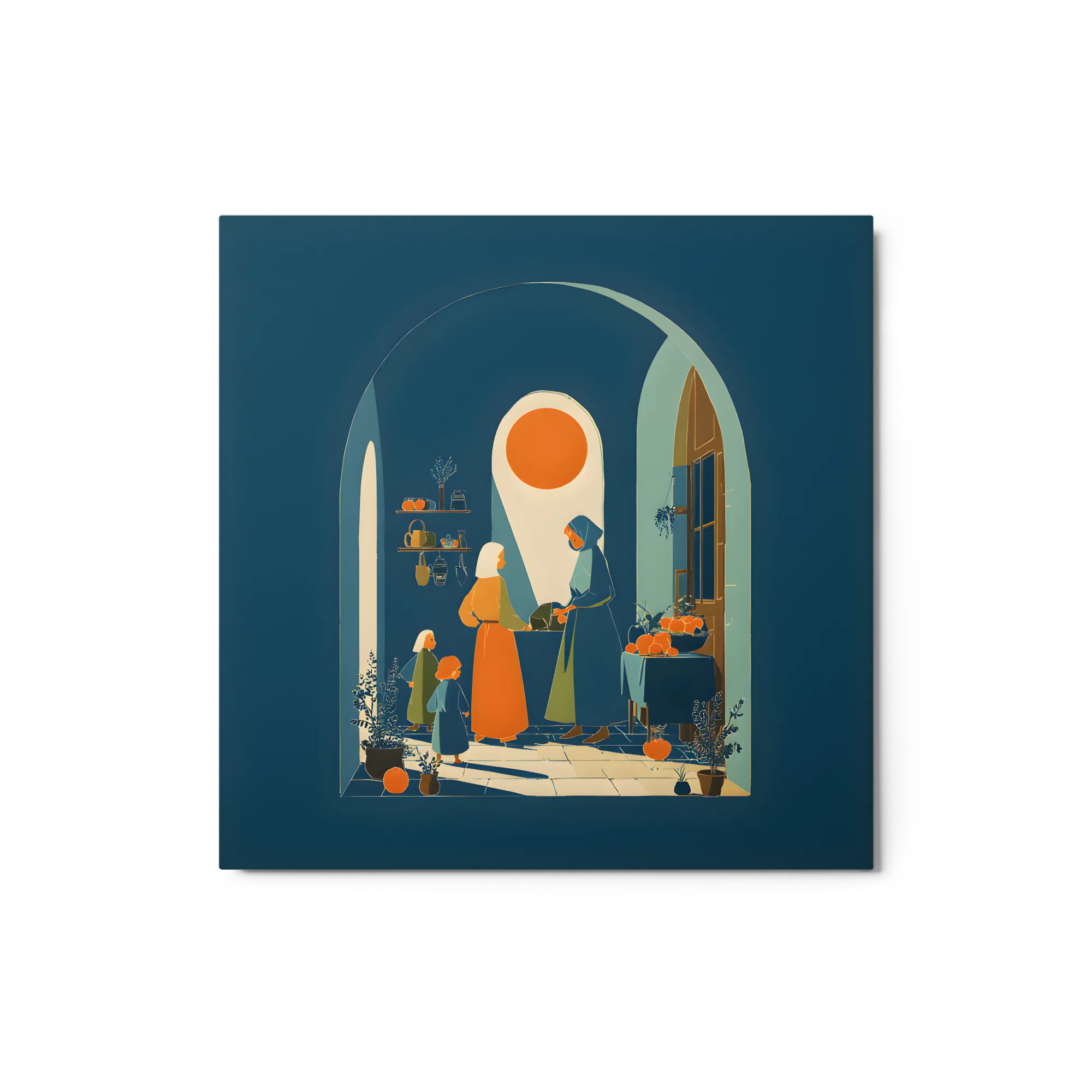
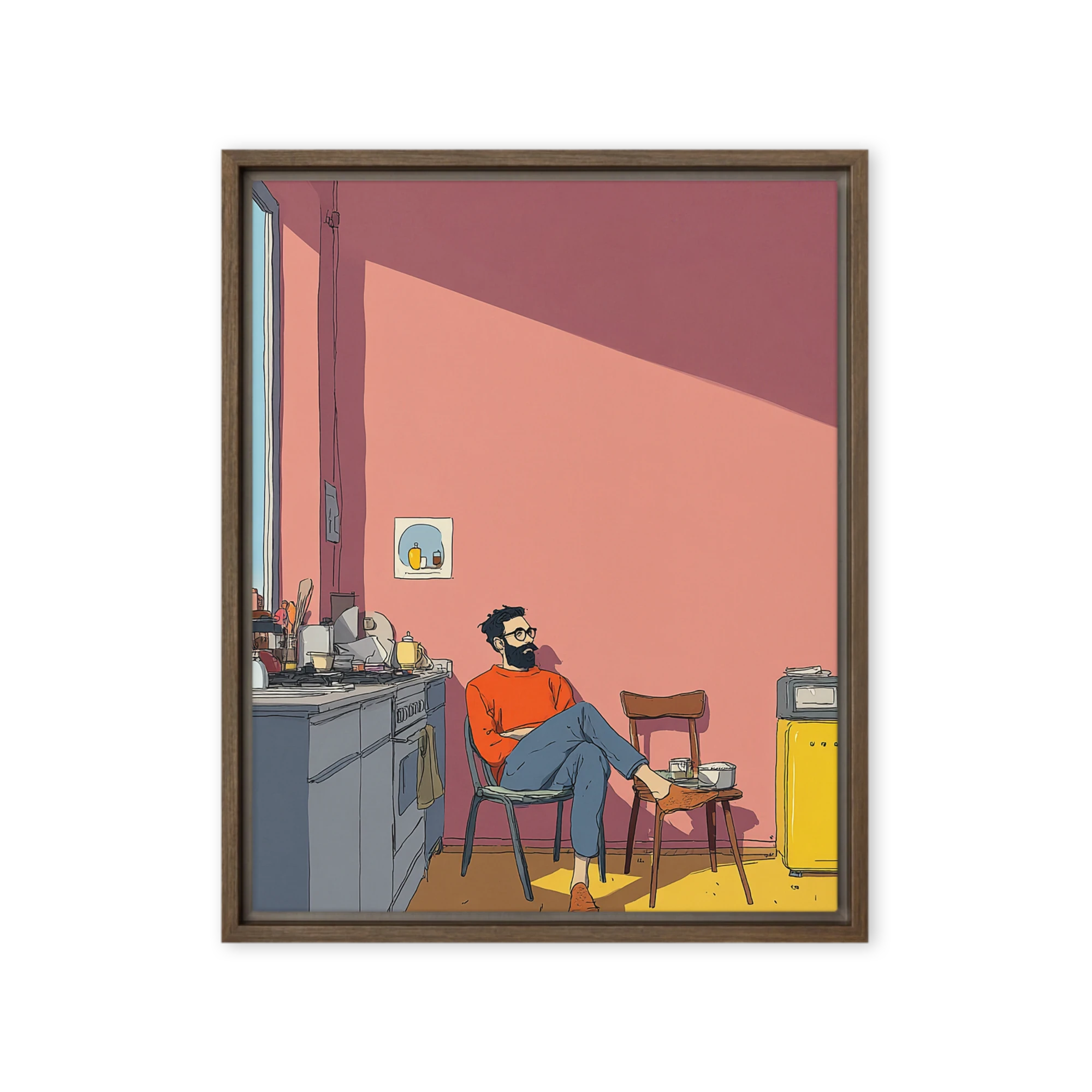
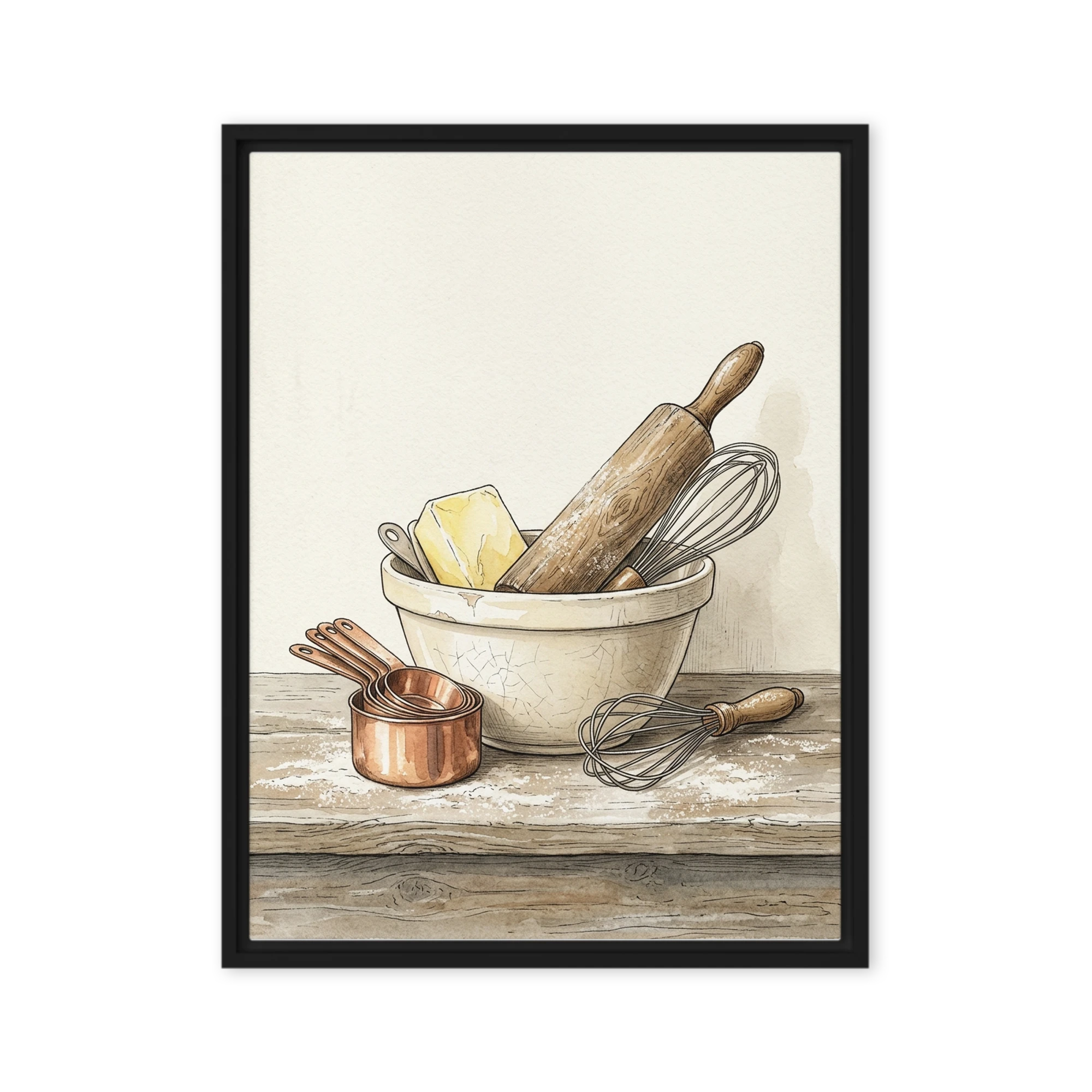
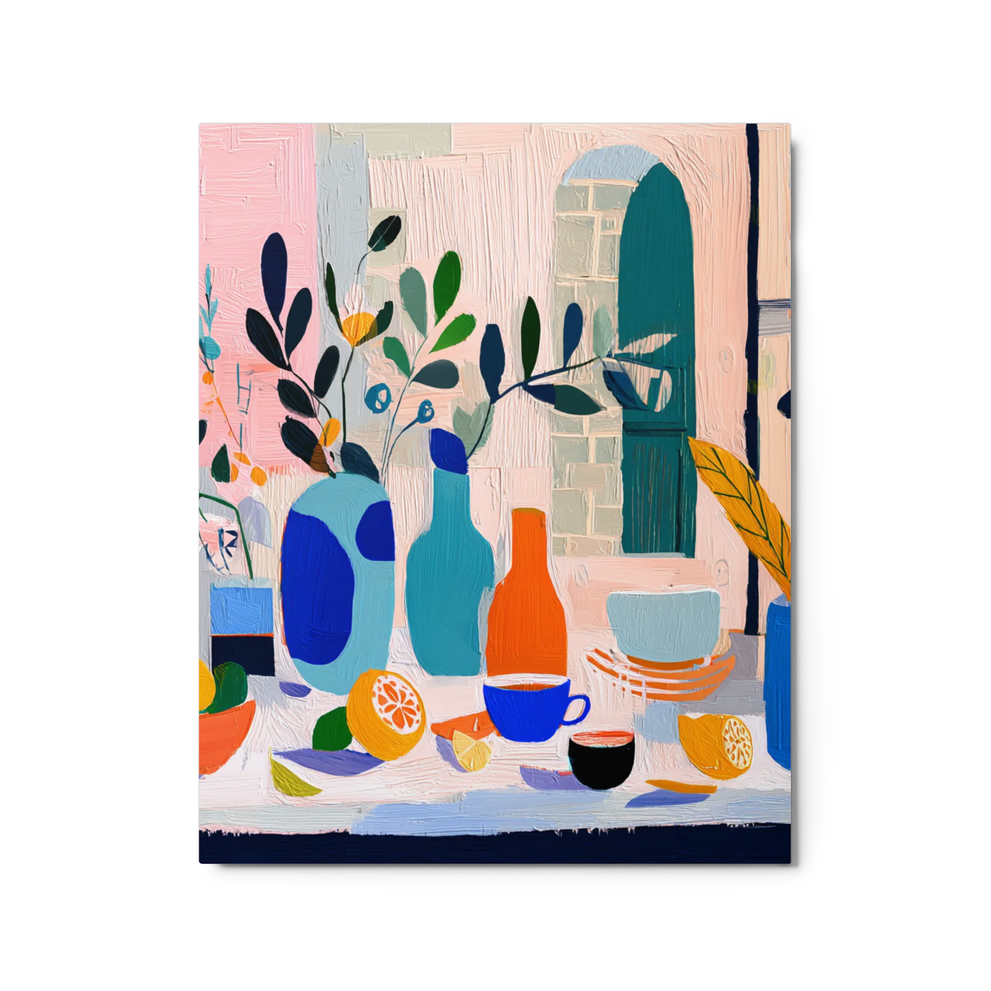
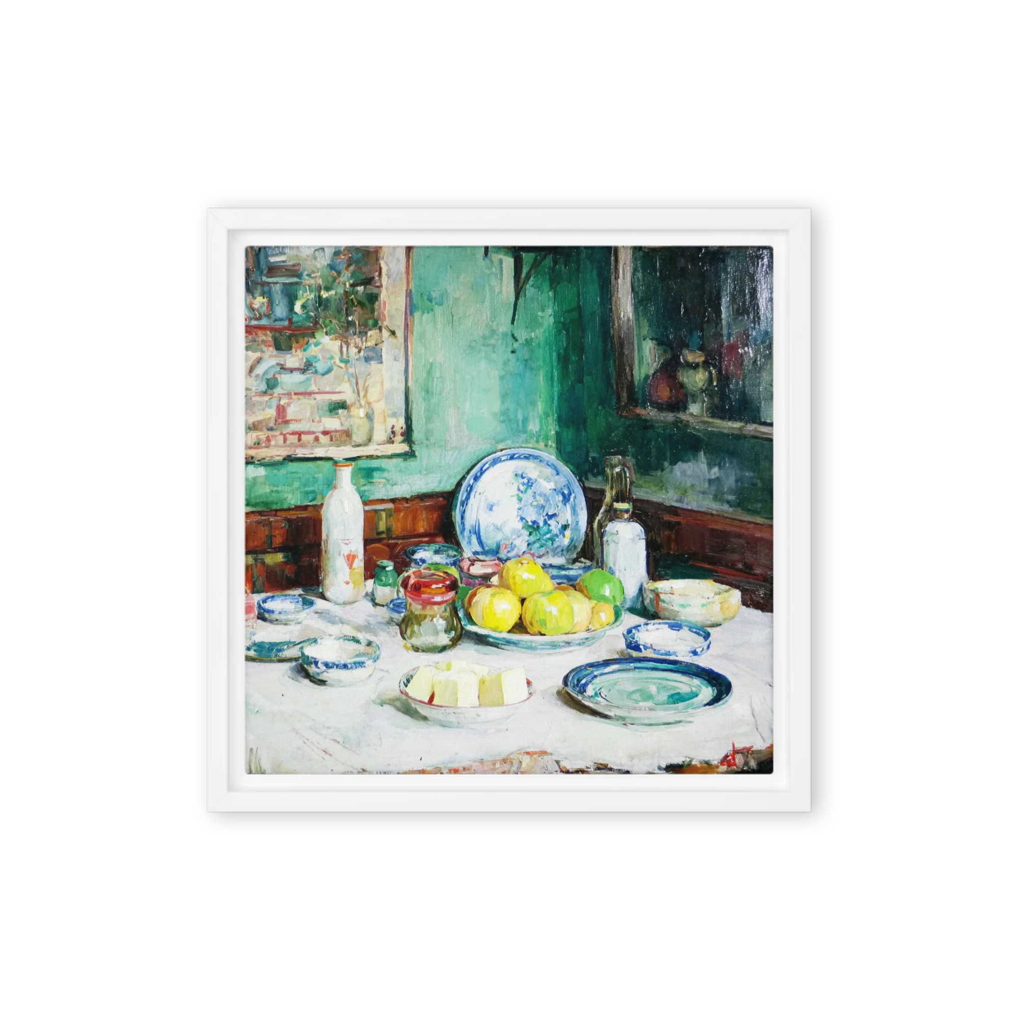
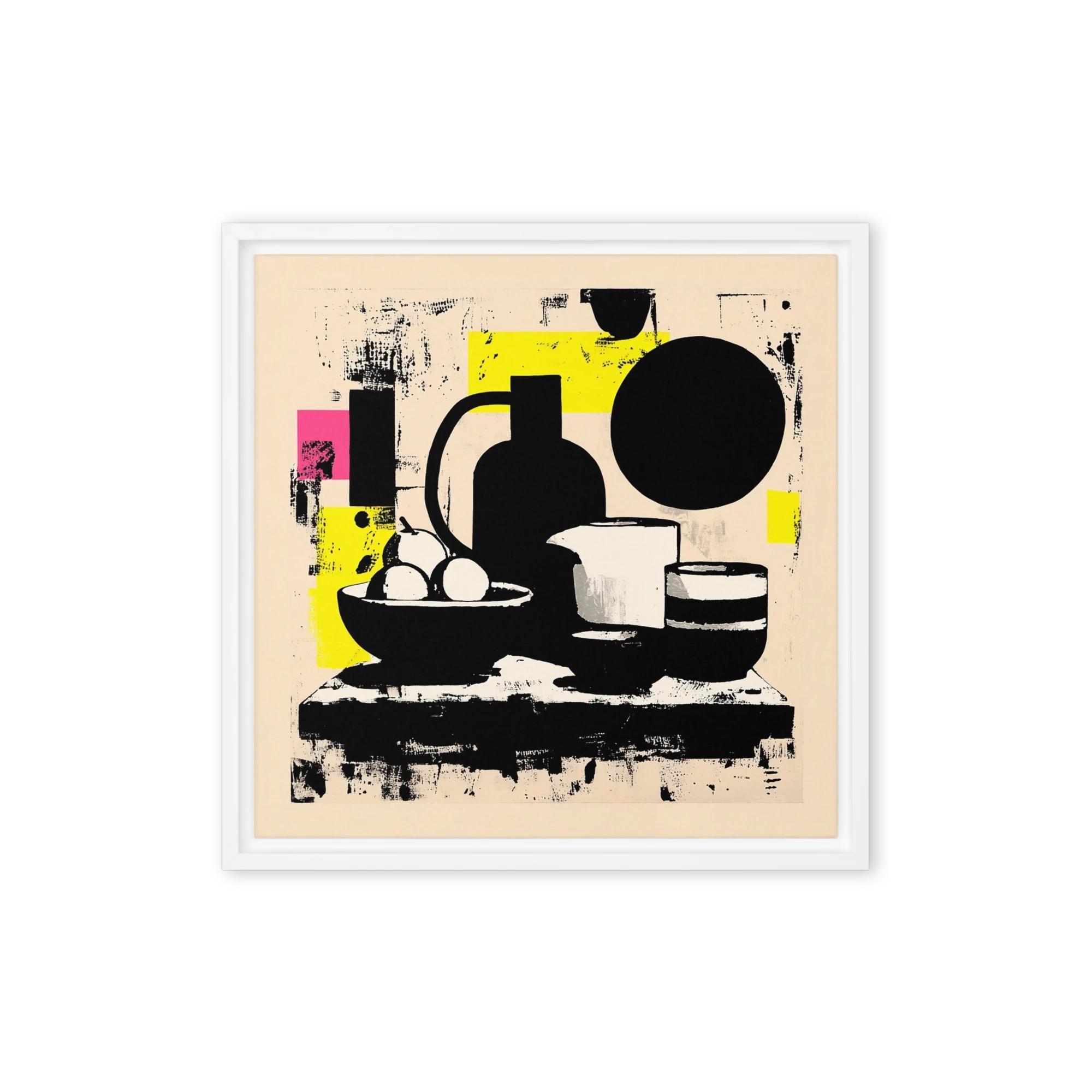
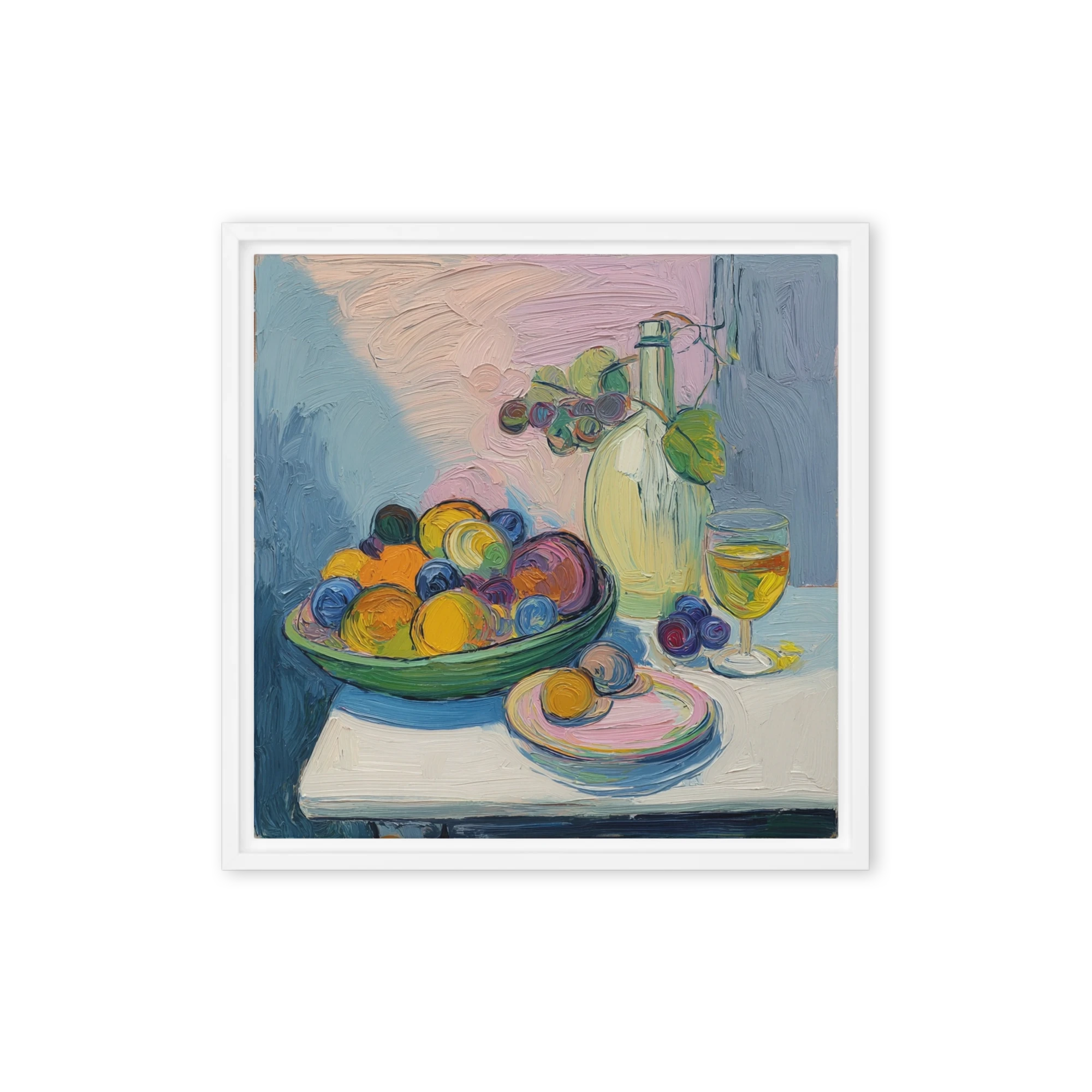
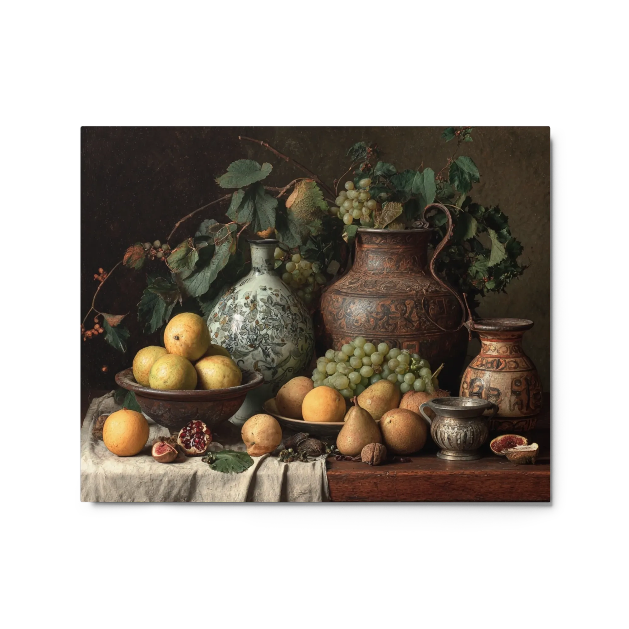
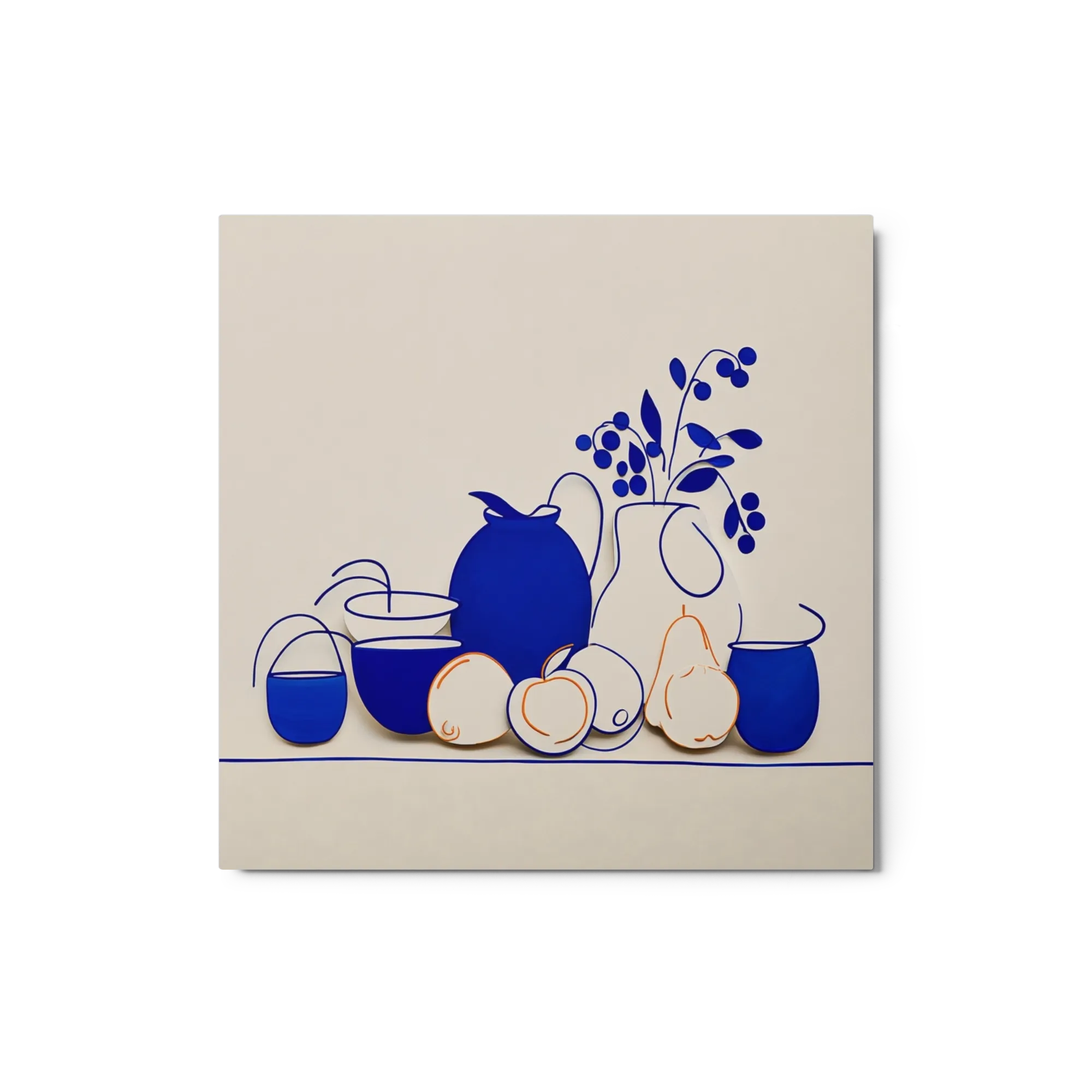
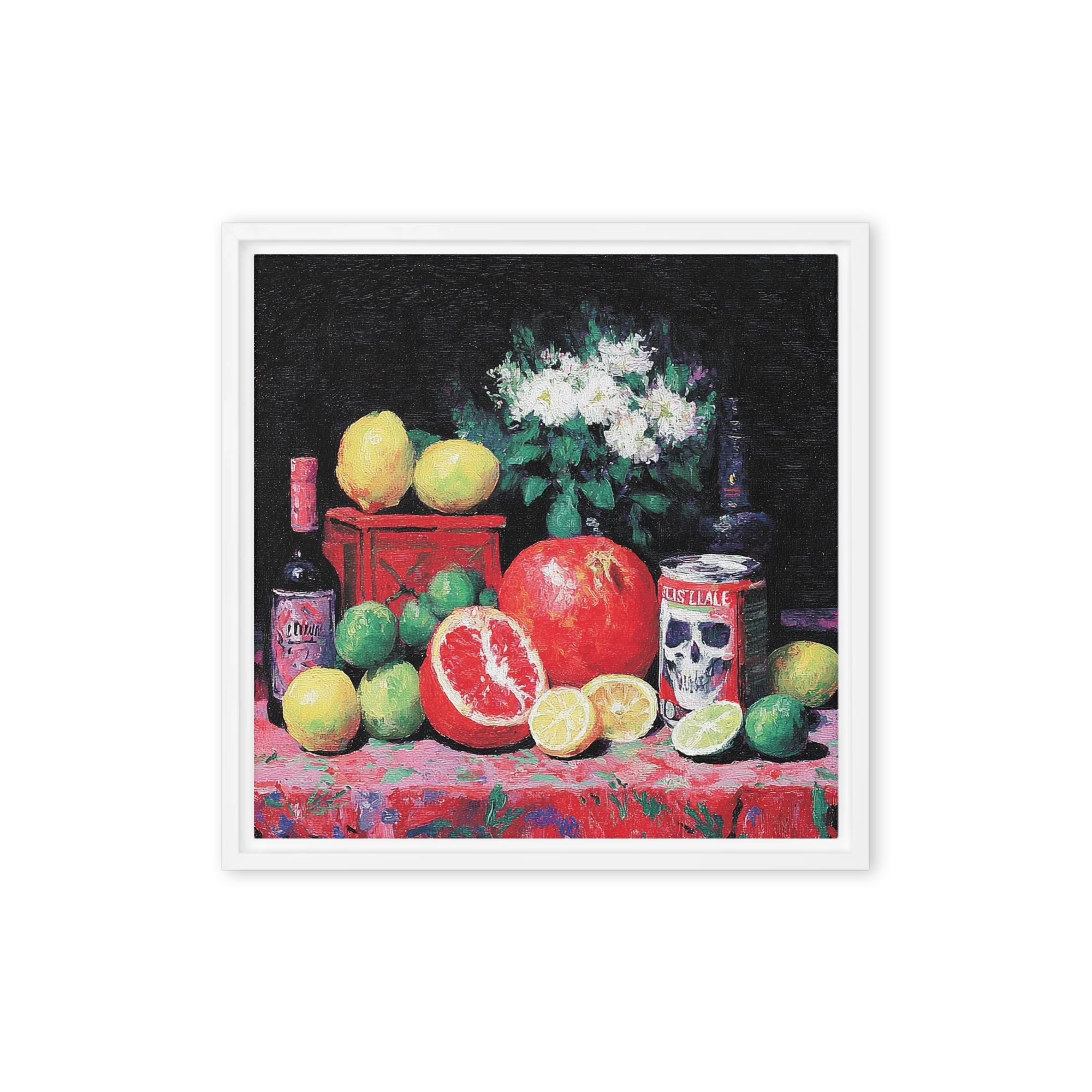
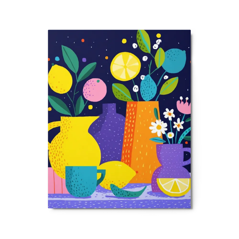
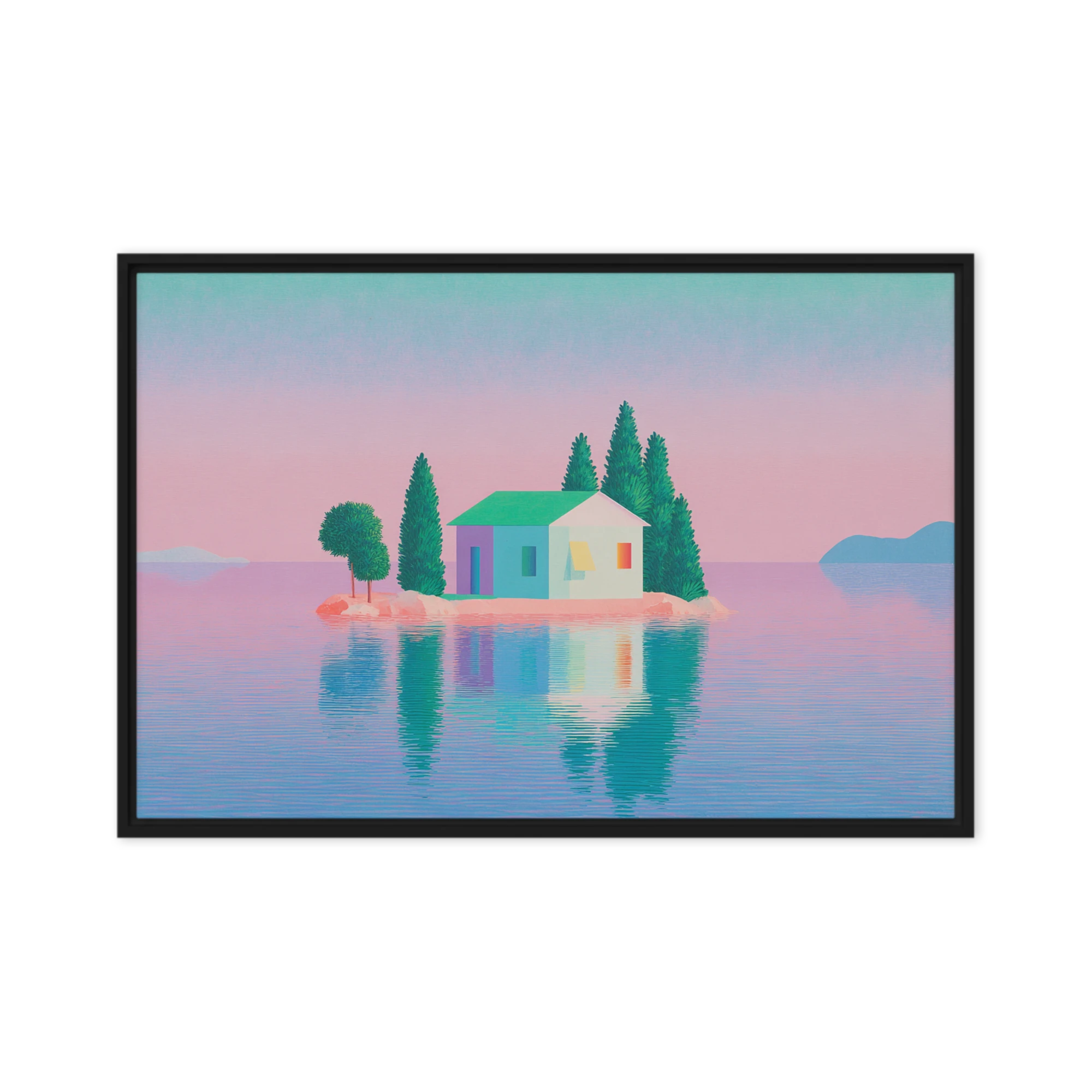
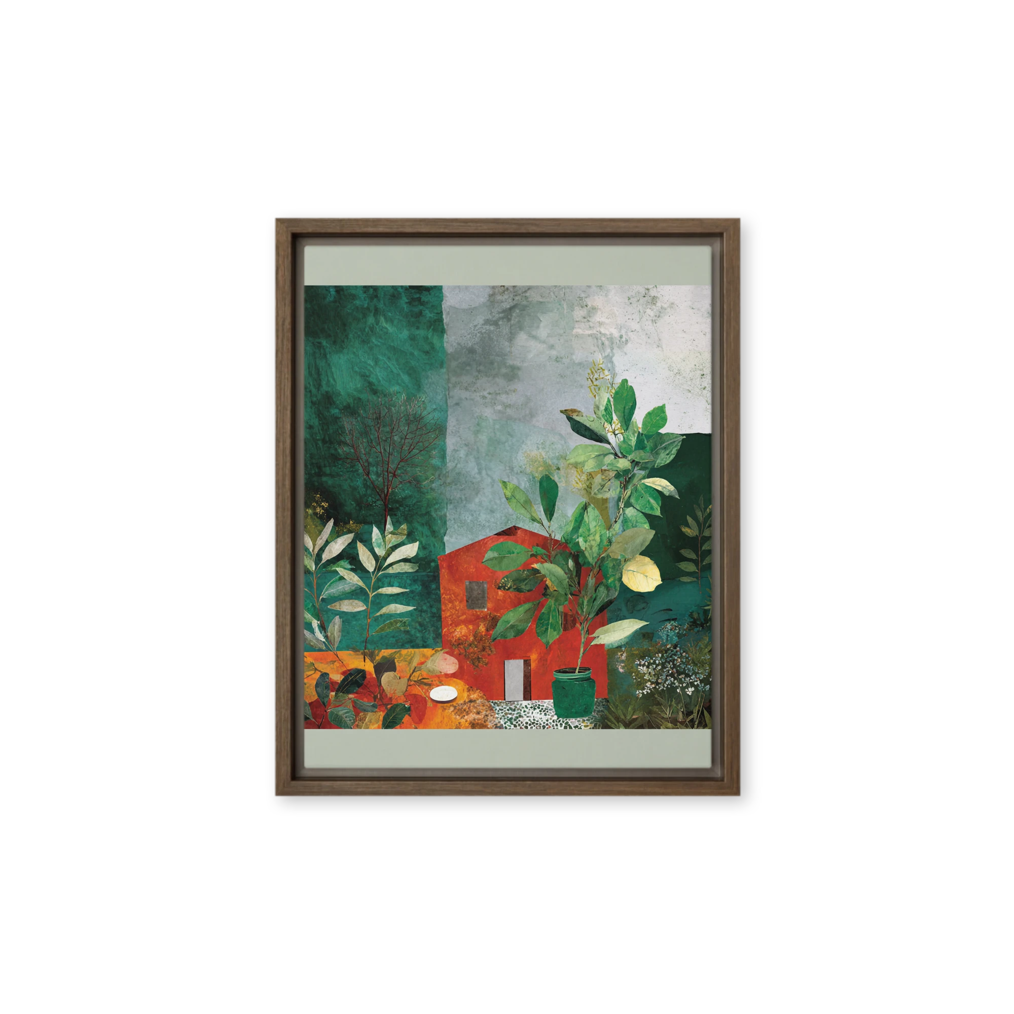
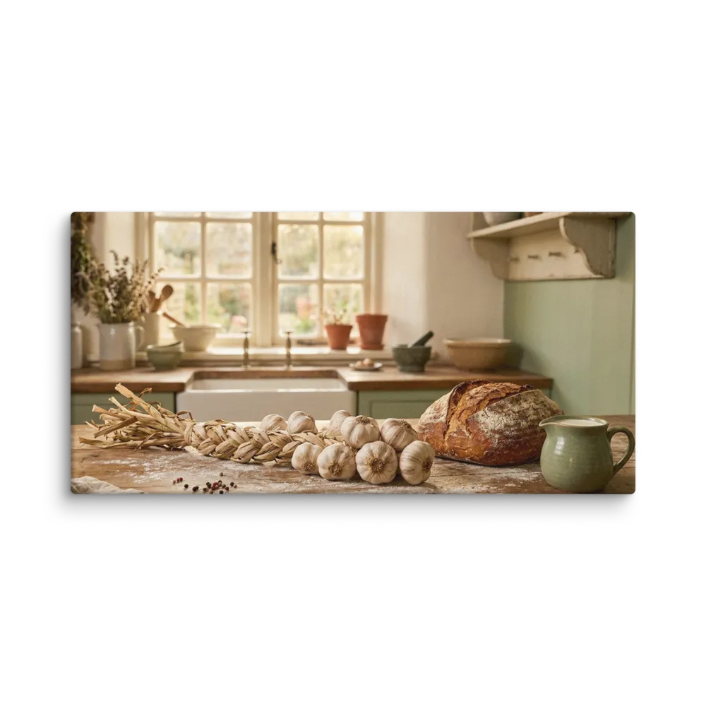
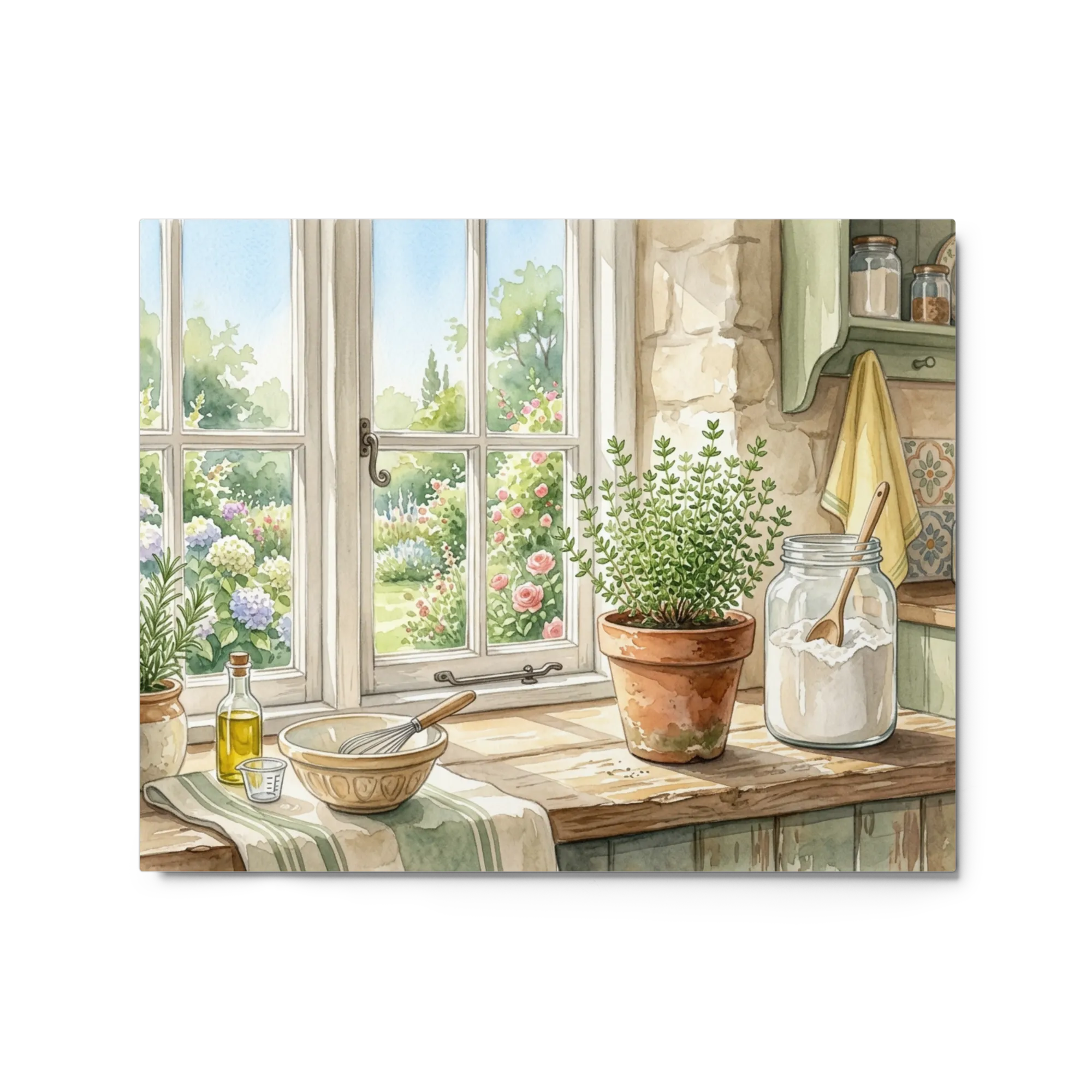
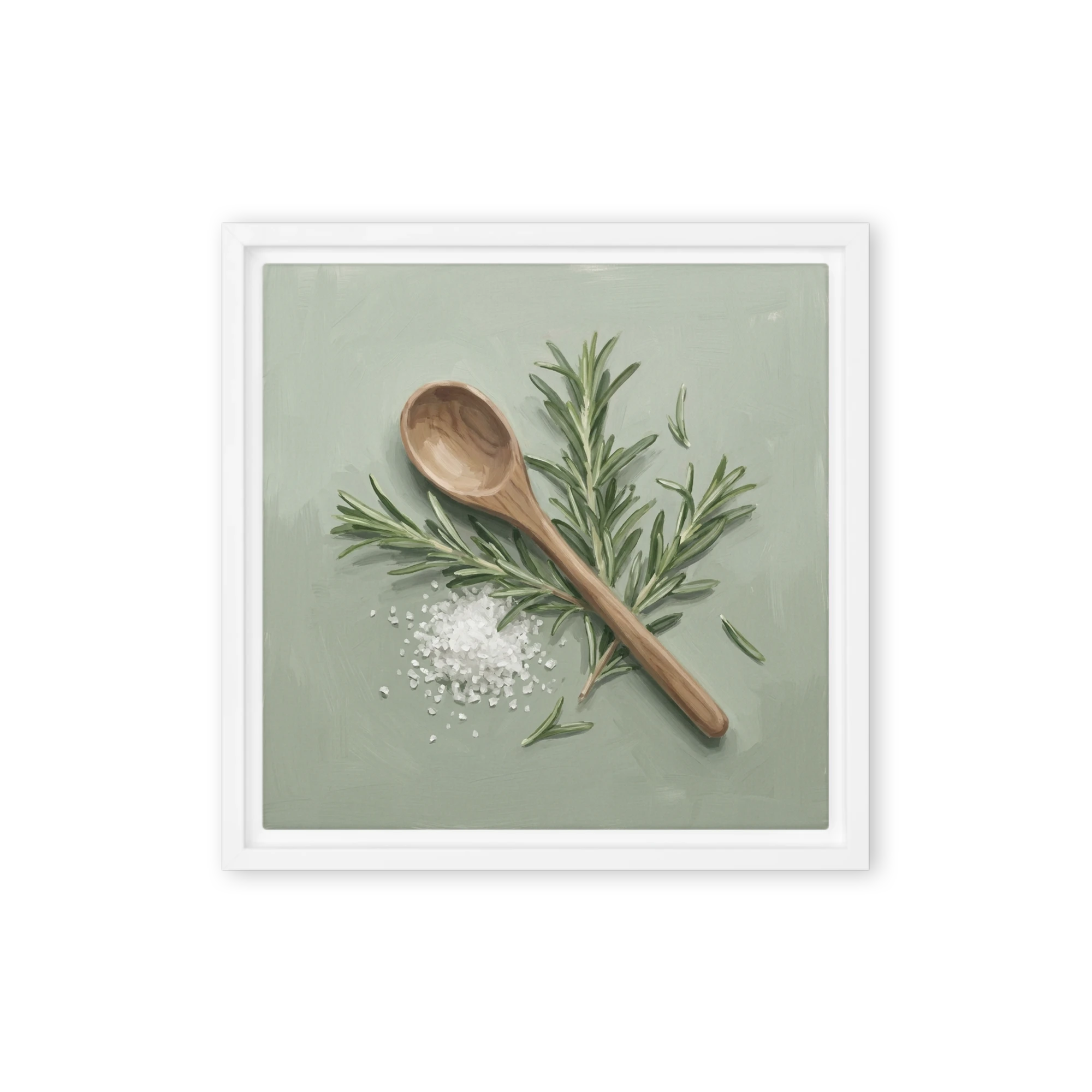
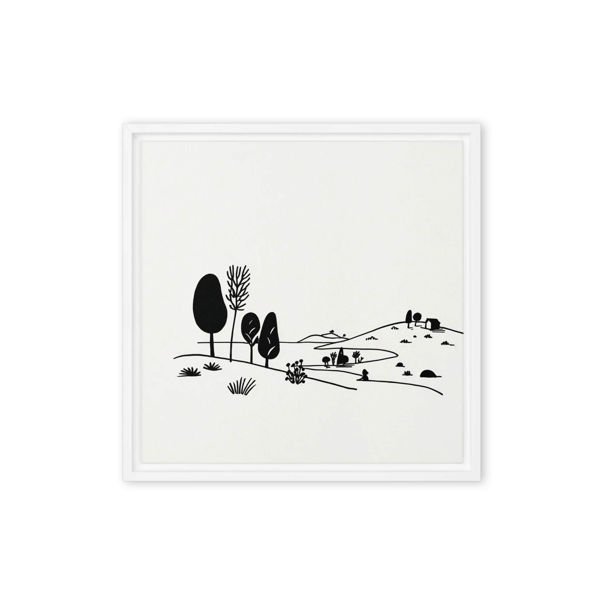
Kitchen wall art reads differently from the rest of the house — the pieces sit closer to eye level, compete with cabinetry and appliances, and need to feel intentional rather than fall back on signage clichés. The strongest subjects are food-and-drink still lifes, painterly wine and produce studies, vintage culinary illustration, citrus and herb botanicals, and considered framed typography (the kind that reads adult, not crafty).
For most kitchens, a single 16x20 or pair of 12x16 prints sit comfortably above a sideboard, banquette, or open shelving. If you have a wall opposite the dining table or above a long counter, go larger — a 24x36 still-life or a tight gallery cluster turns a working room into a destination one. Our kitchen wall art collection skews to warm, food-forward subjects designed to look at home next to oak boards and brass fittings.
The best spots are walls that aren't competing with cabinetry: above a banquette or dining nook, opposite a galley run, above open shelving, or on the long wall behind a dining table. Avoid hanging directly above a hob (heat and steam) or above a sink window where it'll fight for attention.
In a small or galley kitchen, pair two 11x14 or 12x16 prints rather than one large piece — the smaller scale reads as intentional in a busy room without crowding sight lines. A triptych of 8x10s above a sideboard is another clean move.
Framed prints (with glass) are easier to wipe clean if grease or steam reaches them; canvas suits drier dining-area walls. If you cook a lot of high-heat food, choose framed-with-glass and hang at least 6 feet from the cooking zone.
Painterly wine-and-fruit still lifes, vintage culinary diagrams, citrus and herb botanicals, abstract warm-toned compositions, and considered typography read as adult and intentional. Avoid generic 'But first coffee' signage and overly-stylised cookbook imagery — they age poorly.

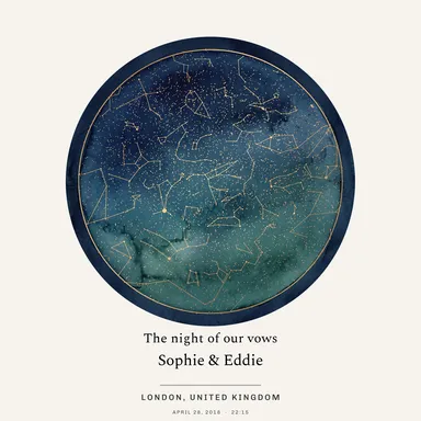 Star Map
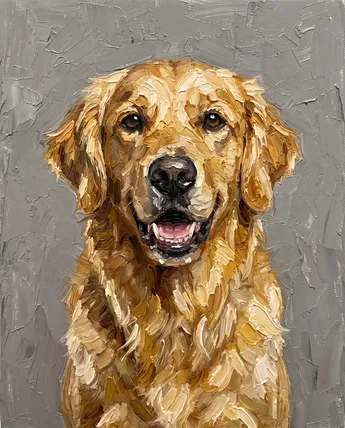 Pet Portrait
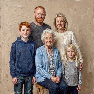 Portraits
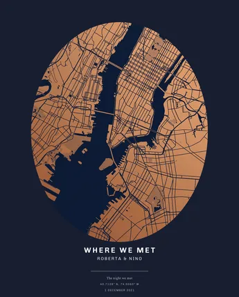 Maps
Maps Cats
Cats Family
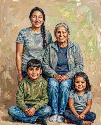 Multi-Generation
 Couple
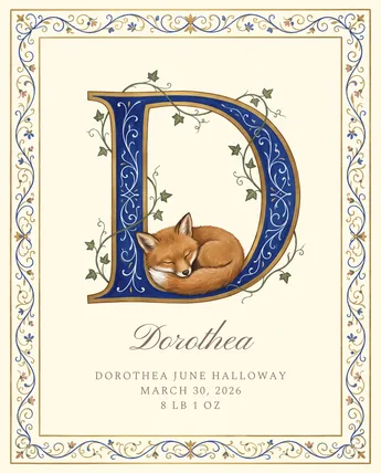 New Baby
 Black & White
 Colorful
 Feeling Blue
 Golden Touch
 Purple Reign
 Burnt Orange
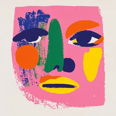 In the Pink
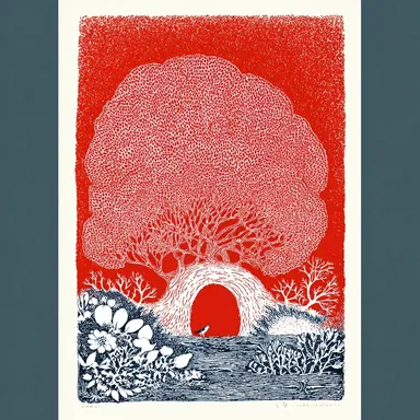 Seeing Red
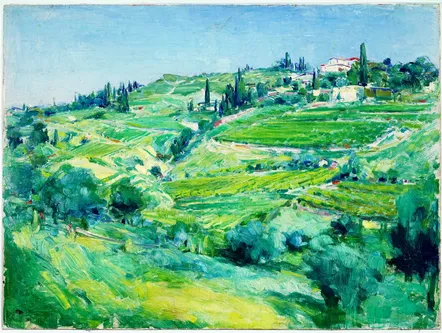 Evergreen
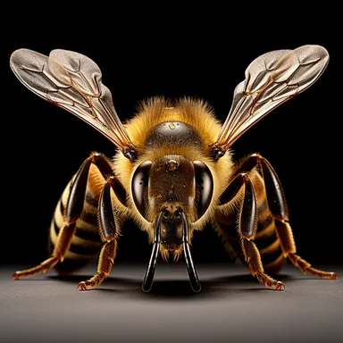 Earthy Browns
 Explore by Theme
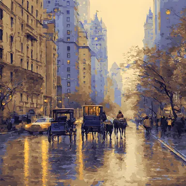 Maps & City Lovers
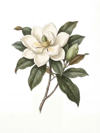 Landscape & Nature
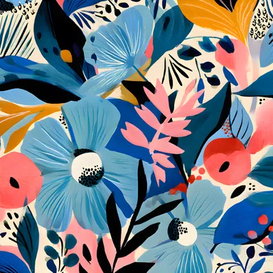 Botanical & Floral
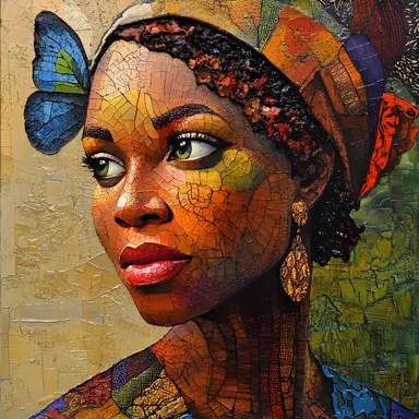 Figurative & Portraits
 Travel
 Vintage & Famous Art
 Photography
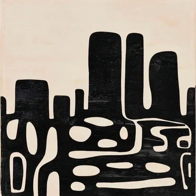 Abstract
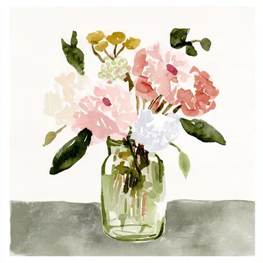 Watercolors
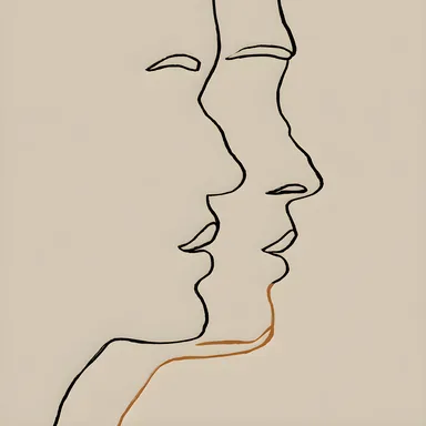 Line Art
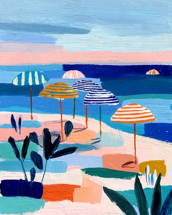 Pastels
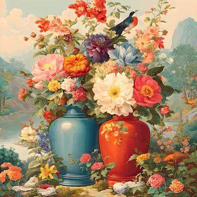 Vintage & Retro
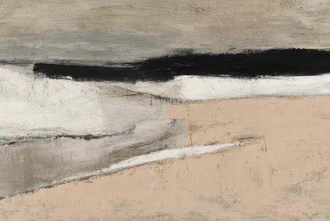 Minimalist
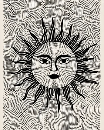 Block Prints & Linocuts
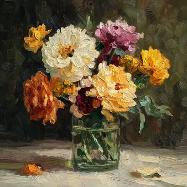 Impasto & Texture
 Folk & Naive
 By Room
 Living Room
 Bedroom
 In the Office
 Kitchen
 Nursery Room
 Children's Room
 In the Bathroom
 For Your Business
 Minimalist & Modern
 Vintage & Retro
 Cats & Animals
 Abstract & Geometric
 Floral & Botanical