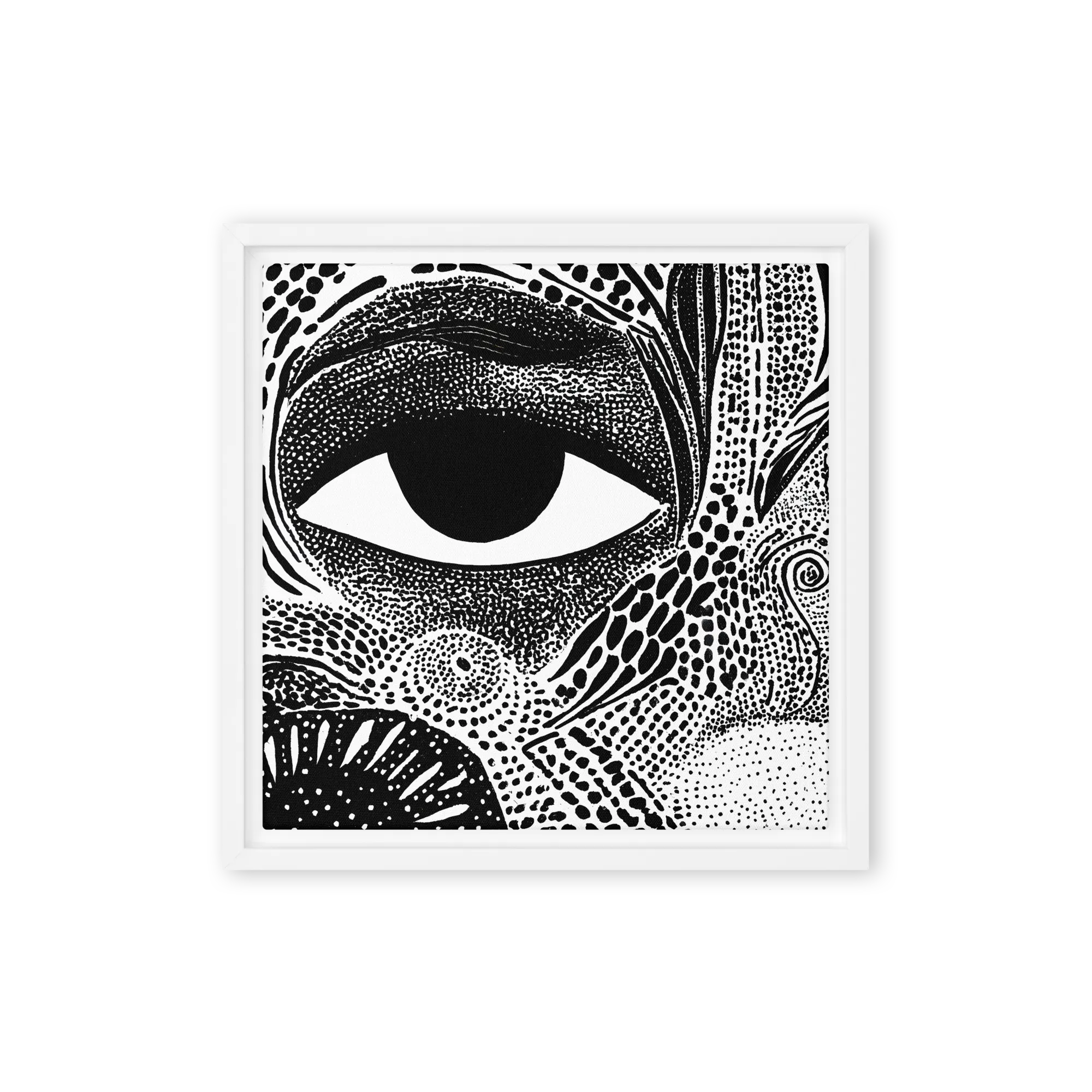
Black and white wall art is the default for buyers who want gallery and timeless without committing to a colour palette. Fine-art photography, ink illustration, tonal portraits, architectural detail, and abstract studies all live here. Genuinely neutral pieces survive furniture and palette changes that coloured work doesn't.
Scale and framing carry black-and-white wall art more than subject. For above-sofa anchor pieces, a 30x40 or 36x48 piece in a slim black frame reads gallery; a small print in an ornate frame reads decor-store. A tight pair or triptych of 16x20 prints in matching frames is the most reliable bedroom look.
It's the lowest-risk choice. Black and white doesn't tie the room to a specific palette, doesn't compete with furniture changes, and reads gallery in almost any interior — modern, traditional, Scandinavian, editorial. Buyers who don't trust their own colour eye, or who swap throw pillows seasonally, default here.
Go large. A single 30x40 or 36x48 piece in a slim black or oak frame above a 3-seat sofa reads anchor; smaller pieces float. If you prefer a set, two 24x36s or a triptych of 18x24s carry the wall. Aim for total width roughly two-thirds the sofa, hung 6-10 inches above the sofa back.
Slim black frames are the safest universal pick — they sharpen the contrast and read gallery. Natural-oak frames soften the look and work in Scandinavian interiors. White frames blend into white walls and make the art read mounted-floating, which suits minimal apartments. Avoid ornate or coloured frames.
Yes — it often calms a colourful room down. If your sofa, rugs, and pillows already carry the colour story, a black-and-white piece gives the eye somewhere quiet to rest. The opposite — coloured wall art over coloured furniture — feels busy. Black and white is the trick rooms with strong colour usually need.