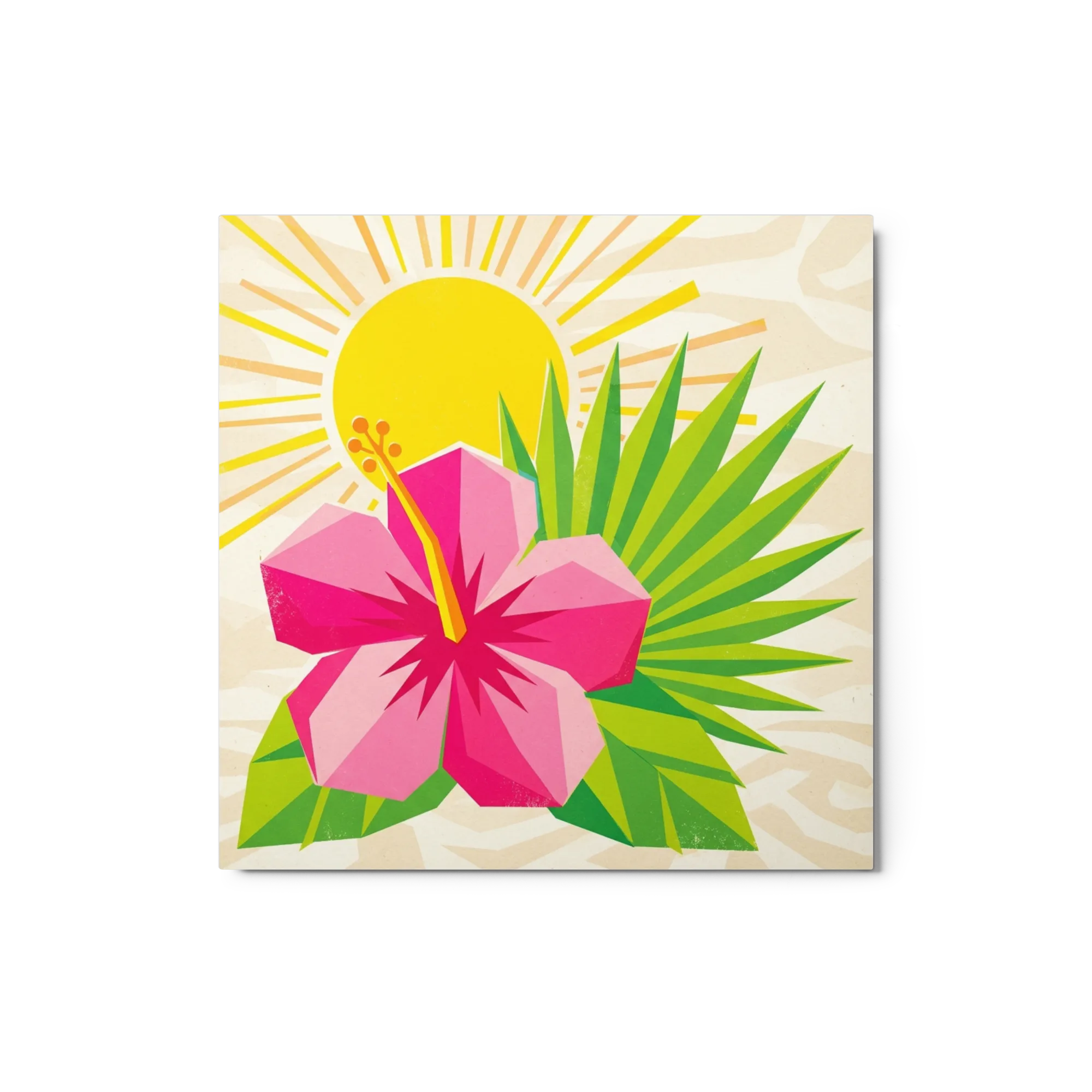
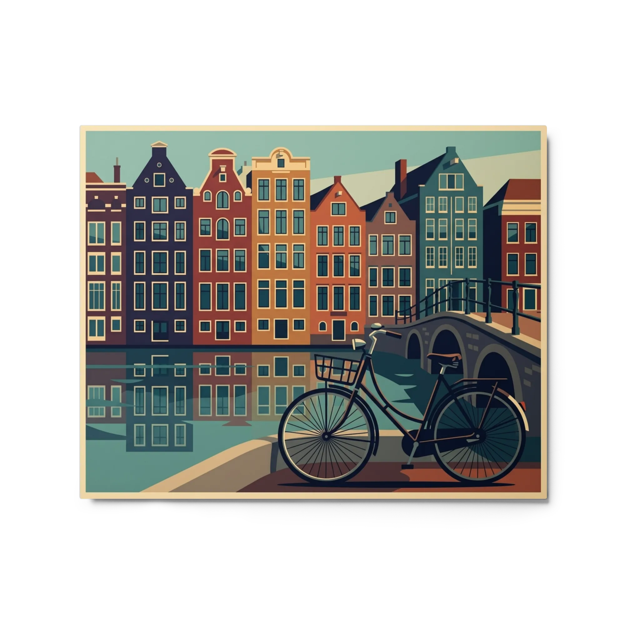
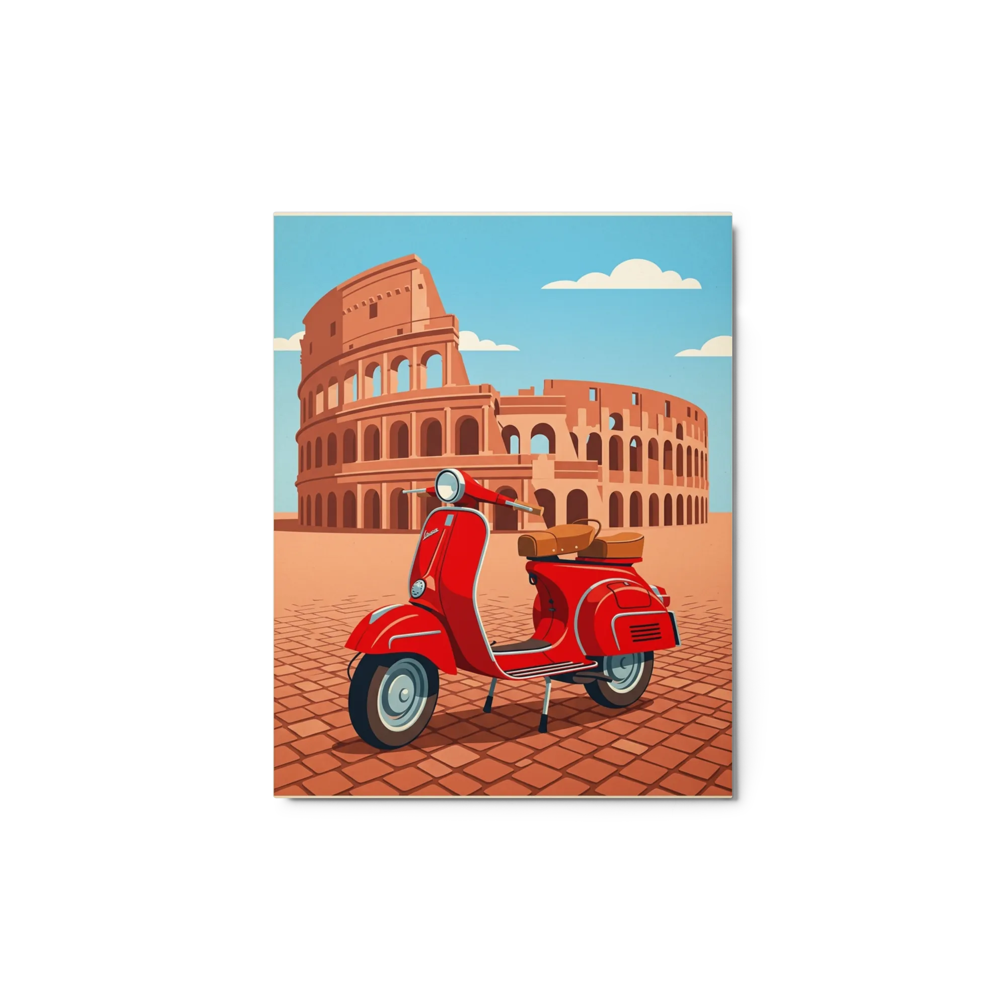
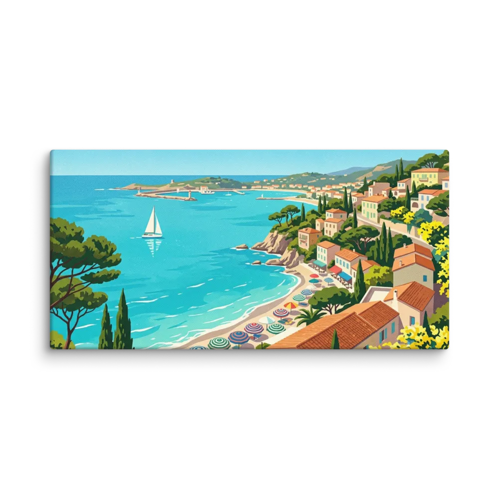
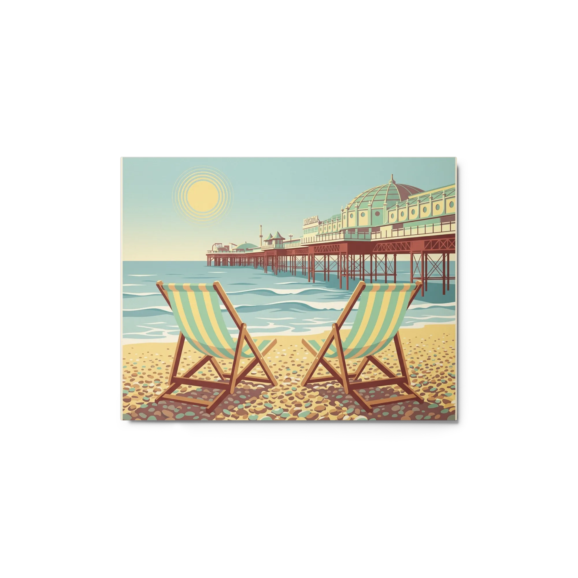
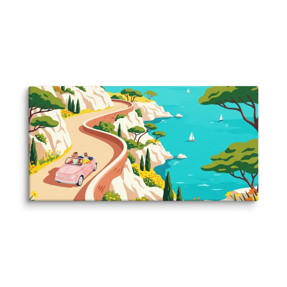
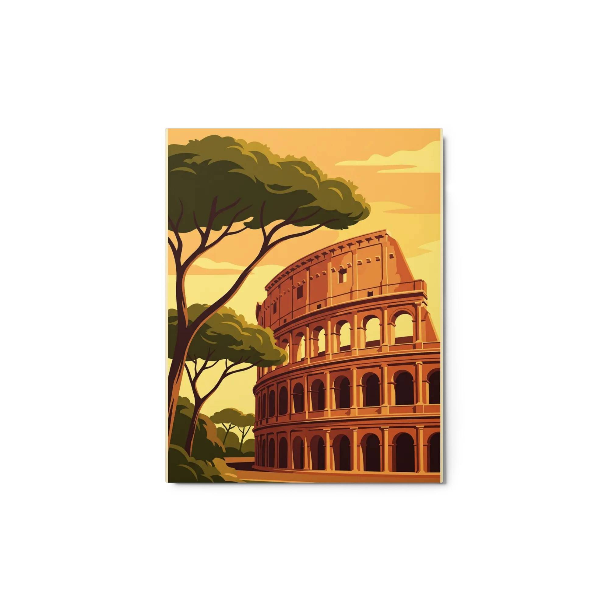
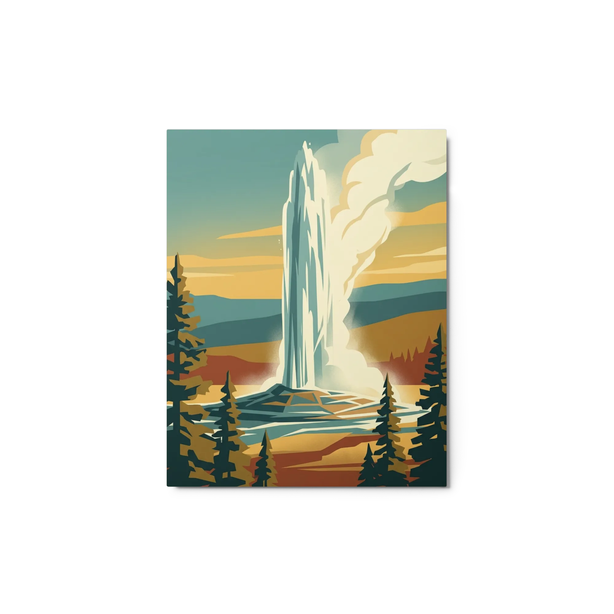
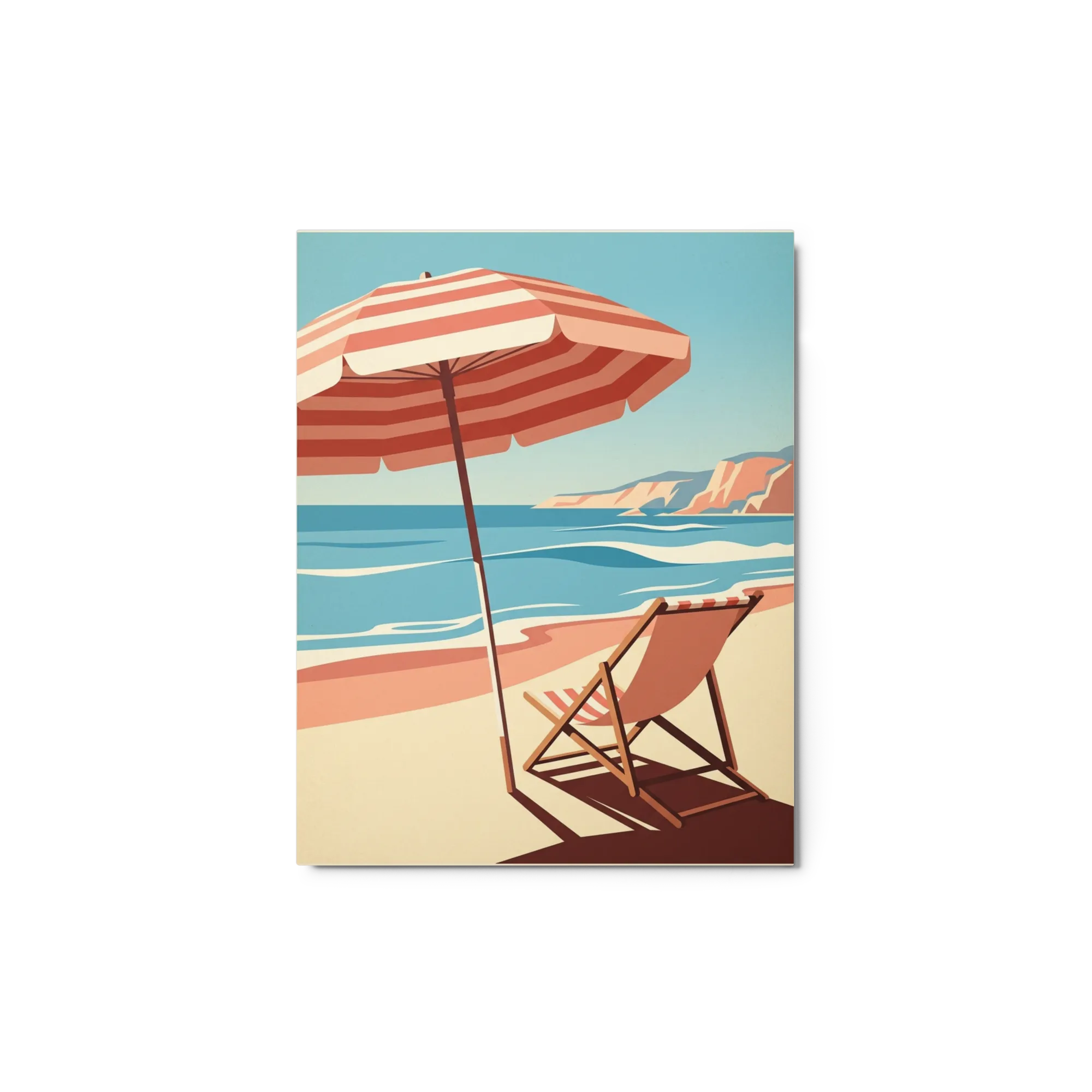
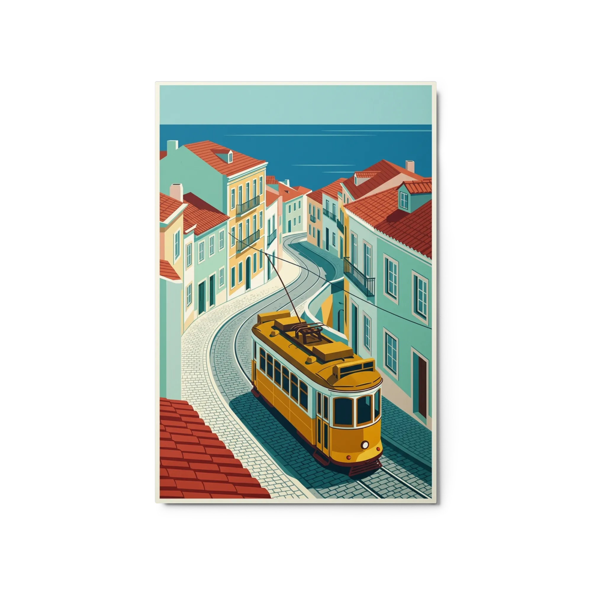
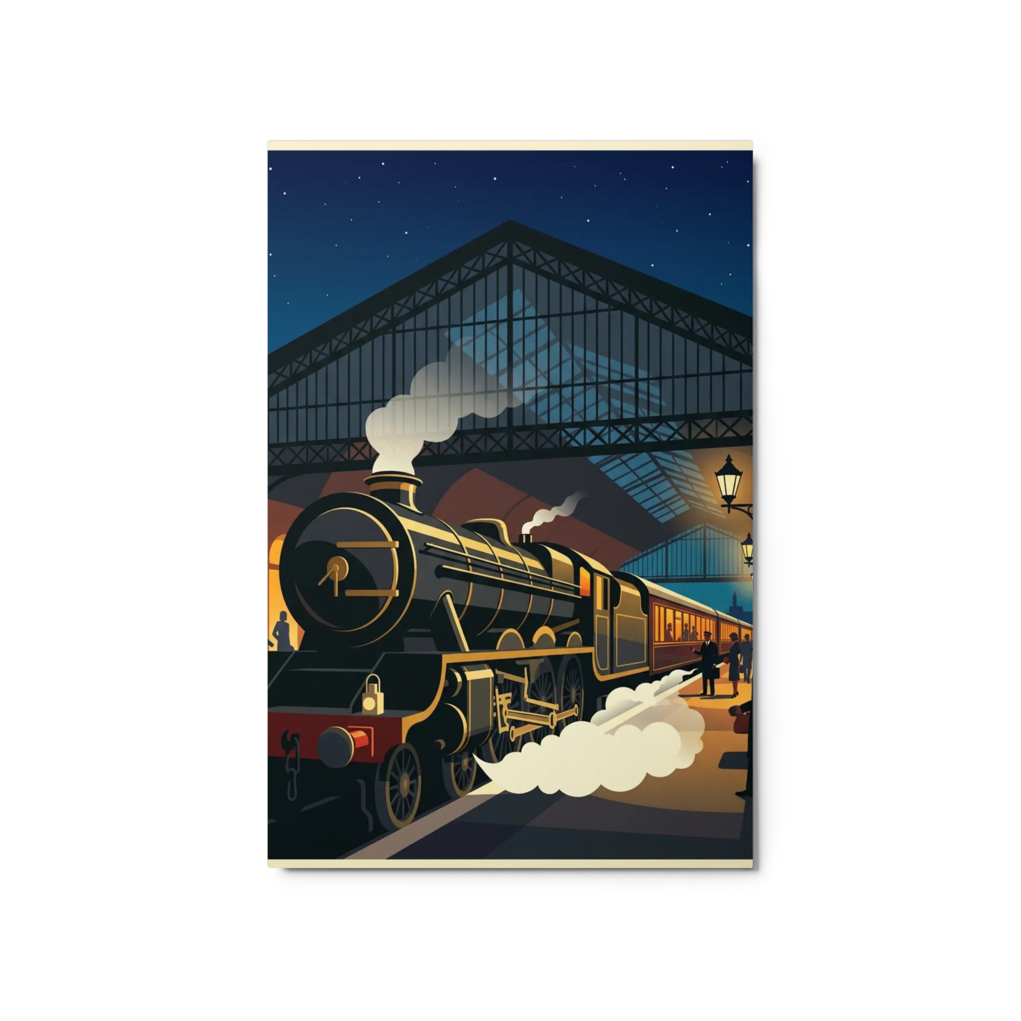
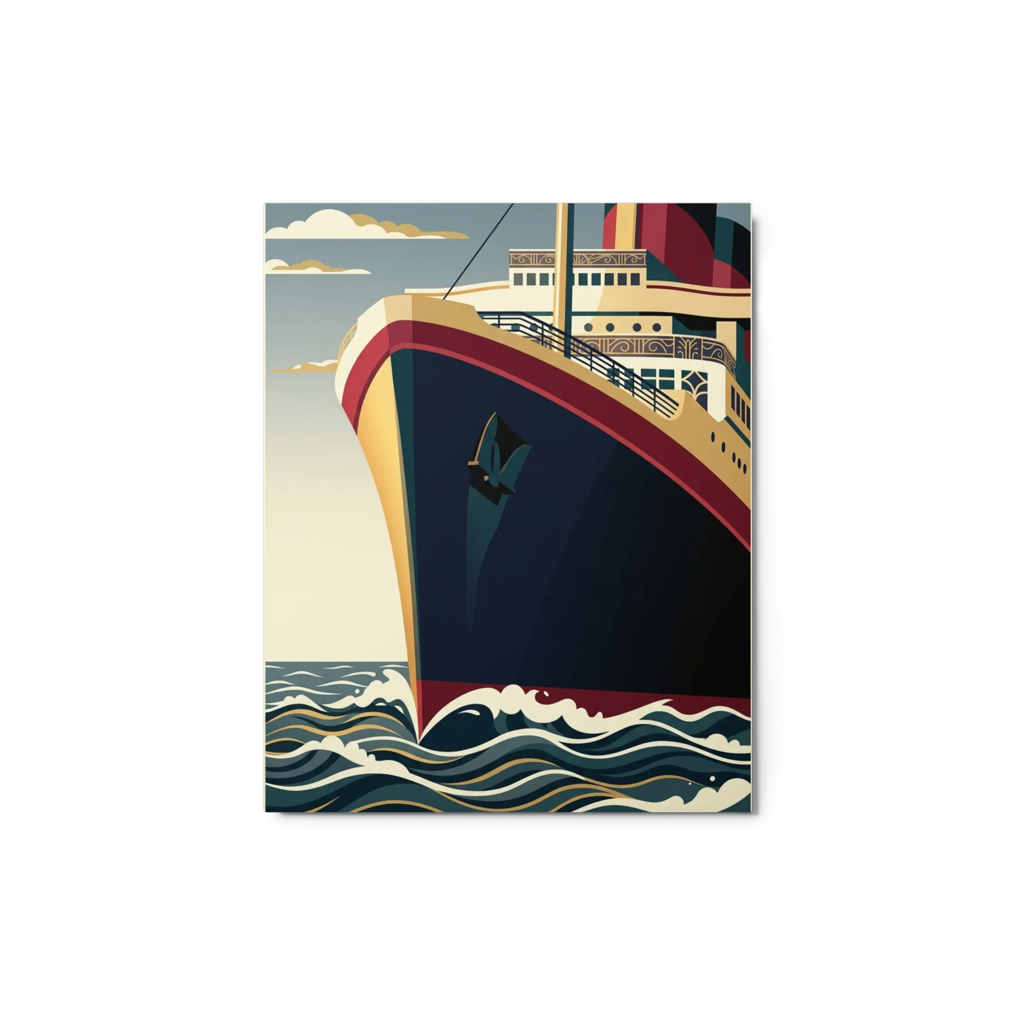
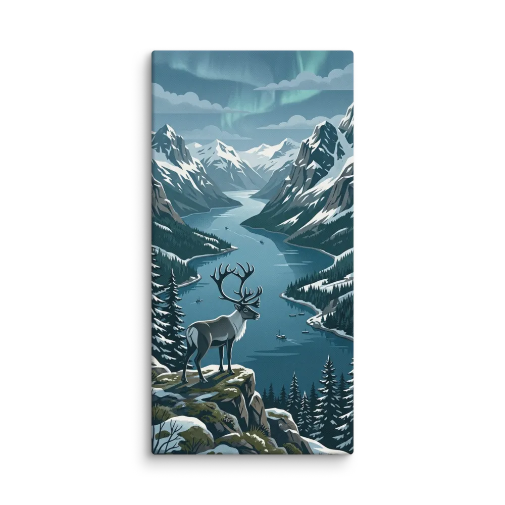
Vintage travel posters are the most reliable shorthand for a culturally-engaged room: reissued mid-century travel-agency, airline, and steamer prints (Air France, BOAC, Cunard), railway-route advertising, and bold 'VISIT [PLACE]' graphics. The strict vintage-poster register — flat-colour illustration, bold period typography, slightly distressed inks — is what separates these from contemporary painterly travel art.
For a hallway, home office, or guest room, a series of three or four 18x24 vintage travel posters hung in a line at consistent height is the canonical move — it reads as a collection rather than a single souvenir. Frame them identically (thin black or natural oak with a small mat) so the typography and palette do the work. Our vintage travel posters catalogue keeps the register tight: contemporary painterly travel art lives elsewhere; WPA park posters belong with national-parks pieces.
Our vintage travel posters are high-quality reproductions and contemporary work in the mid-20th-century travel-poster aesthetic. Originals (Cassandre, Roger Broders, period BOAC and Cunard prints) would cost thousands and require conservation framing; reproductions give you the visual hit at a hangable price.
Thin black or natural-oak frames with a small white mat — identical across the set. The frame should disappear so the typography and flat-colour illustration carry the wall. Avoid heavy or ornate frames; they fight the modernist register of the original posters.
Hang three or four 18x24 posters in a horizontal line at consistent centre height (57-60 inches from the floor), with 2-3 inches between frames. The line should span two-thirds of the wall or the furniture beneath. Vertical stacks work in narrow stairwells.
Yes — they're one of the most popular cross-registers between mid-century and modern design. The flat-colour illustration and bold typography read as design-history rather than period-specific, which is why they appear in design-magazine living rooms, restaurants, and Airbnbs.

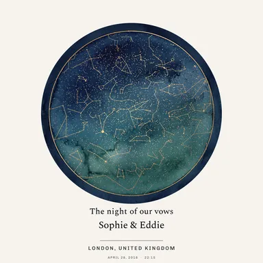 Star Map
 Pet Portrait
 Portraits
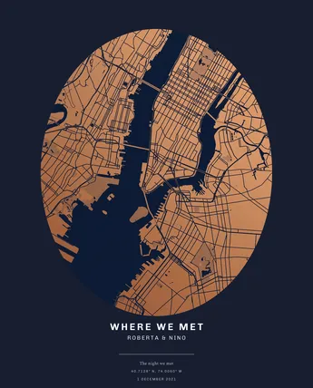 Map Prints
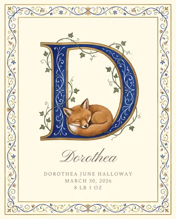 Nursery Name Art
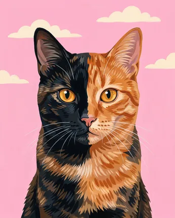 Cats
Cats Family Portraits
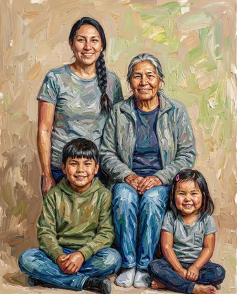 Multi-Generation
 Couple
 Black & White
 Colorful
 Feeling Blue
 Golden Touch
 Purple Reign
 Burnt Orange
 In the Pink
 Seeing Red
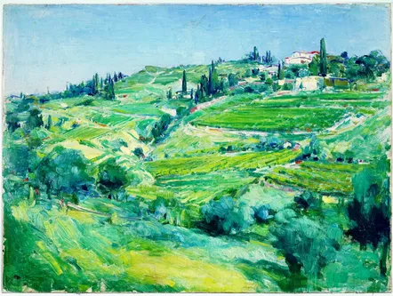 Evergreen
 Earthy Browns
 Explore by Theme
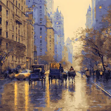 Maps & City Lovers
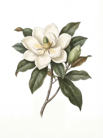 Landscape & Nature
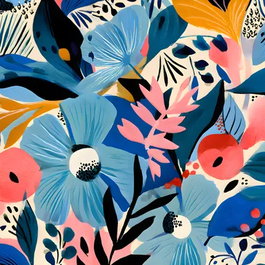 Botanical & Floral
 Figurative & Portraits
 Travel
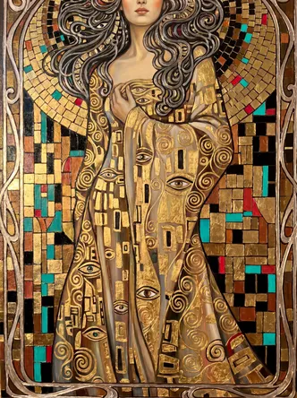 Vintage & Famous Art
 Photography
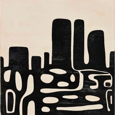 Abstract
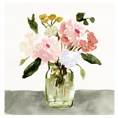 Watercolors
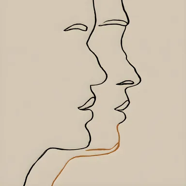 Line Art
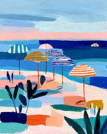 Pastels
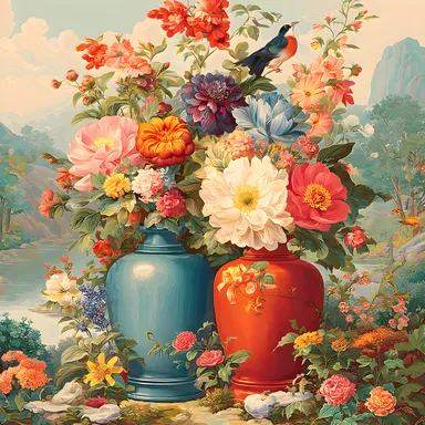 Vintage & Retro
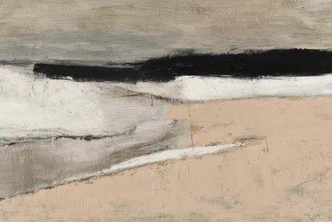 Minimalist
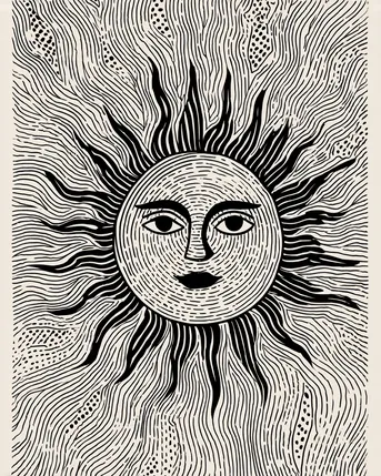 Block Prints & Linocuts
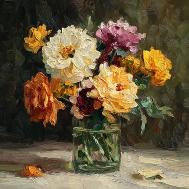 Impasto & Texture
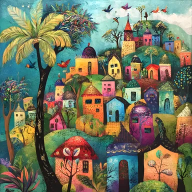 Folk & Naive
 By Room
 Living Room
 Bedroom
 In the Office
 Kitchen
 Nursery Room
 Children's Room
 In the Bathroom
 For Your Business
 Minimalist & Modern
 Vintage & Retro
 Cats & Animals
 Abstract & Geometric
 Floral & Botanical